Portfolio
Here are case studies and additional projects I've completed

Cooper's Hawk Winery
Website & Mobile App
Delivery First
Driver-Facing Mobile App
Resource Allocation Tool
Pharmaceutical Company Desktop App
Alefa Fitness
Challenge-Based Fitness App
Boston Energy
Asset Monitoring Mobile App
Academy of Ortho. Surgeons
Medical Association Mobile App
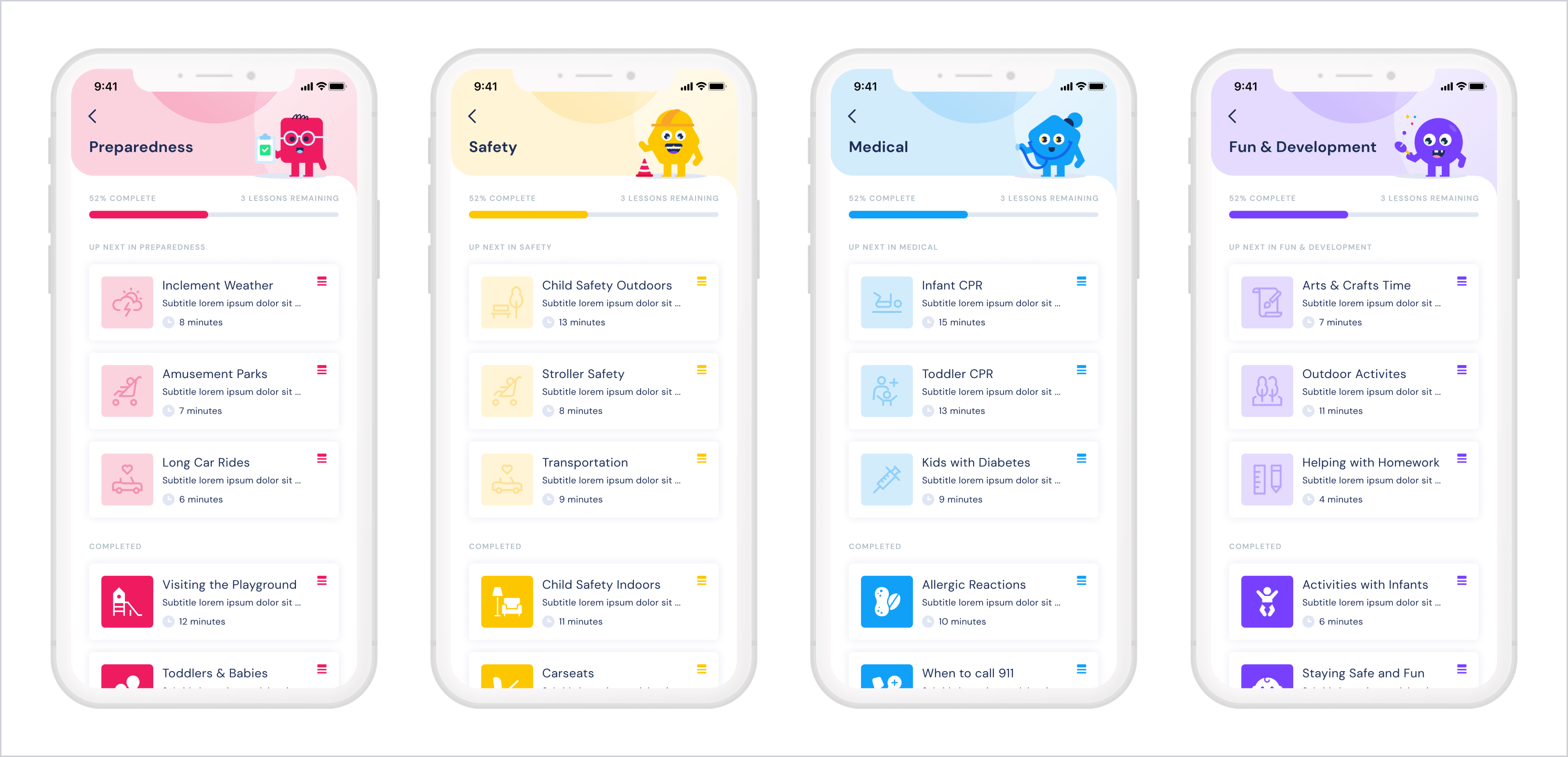
American Academy of Pediatrics
Caregiver Training Mobile App
Tagg Fashion
Website & Chrome Extension
Winston Privacy
Mobile App for Internet Privacy Device

RacketStats
Tennis Stats & Charting Mobile App
Visipill
Pill Dispenser Device Interface
Forth Phase
Branding & UI
Tenley
Mobile App for Credit Consolidation
Icons & Illustrations
Gallery of Selected Work
Branding & Logos
Gallery of Selected Work
Mallory Made Co
Personal Project
Skills
Check out some of my top abilities & qualifications
About Me
Iowa born. Ohio educated. Chicago designer.
Hey! I'm Mallory, a designer based in the Windy City. I am an Ohio University graduate with a BS in Visual Communication, and an alumna of the UX/UI Digital Design Bootcamp, Designation.
Most recently, I've been working as a Senior UX/UI Designer at a consultancy in downtown Chicago, where I've collaborated closely with a variety of clients and my internal team of interaction designers, product managers, and developers on desktop and mobile applications, and responsive websites. In addition, I've been able to lead a variety of branding, marketing, and illustration-focused projects as well.
Outside of my digital designer time, I'm also an avid ceramicist! I work with a group of friends out of a community studio in the Lincoln Park neighborhood creating both wheel-thrown and handbuilt pottery pieces, which you can find in my Etsy shop Mallory Made Co. And if I'm not at the studio, you can find me snuggling my golden retriever puppy, Frannie

Get in touch!
Like my work? Drop a line for work inquiries, or just to chat!
I enjoy deep discussions regarding design & cats.
malhaack@gmail.com
Cooper's Hawk Winery & Restaurants
Website & Mobile App • UX & UI Design
INTRODUCTION
A client I was able to work very closely with was the Illinois-based restaurant and winery chain, Cooper's Hawk. In multiple recurring engagements, my team and I worked to improve their existing membership web-app and online ordering experience, as well as designing and developing their first native mobile application. Over the course of about two years I was able to collaborate with senior executives, stakeholders, and IT managers at Cooper's Hawk to implement cohesive and visually engaging user experience accross their platforms.
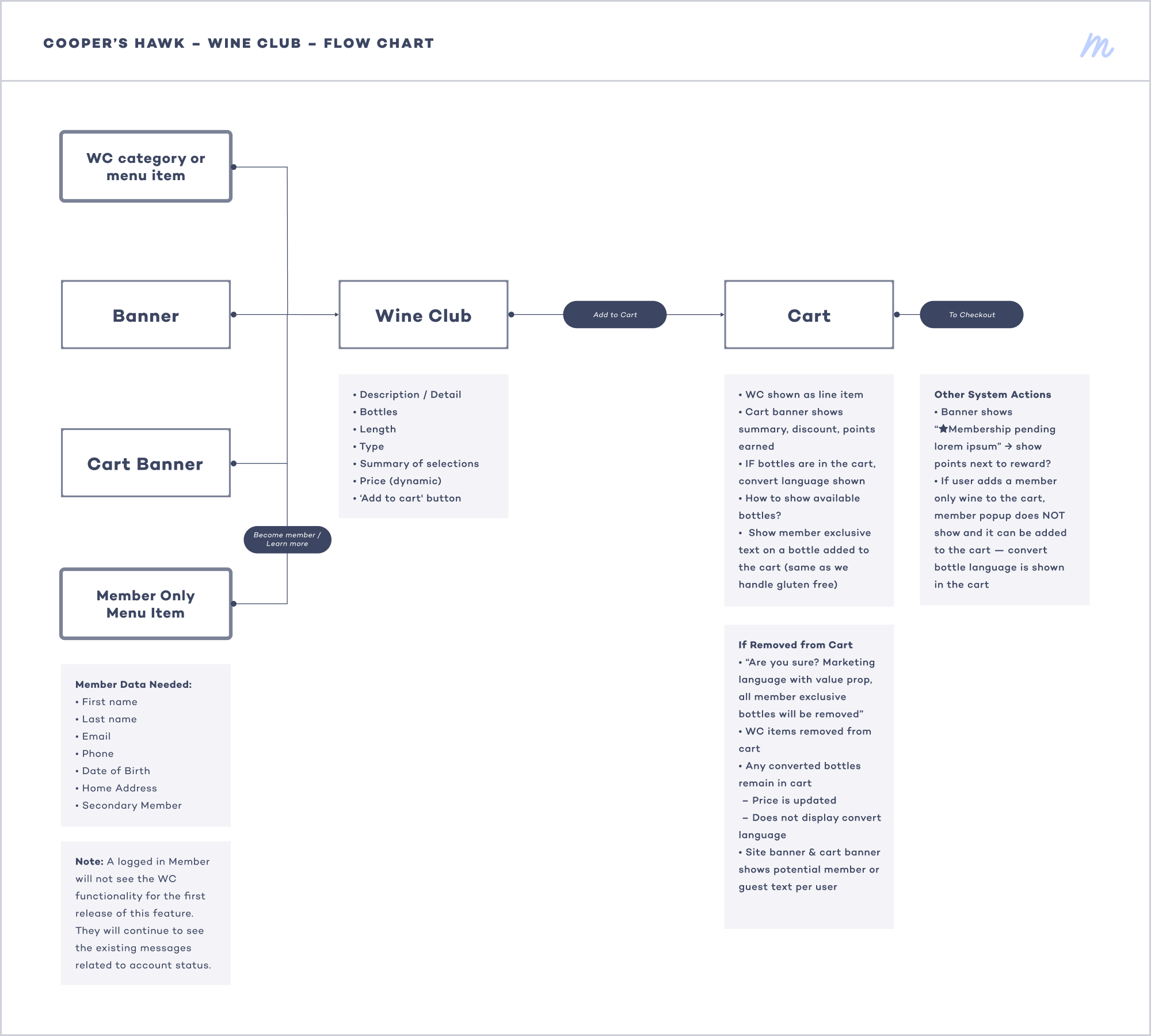
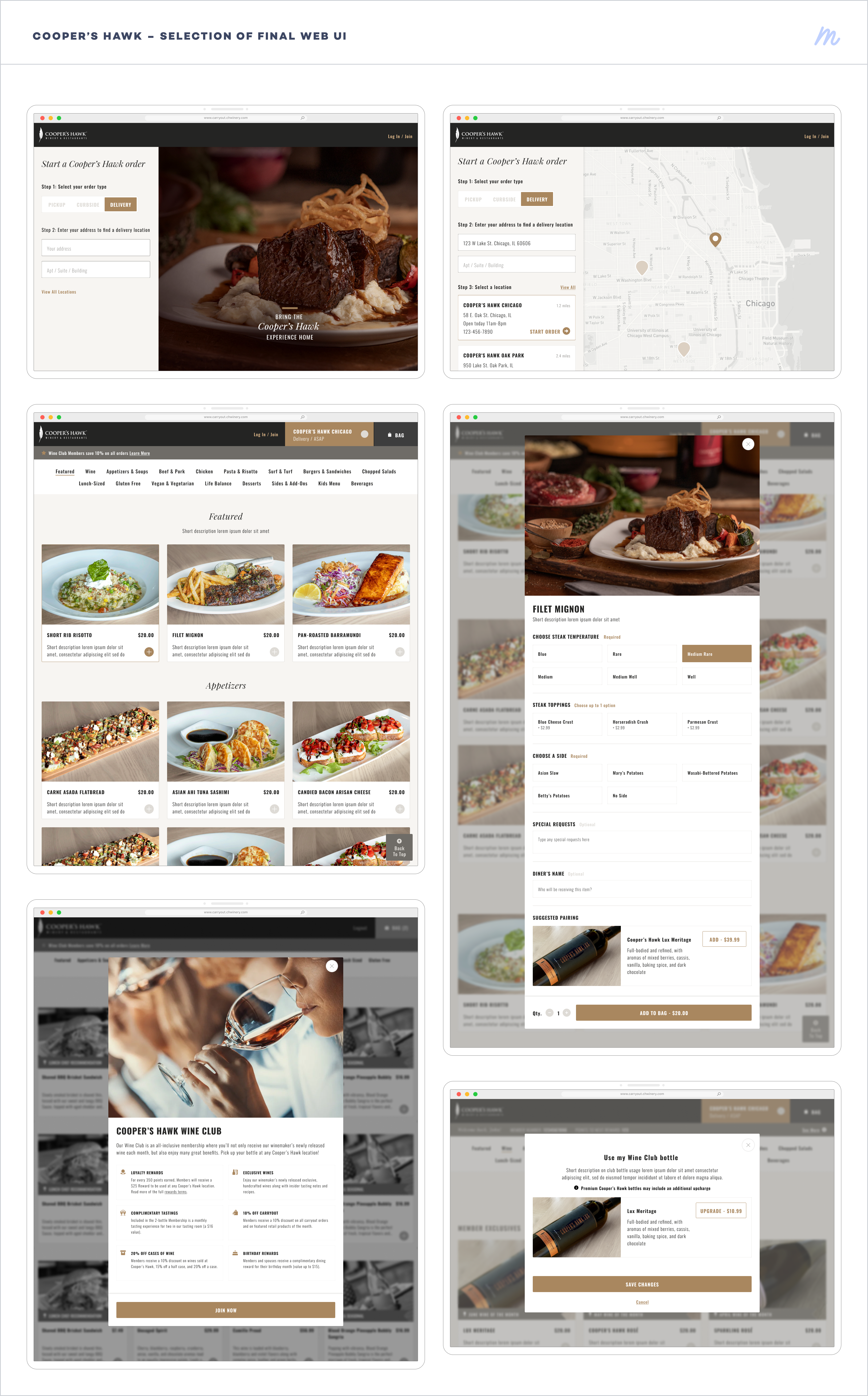
ONLINE ORDERING & MEMBER SERVICES
My first engagement with the Cooper's Hawk team included revamping their online ordering process, as well as improving the Wine Club Member web experience. My team and I worked through an agile process which included an audit of the existing experience, competitor analysis, user flows, and wireframes leading to the final high fidelity mockups.


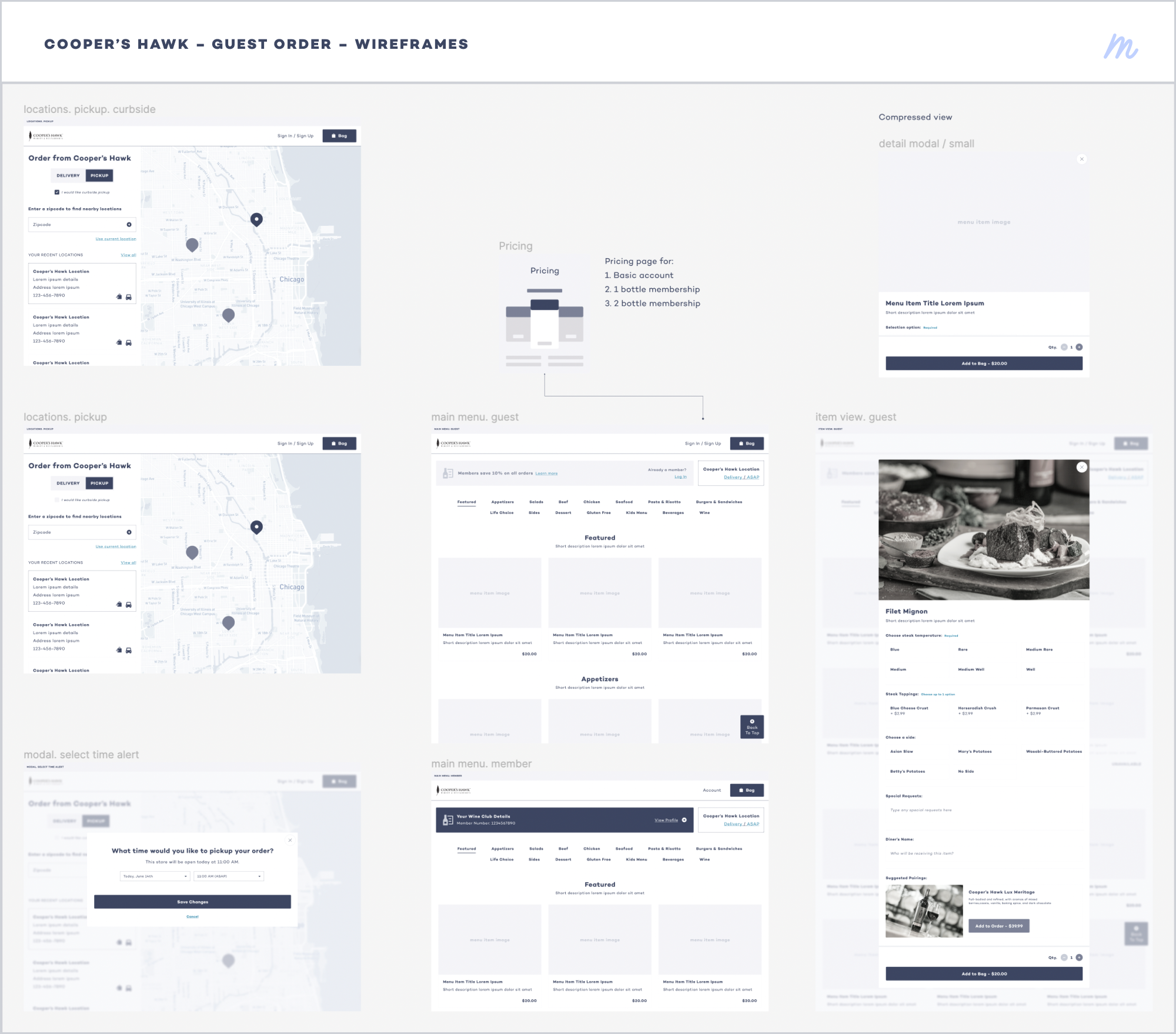

FINAL DESIGNS
Over the course of about three months, my team and I closely collaborated with the team at Cooper's Hawk to deliver and implement the updated online ordering system, and improvements to the existing Wine Club membership portal. The final designs drew visuals and brand details from the Cooper's Hawk brand, while also introducing an enhanced user experience and structured layout.
CREATION OF A MOBILE APP
Shortly after our initial engagement with the Cooper's Hawk team, they signed on for a significantly larger scope of work — the design and development of their own native mobile app. Throughout the discovery and design phase, my team and I again collaborated with the various Cooper's Hawk stakeholders to create a polished and accessible app that would enhance their existing platforms and users' experiences.
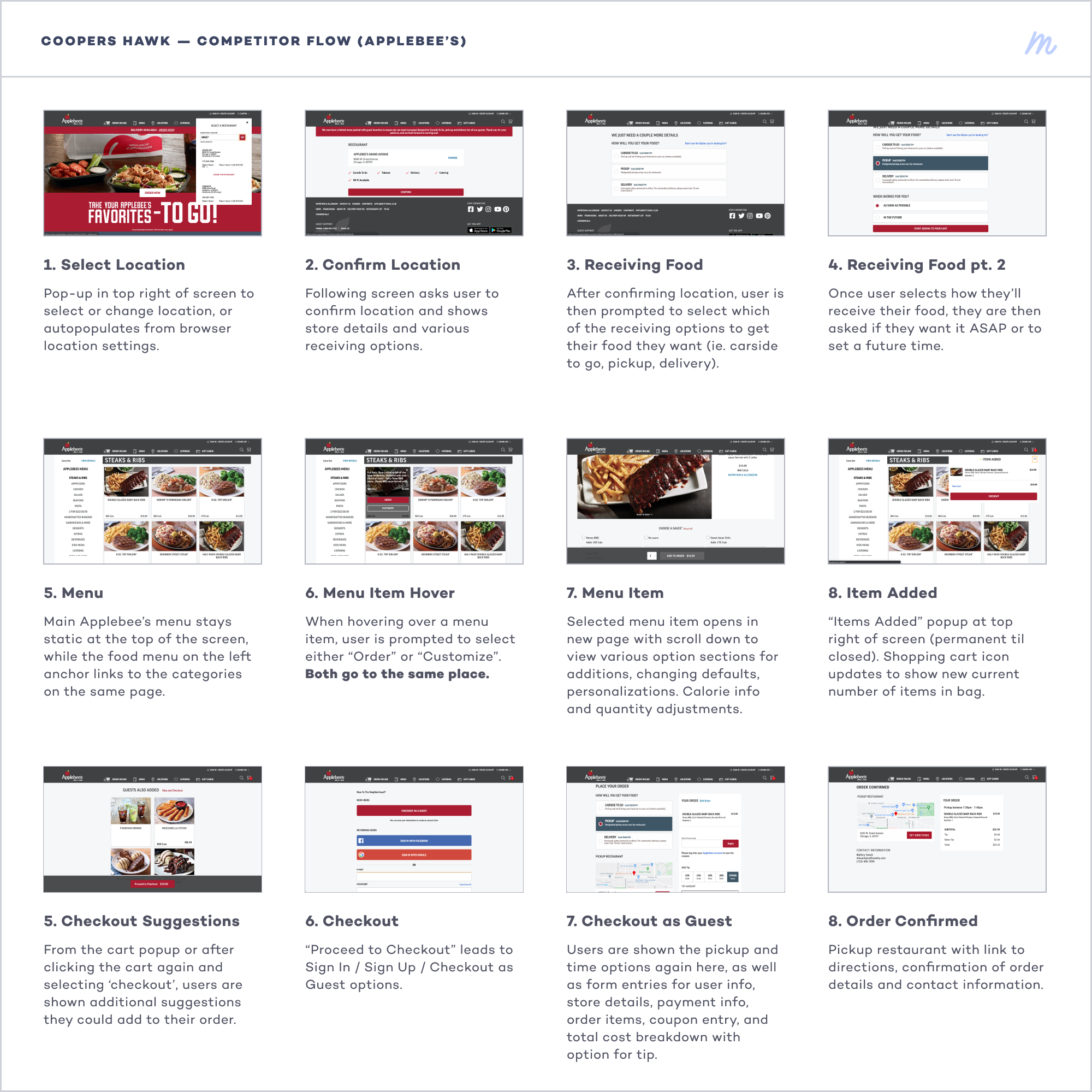
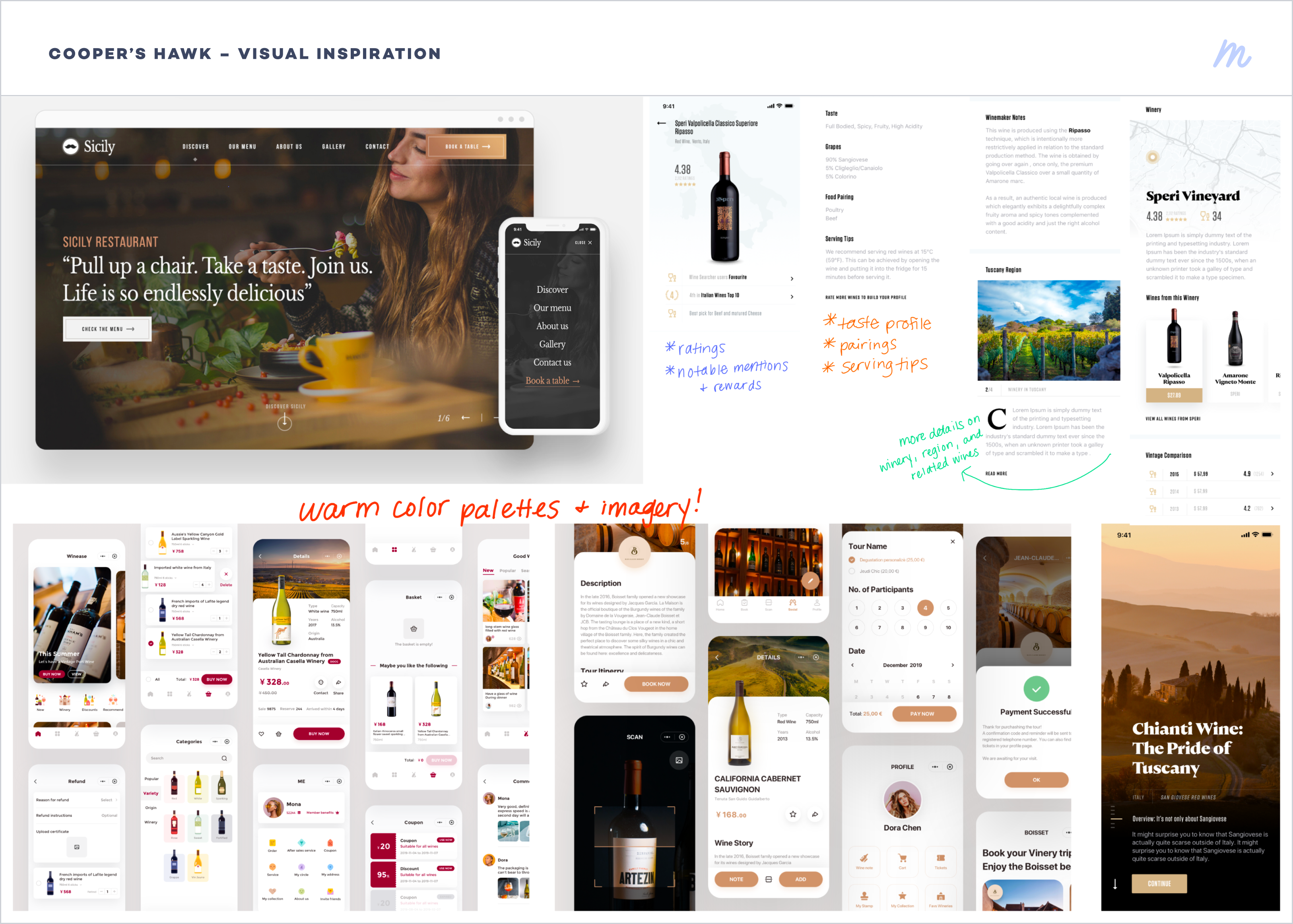
To begin the process, I conducted a comprehensive competitive analysis. In addition to anaylzing competitors in the restaurant space, I also researched companies across different domains. This included companies that engaged in alcohol delivery — something that Cooper's Hawk was interested in exploring — as well as companies that have a dedicated Member Services platform. From this research and our conversations with the Cooper's Hawk team and a few of their existing users, my team and I were able to build feature and requirements documentation to guide us through the design process and piecing together the app.

BUILDING THE APP
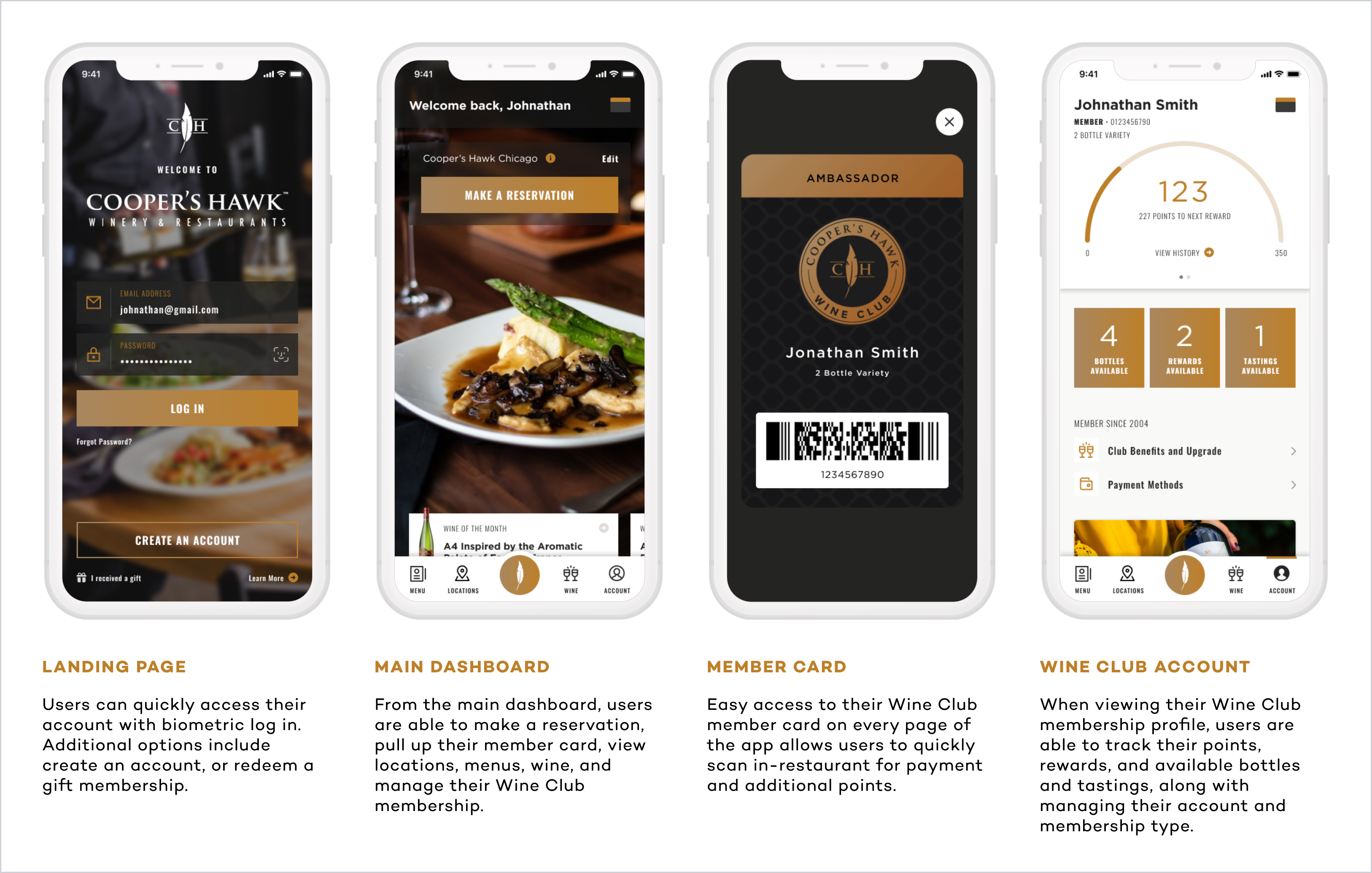
As we continued to work out requirements and app features, I also began to experiment with visuals and UI treatments that would complement Cooper's Hawk's existing brand while attracting new customers and potential members. After compiling a collection of inspiration visuals, the Cooper's Hawk team and I began to iterate on the main dashboard of the app, where we felt we could best showcase multiple UI elements and make the best impression on users when they first enter the app.
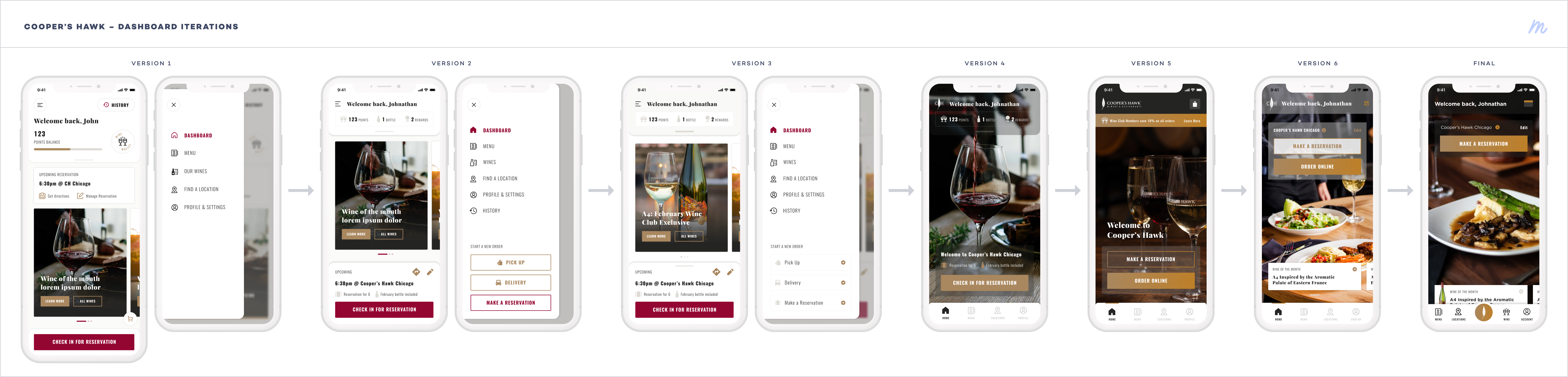
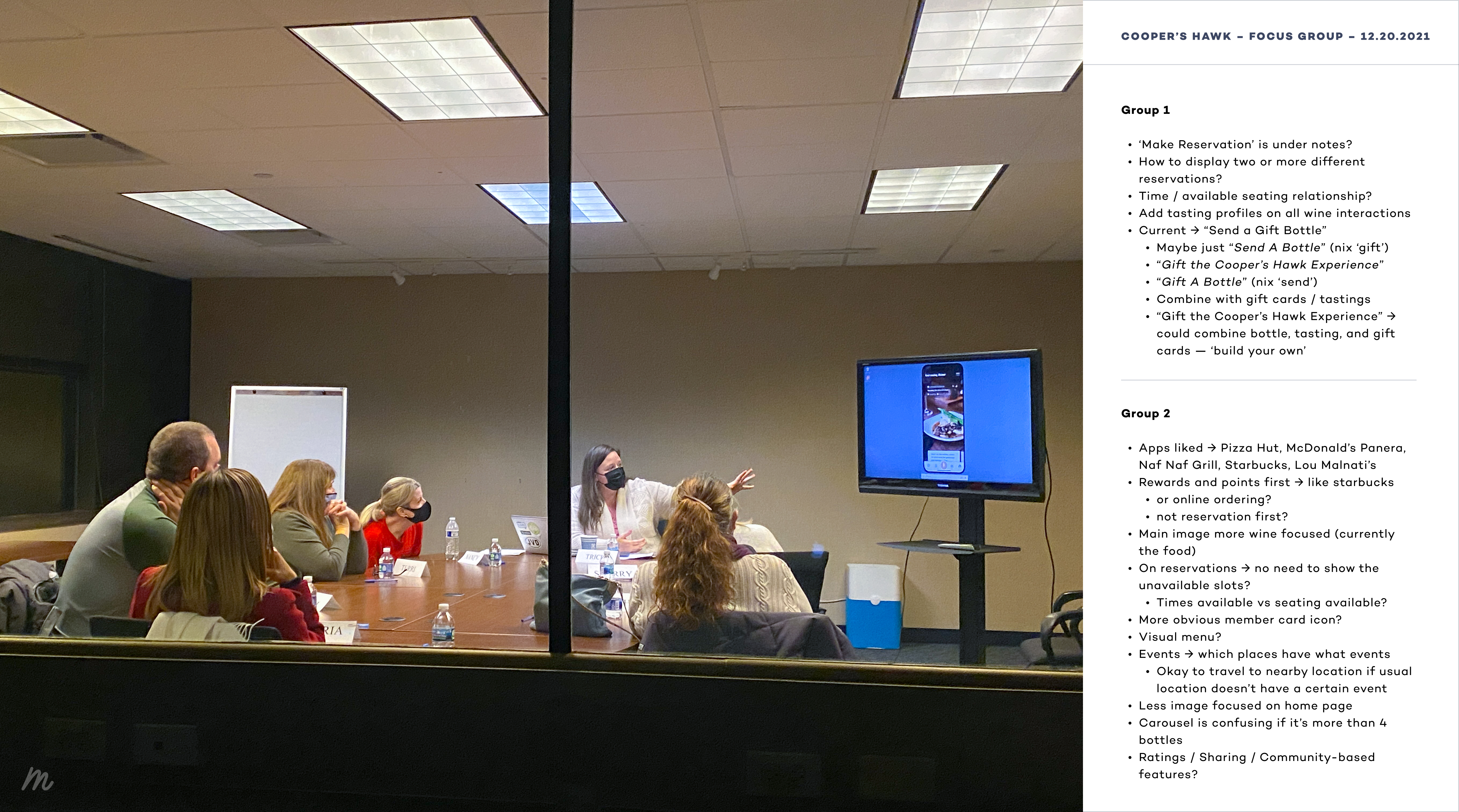
FEEDBACK & ITERATIONS
As we completed the discovery and design phase and began development, we worked with a research firm to conduct a focus group. We were able to observe through a two-way mirror as the research lead held two sessions with existing Cooper's Hawk members and walked them through a prototype of the app. We were able to gather a lot of great feedback from the participants and implement updates as we were preparing to launch the app.
FINAL DESIGNS
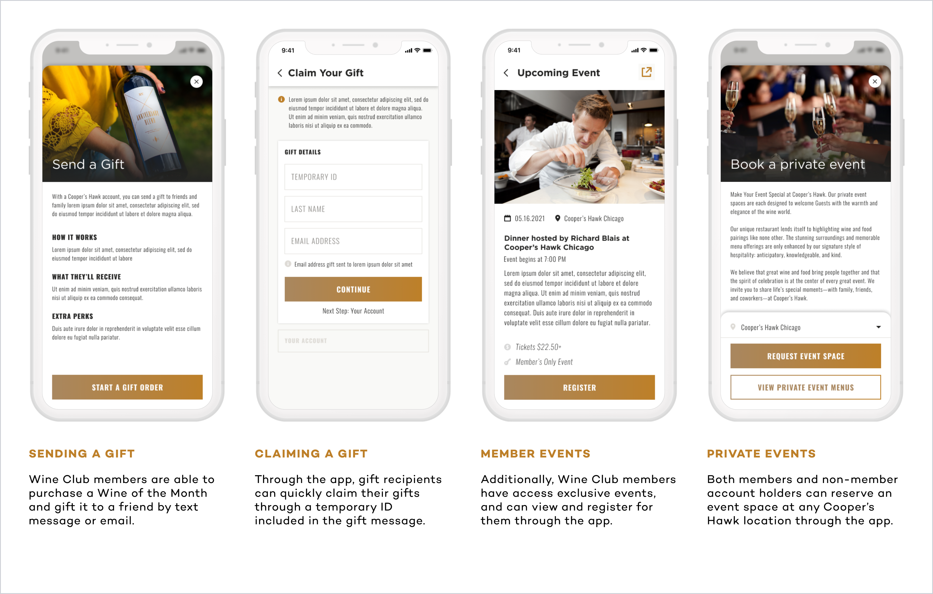
After launching in the Fall of 2022, the Cooper's Hawk app has been well received by existing members, and has led to a considerable increase in new Wine Club memberships. Currently, the app has over 13,000 ratings for an average rating of 4.9 stars. Below, you can find a summary of features and a selection of the final app designs.
The Cooper's Hawk mobile app is available on the App Store and Google Play Store.


- Date: 2021-2023
- Client: Cooper's Hawk Winery & Restaurants
- Roles: UX/UI Designer
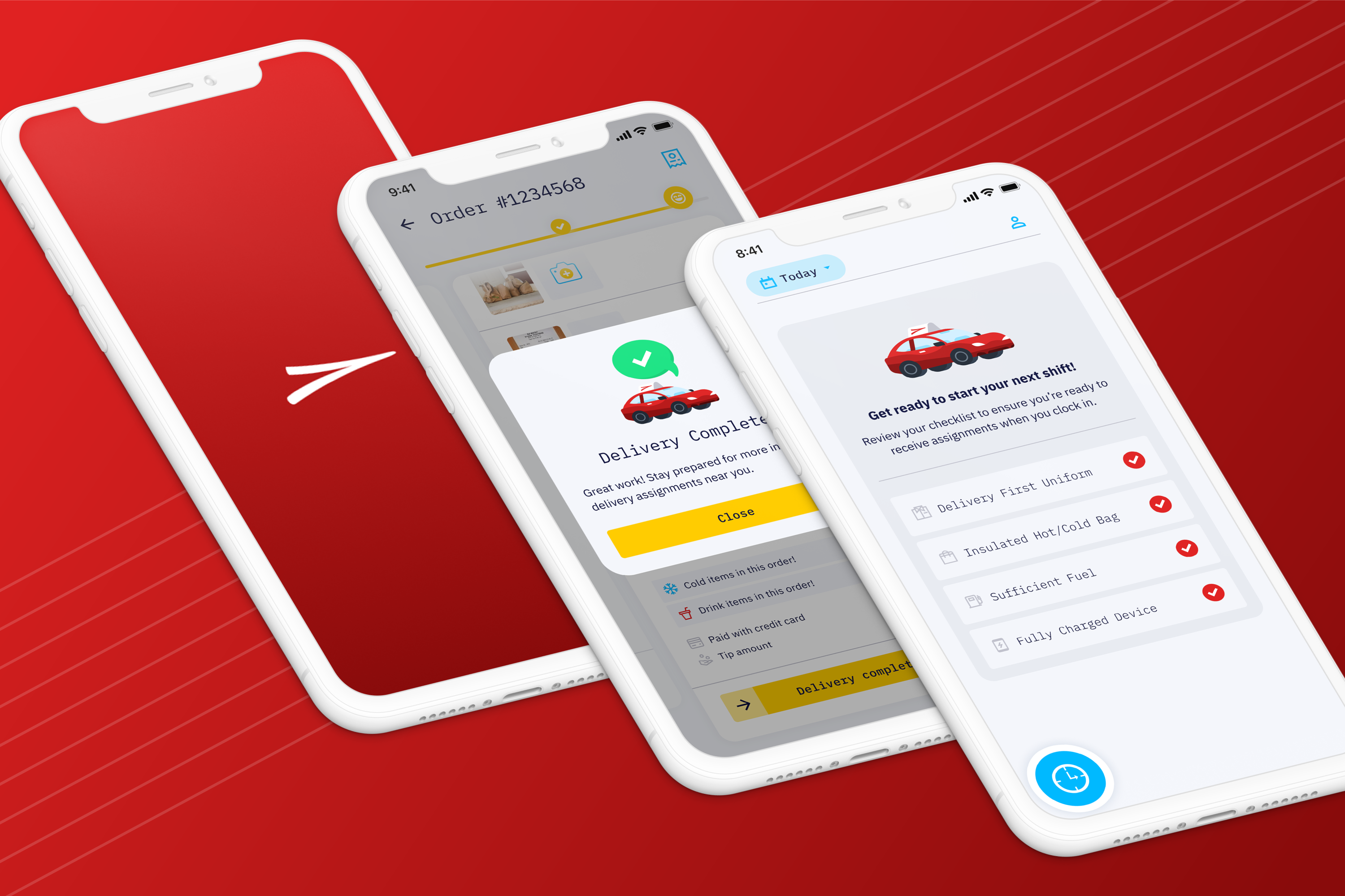
Delivery First
Driver-Facing Mobile App • UX & UI Design • Illustration
INTRODUCTION
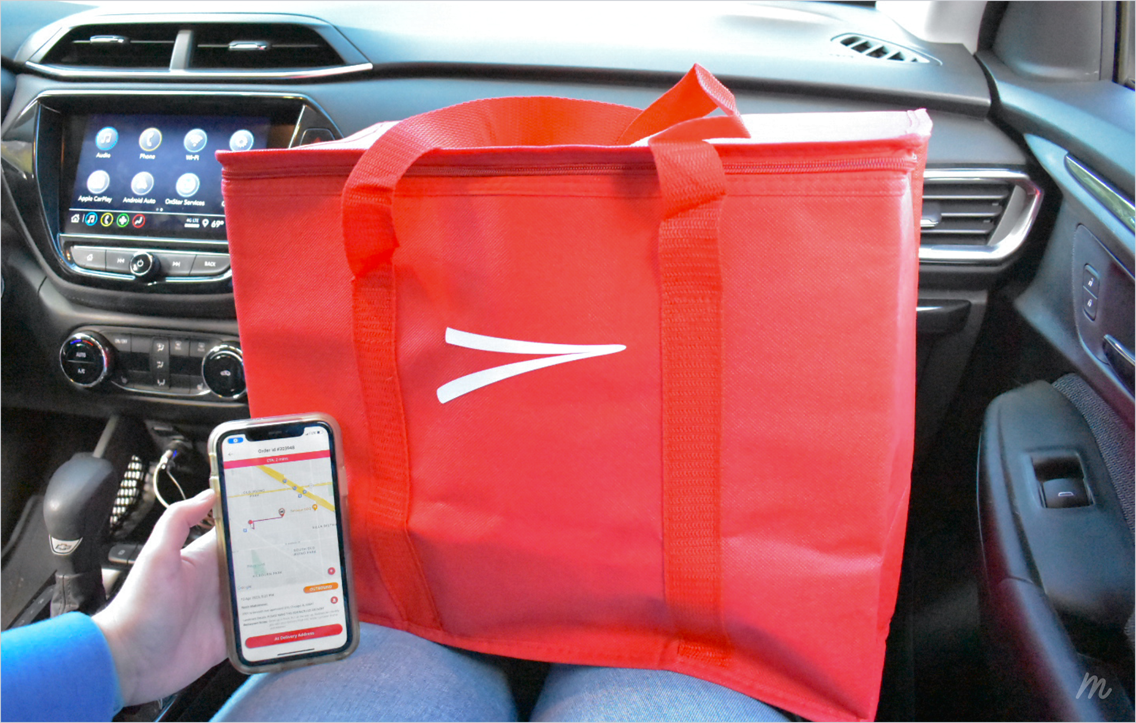
My most recent client project was with the Chicago-based food delivery platform, Delivery First. Delivery First was created by restaurant operators who were unsatisfied with the delivery options available to them, and wanted to create a delivery company that employed drivers in a full-time, salaried capacity, competing with companies such as DoorDash or GrubHub in the 'gig economy' where drivers only earn income on deliveries and have no additional employment benefits. My team and I worked with the Delivery First team to drastically overhaul and modernize their driver-facing mobile app to improve delivery efficiency and reduce driver complications.
DELIVERY DISCOVERY RIDE ALONG
At the start of the discovery and design phase, I was able to participate in a delivery ride along with a veteran driver and zone manager. Throughout the ride along, I was able to experience the full delivery flow and learned more about various painpoints and strategies for when issues arise. Additionally, I gained insight about driver employment process and additional challenges related to shifts, payment tracking, and delivery zone management.

PLANTING A FEATURE TREE
Throughout our discovery phase and ongoing conversations with the Delivery First team, my team and I created a feature tree to guide those client conversations and track which features were already existing, an approved scope addition, future enhancements, etc. This helped us make decisions when it came to priorities while honoring the client's budget.
Additionally, my team and I worked together in evaluating and iterating on the delivery process. Through a collaborative virtual whiteboarding session, we were able to find the best methods in streamlining a driver's delivery for a more efficient and issue-free flow.


ILLUSTRATING DELIGHT
One thing I really enjoy doing when working on an app is creating custom illustrations that I believe can help complement the interface design and bring a bit of delight to the end users. With Delivery First, I created a series of delivery car illustrations to pair with system messages drivers will see in the app. The illustration style and implementation matches the goal of modernization and having that quick visual aid for the driver to know where they are in the process.

FINAL DESIGNS
The Delivery First driver app is currently in the end stages of development and nearing its launch to the app stores. As it nears the launch, myself and the team continue to work closely with the Delivery First team to test with users and make improvements to ensure the app is successful with the driving team members and aids Delivery First in their mission to grow their driver fleet. Below, you can find a selection of the final mockups, as well as a flowchart of the finalized active delivery process.

DARK MODE
In addition to the standard light mode design of the app, my team and I decided that it would also be beneficial to include an option for dark mode that would follow the user's system settings or that could be selected in the app settings, especially for nighttime deliveries where drivers might not want to have a brighter screen. In an effort to be conscientious of budgets and time restraints, I designed color management guide and a few select screens with the dark mode applied to direct the developers in how and where to implement those styles.

- Date: Spring 2023
- Team: Red Foundry
- Roles: Lead UX/UI Designer, Illustrator
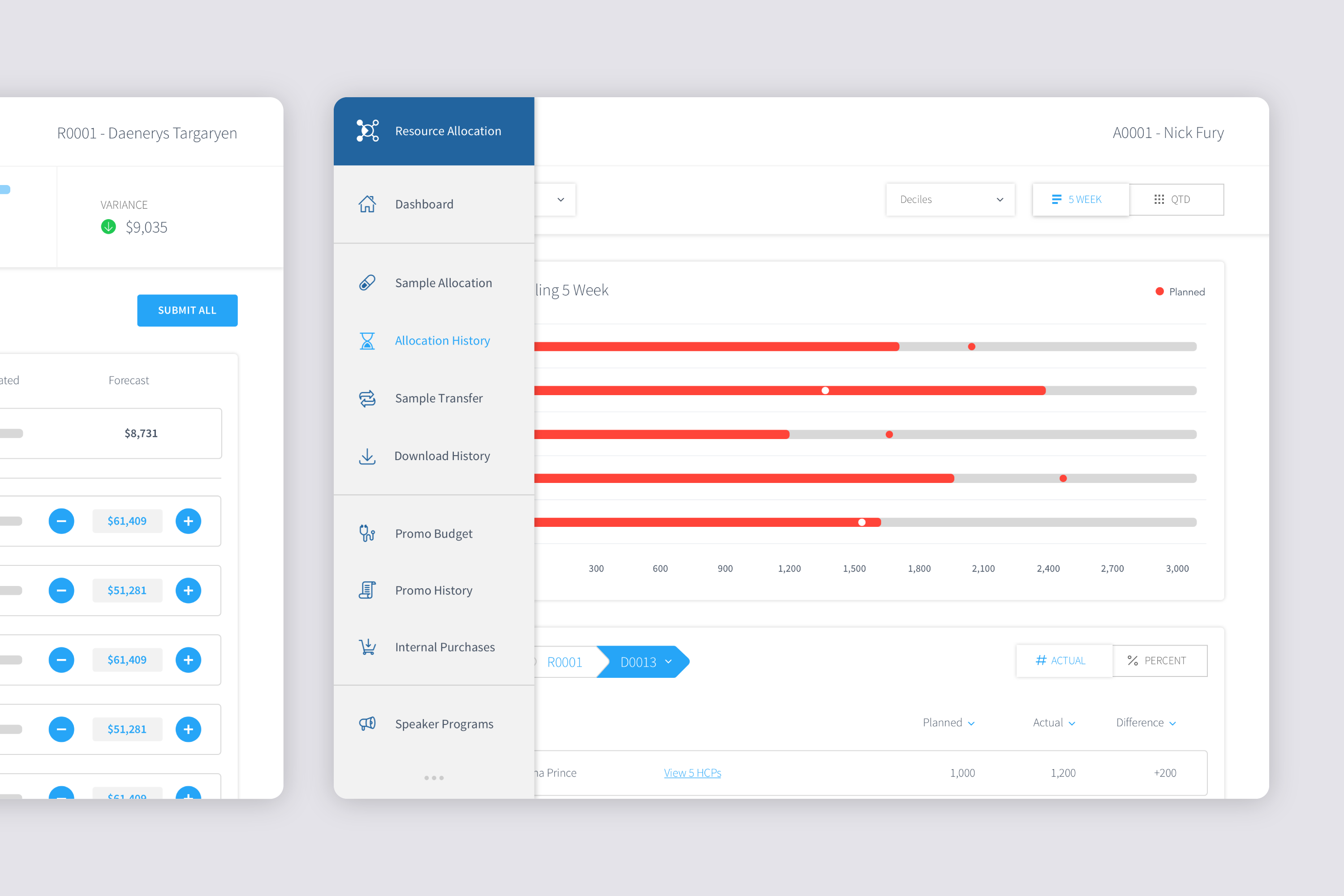
Resource Allocation Tool
Pharmaceutical Client • UX & UI Design
INTRODUCTION
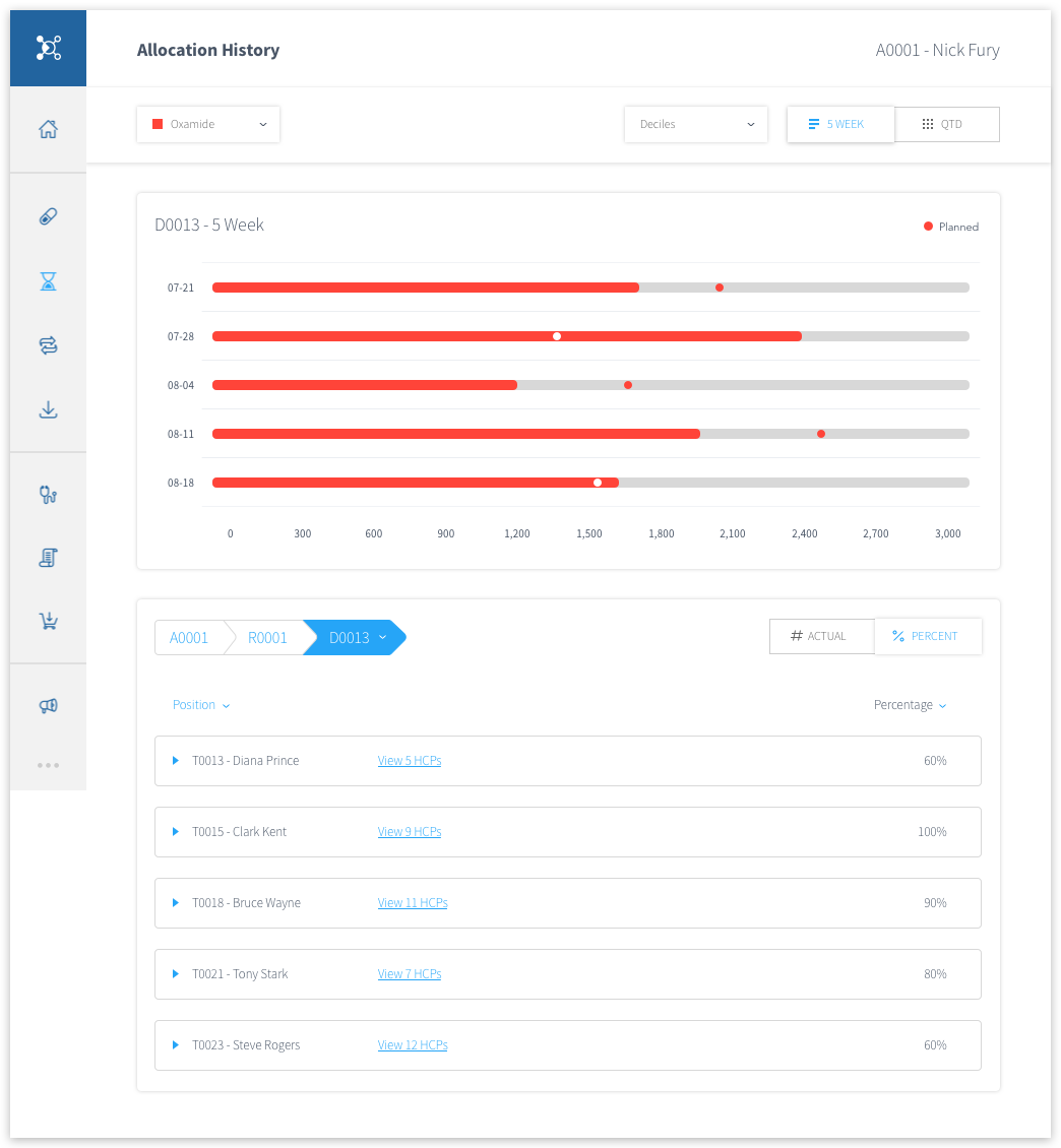
A client I was able to work very closely with is a global, research and development-driven pharmaceutical company committed to bringing better health and a brighter future to their patients. One of the many projects I've collaborated with them on is an internal iPad application, the Resource Allocation Tool. This app is used by pharmaceutical representatives to monitor and control allocations of samples and expense budgets to other reps and doctors.
This application was initially a developer-designed tool, and after I started at Pandera I had been working within the previously designed interface for a few months, making small updates and additions as needed. When the client introduced a new large piece of the application they wanted to collaborate with us on, I took the opportunity to redesign the interface, while also taking stock of the experience as a whole and make some minor updates there. The end goal was to improve user efficiency and visual appeal of the application.
REQUIREMENTS & IDEATION
The first step was to discuss and define the goals of these users, and what elements I needed to cover in the designs. I started by defining the basics of what the user needed to do in the app, and went through the process of whiteboarding, sketching, and wireframing.

FINAL DESIGNS
In my final designs, I wanted there to be a lot of consistency in the visual language across the application. One of the biggest visual elements I implemented was the horizontal progress bars, for tracking both budget usage and sample allocations.
Additionally, I made some big changes to the left hand navigation menu. To allow more screen real estate for the data visualizations, I designed the menu to be retractable, but still usable when it's in the closed state. I also took the time to design new custom icons to add to the visual appeal of the app, especially with the icon-focused menu.


FRIENDLY FEEDBACK
After shipping these updates to the resource allocation tool, I sought more user feedback from the stakeholders and reps who would be using the application. Below are a few quotes from some of the end users...

What I love the most about this app is how simple and clean the layout is
It’s much more appealing and easy to use the application, making my job easier

I now enjoy using this app, my work feels more organized and easier to navigate
- Date: June 2018
- Team: Pandera Labs
- Roles: UX/UI Designer
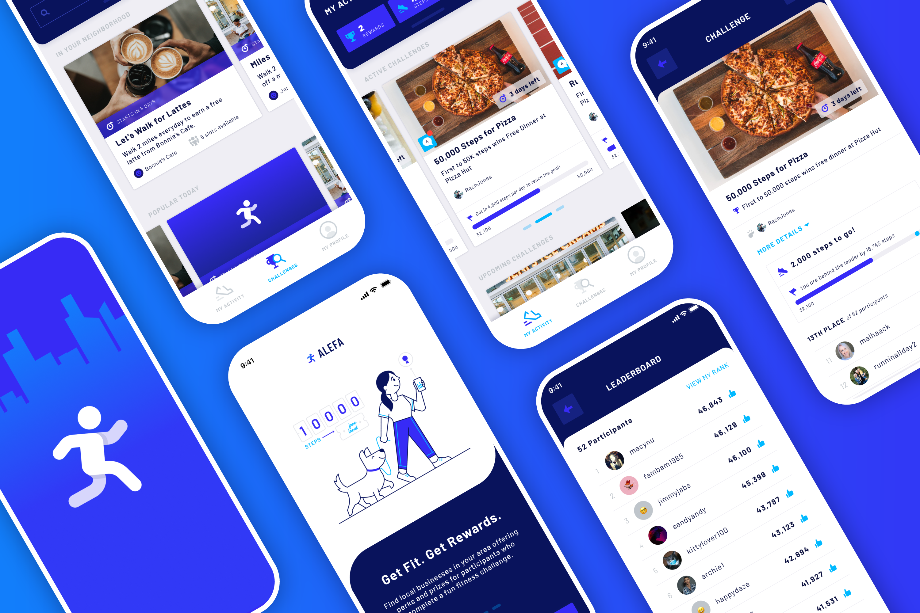
Alefa Fitness
Challenge-Based Fitness App • UX & UI Design • Brand Design • Illustration
INTRODUCTION
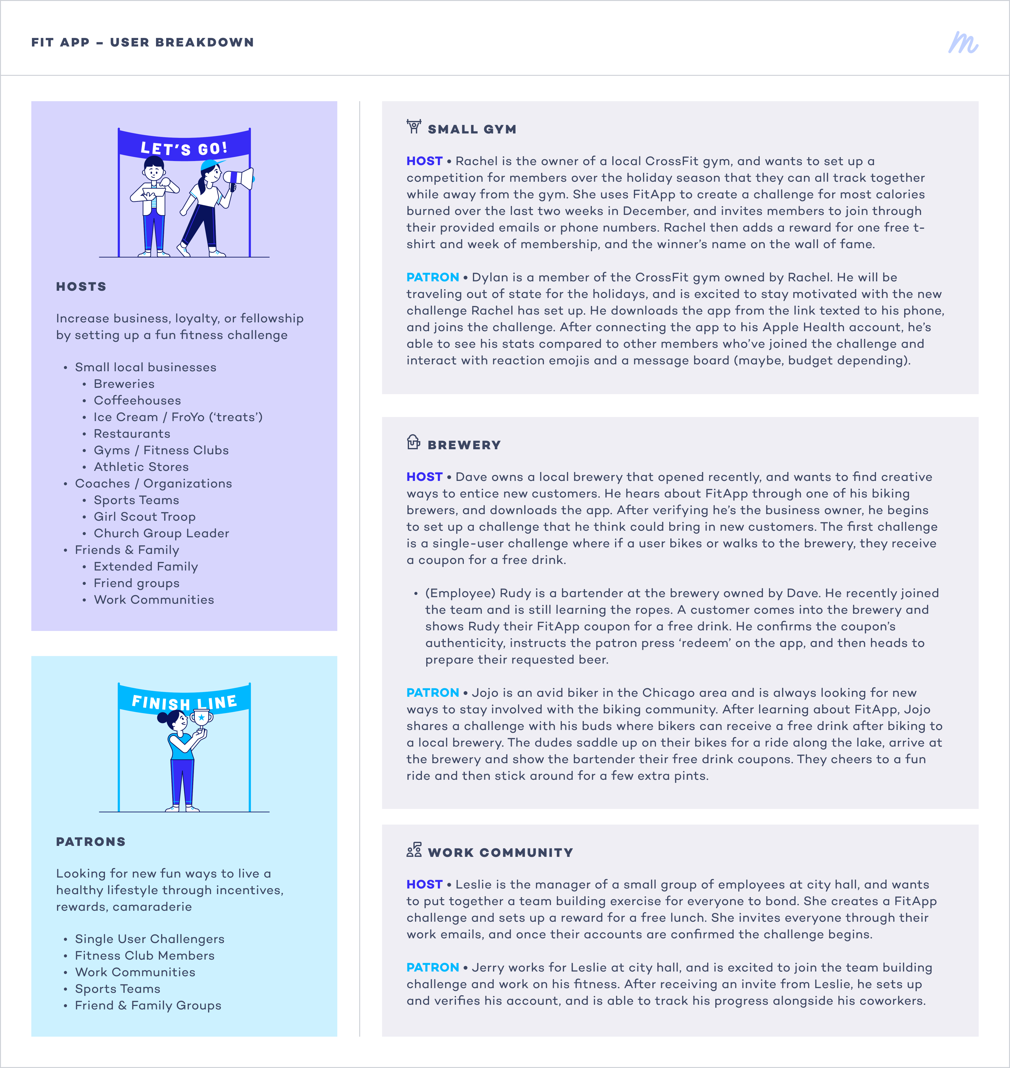
In December of 2020 I had the opportunity to work with an entrepreneur who had an idea for a fitness app that could partner local businesses with users to bring in customers with a challenge-based rewards system. My team and I were able to collaborate closely with the client to build and refine the feature list, organize an optimal user experience, and develop the brand and visual style for this new app.
USER DEFINITION
After some initial conversations with the client, I put together a few different user personas and scenarios so that my team and I could understand the different perspectives and motivators of the different types of folks that might be using the app. I looked at both primary users of the app, as well as other potential secondary interactions — such as an employee of a brewery whose employer set up a challenge on the app to bring in customers with a reward, who will then manage the participants' reward redemption.
CREATING THE FLOW
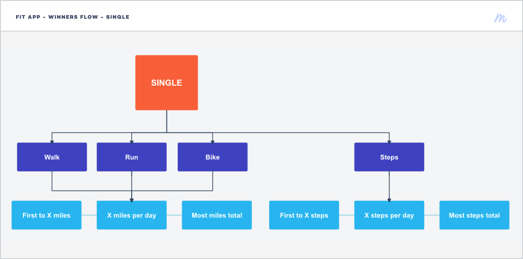
As we continued to work out requirements and app features, I was able to work on a few iterations of flow charts. This helped us understand the basic progression through the app, as well as where the different user types might have crossover and how it affects each user's flow.
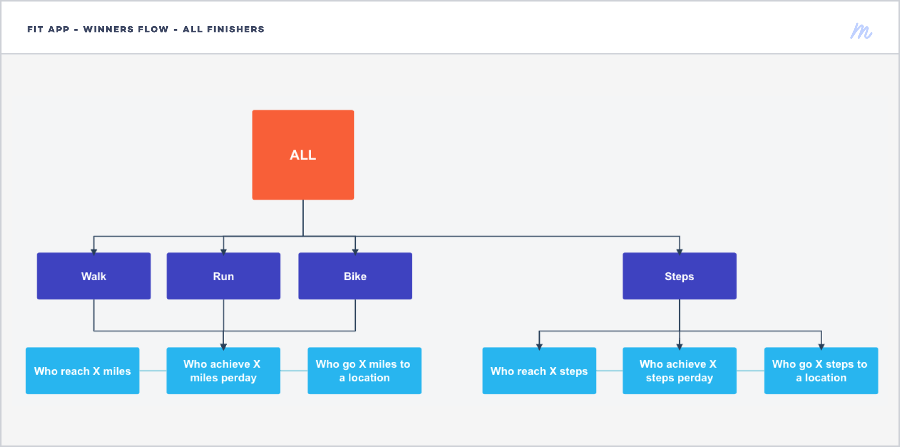
Additionally, I created three different diagrams to help us understand the various challenge-reward options. When a host creates a challenge it can be set as miles-based (by walking, running, or biking), or step-based. Also, the host can decide between a singular winner, a specific number of winners (ie. the top three finishers), or all finishers of the challenge. With all of these different parameters, it was helpful to have a visual aid to understand the multiple options we needed to design for.


BRAND DESIGN & ILLUSTRATION
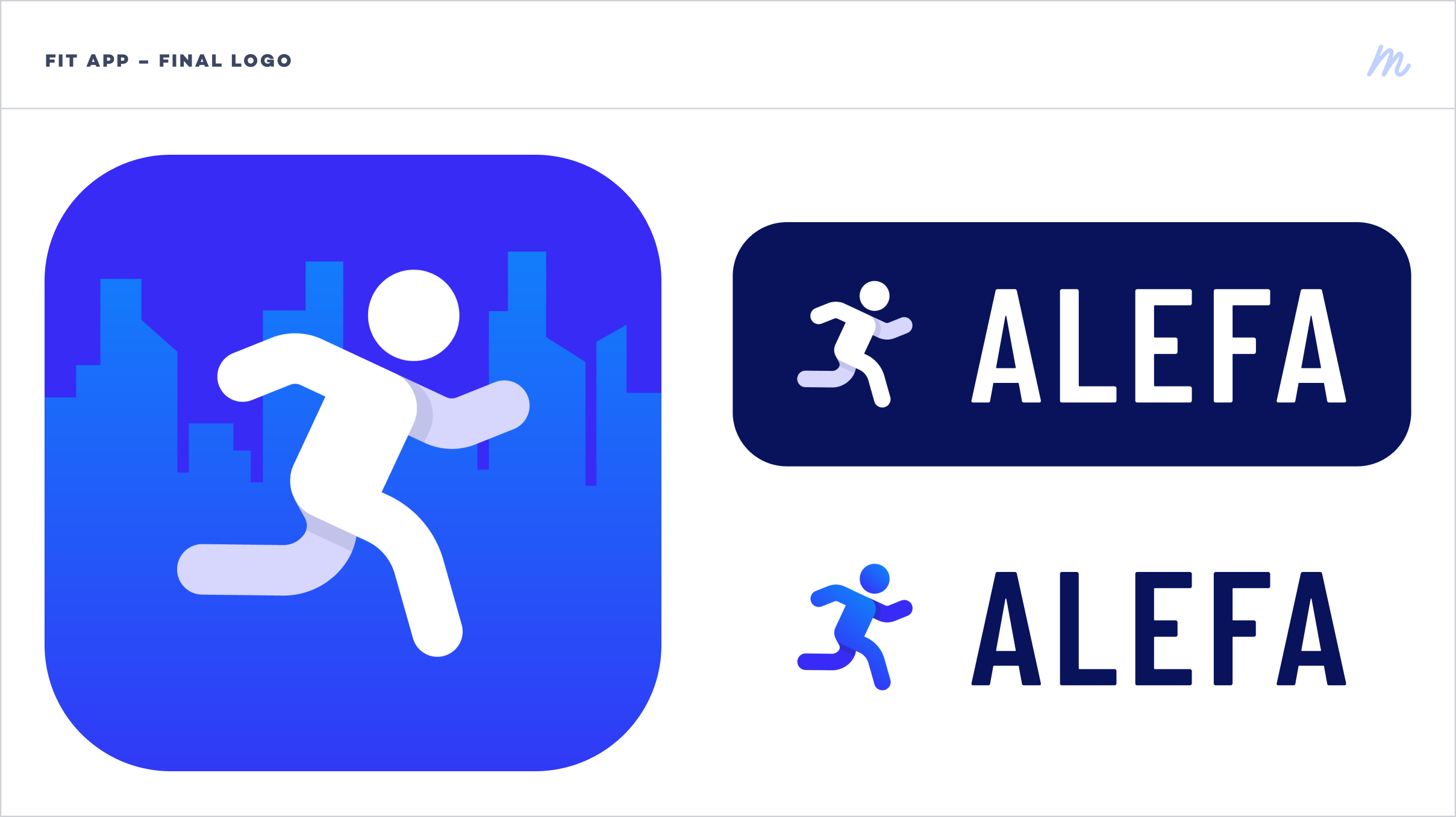
As we continued through wireframes and into the final design phase of the project, I was able to work on a short branding workshop with the client to create a logo for the app. I presented a few different iterations to the client to show how the various logos would look across the app, in the app icon, and how the app icon is displayed in different scenarios.
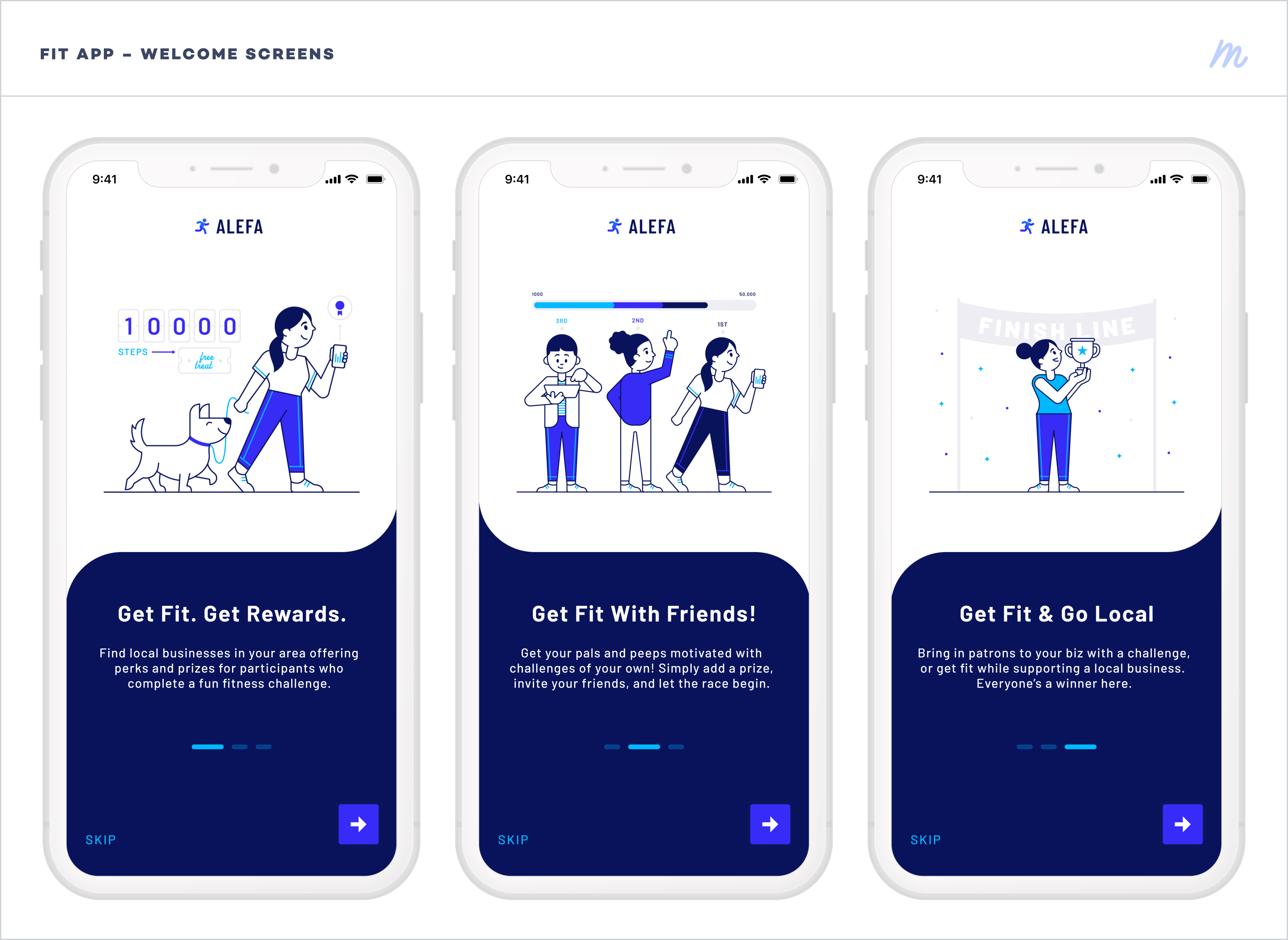
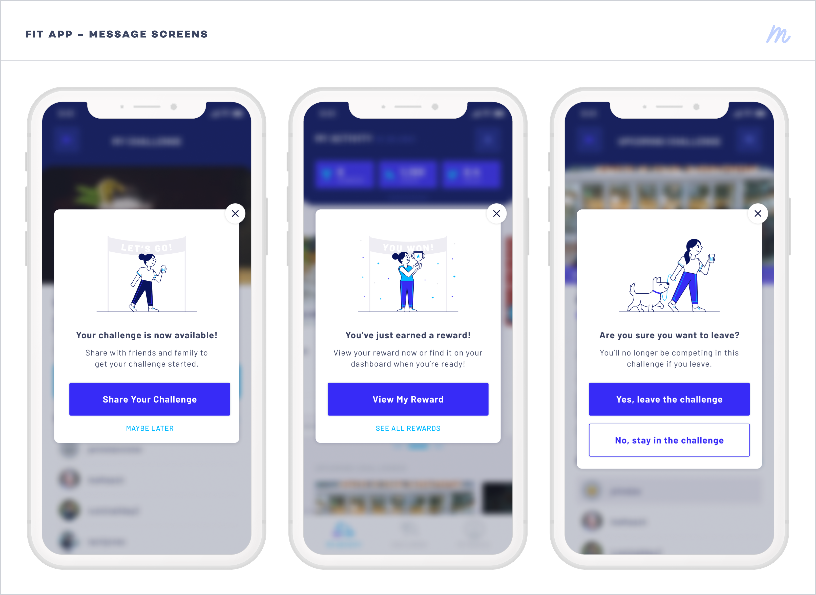
Additionally, I was able to create illustrations for the app to be used on the welcome screens and message popups.
FINAL DESIGNS
After development iterations and securing investment funds, the Alefa app has just recently launched on the app store.
You can find the Alefa Get Fit mobile app in the App Store and Google Play Store.

- Date: Winter 2020
- Team: Red Foundry
- Roles: Lead UX/UI Designer, Brand Designer, Illustrator
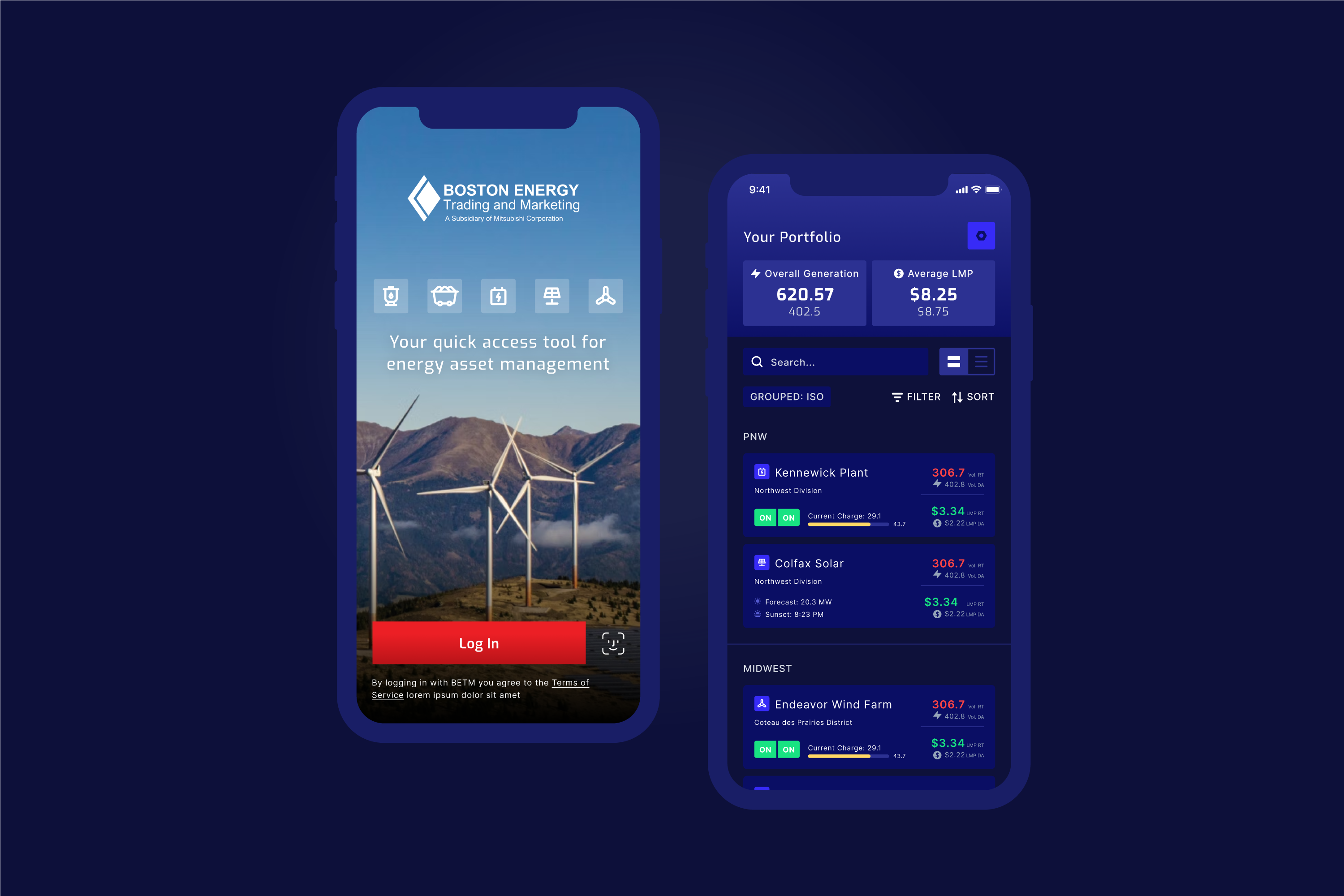
Boston Energy Trading & Marketing
Energy Manufacturing & Monitoring Mobile App • UX & UI Design
SUMMARY
An interesting project I was able to take part in was with the organization Boston Energy Trading & Marketing (BETM), who provides asset management & optimization services to owners of generation and energy storage in North America, and wholesale energy to retail power & gas suppliers. I was able to collaborate closely with the client to design a mobile app for their employees to use to monitor the different regions and assets, and the estimated energy output, market price, forecasts, etc. Below, you can find a summary of features and a selection of the final app designs.
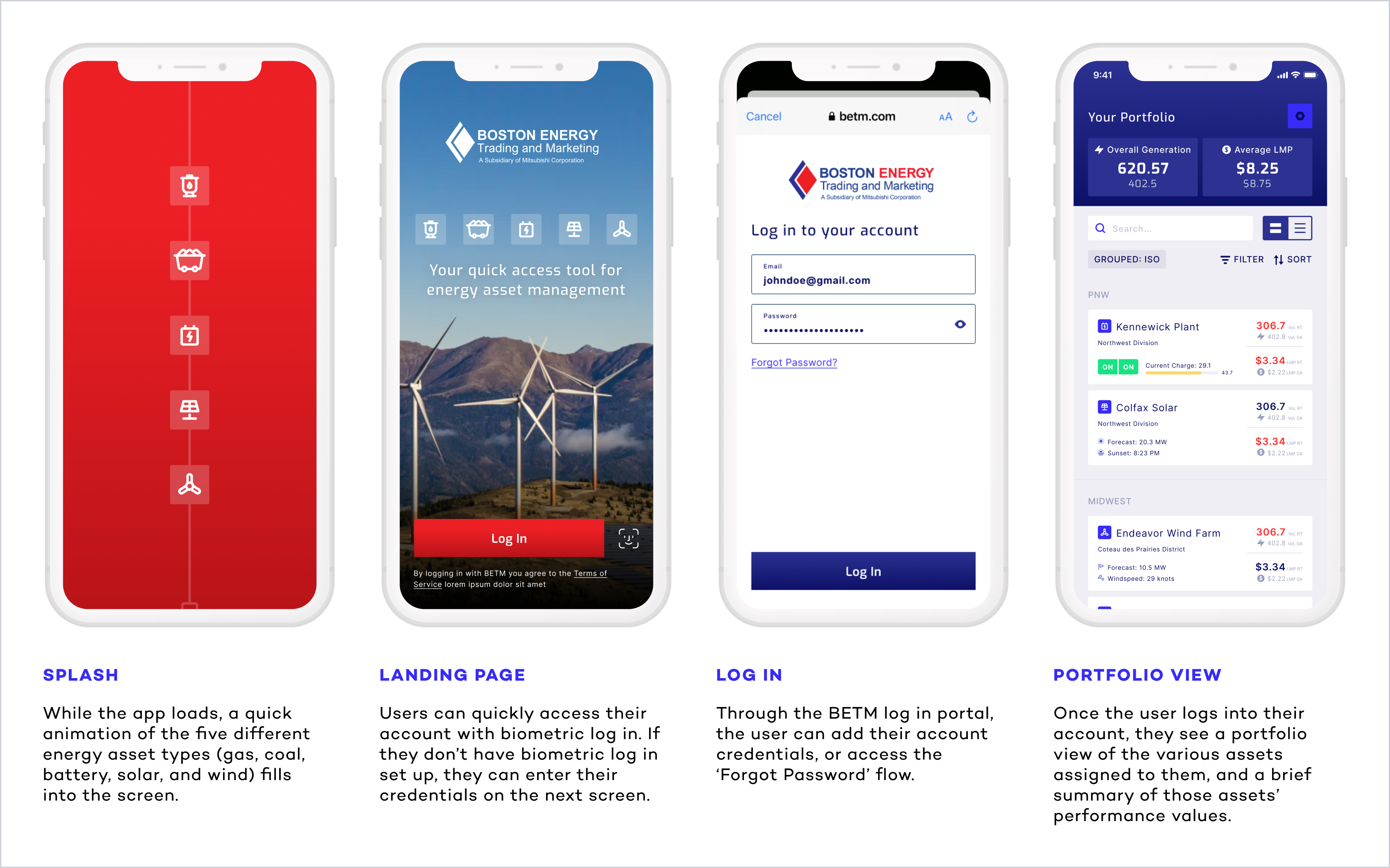
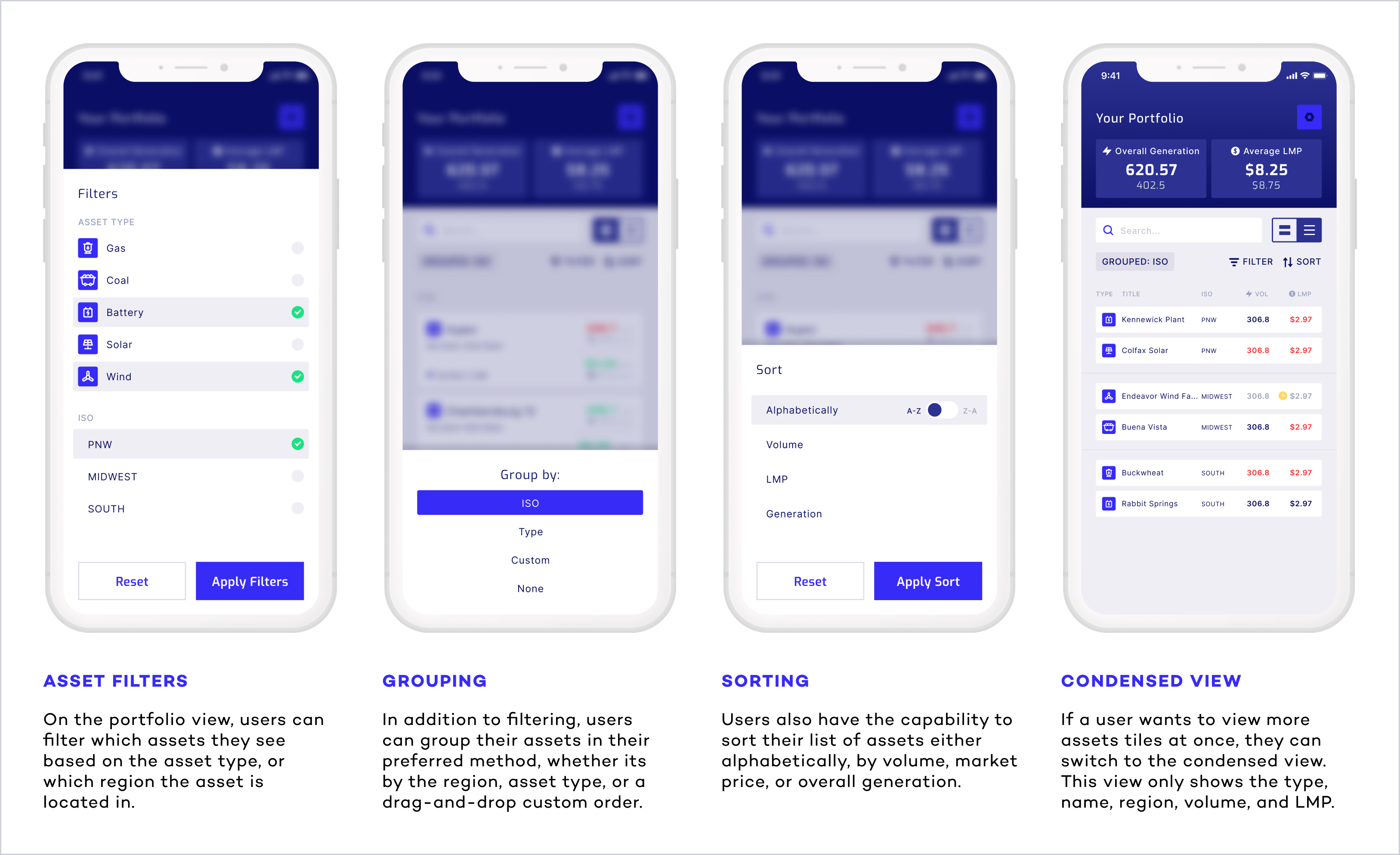
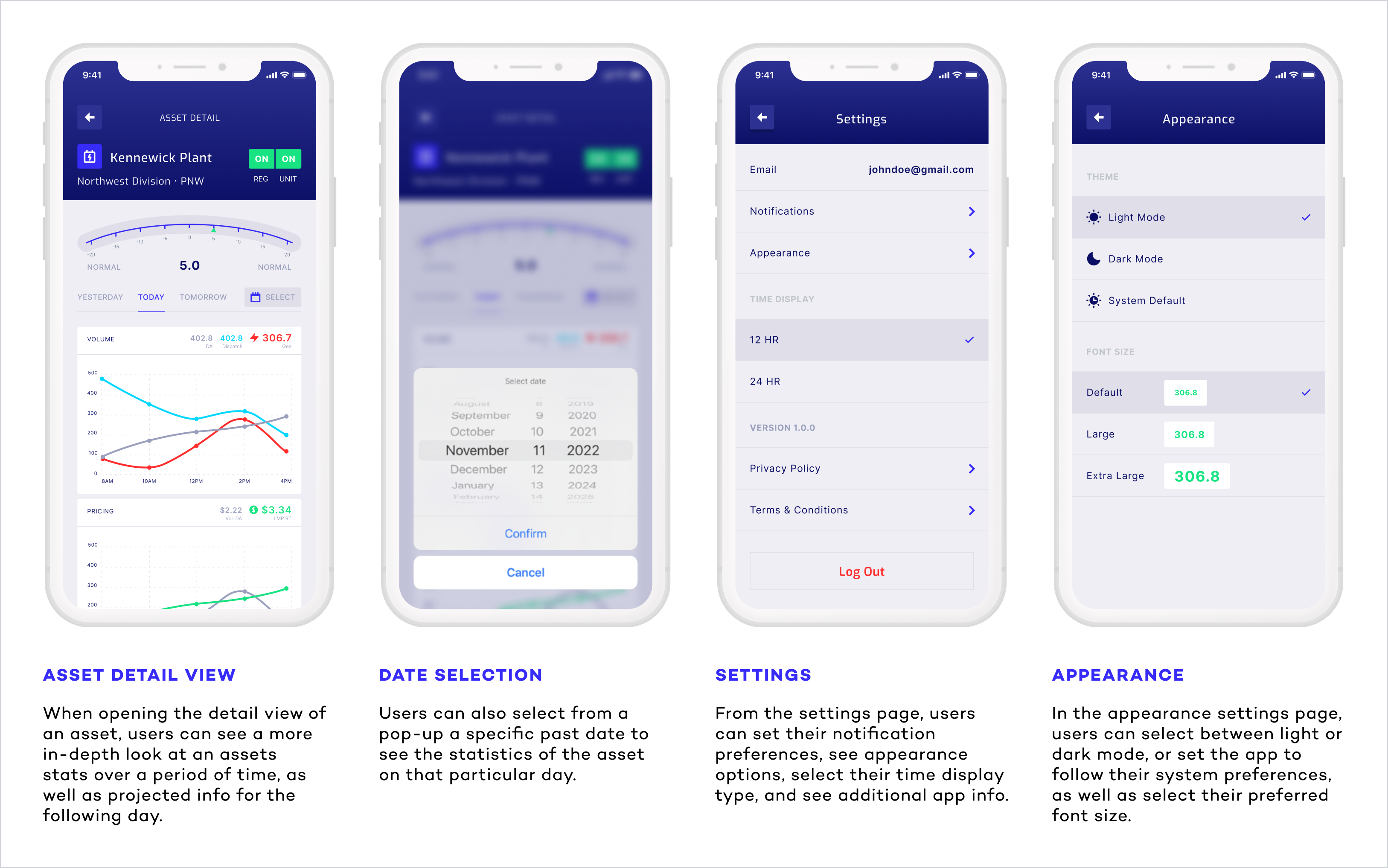

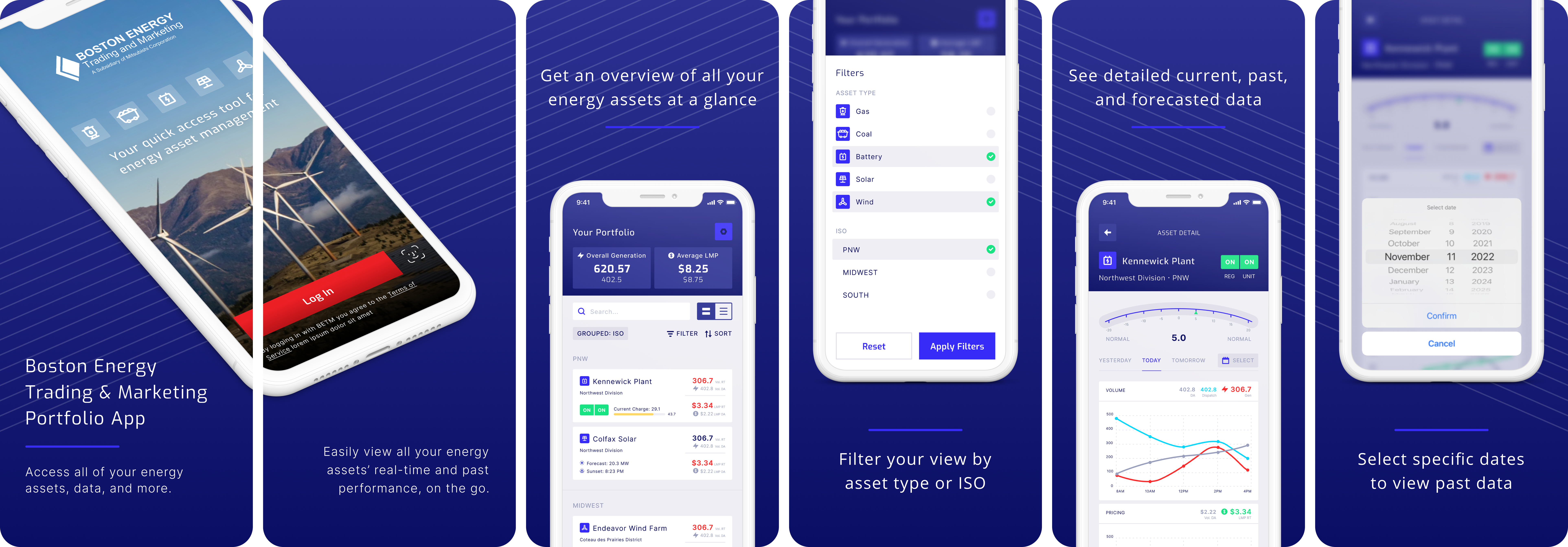
- Date: Summer 2022
- Team: Red Foundry
- Roles: Lead UX/UI Designer
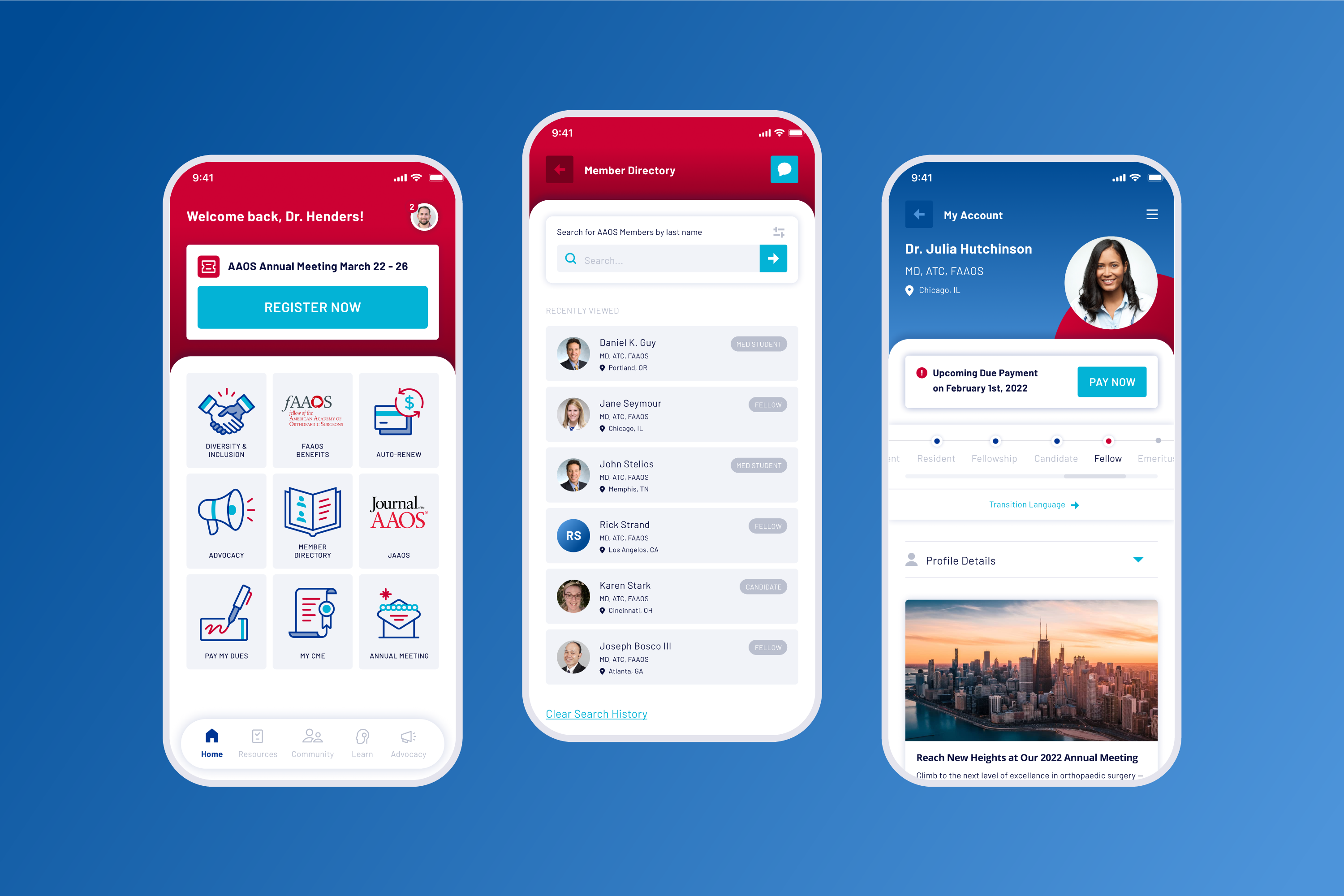
American Academy of
Orthopaedic Surgeons
Medical Association Mobile App • UX & UI Design • Illustration
SUMMARY
A large project I was able to lead Discovery & Design on was with the American Academy of Orthopaedic Surgeons (AAOS). They are the preeminent provider of musculoskeletal education to orthopaedic surgeons around the world, and their involvement includes a world-renowned Annual Meeting, multiple continuing medical education (CME) courses held around the country and at the Orthopaedic Learning Center (OLC), and various medical and scientific publications and electronic media materials. The client wanted to create a new mobile application for their members to access learning materials and resources, engage with peers, and have the tools to build their orthopaedic knowledge and grow within the profession.
The AAOS member app is available on the App Store and Google Play Store. Below, you can find a summary of features and a selection of the final app designs.


SPOT ILLUSTRATIONS
This project also allowed me the opportunity to create a collection of spot illustrations to be used on navigational tiles throughout the app. This was a really great creative exercise for me to design a lot of different icons and maintain a consistent, cohesive style.

- Date: Spring 2022
- Team: Red Foundry
- Roles: Lead UX/UI Designer, Illustrator
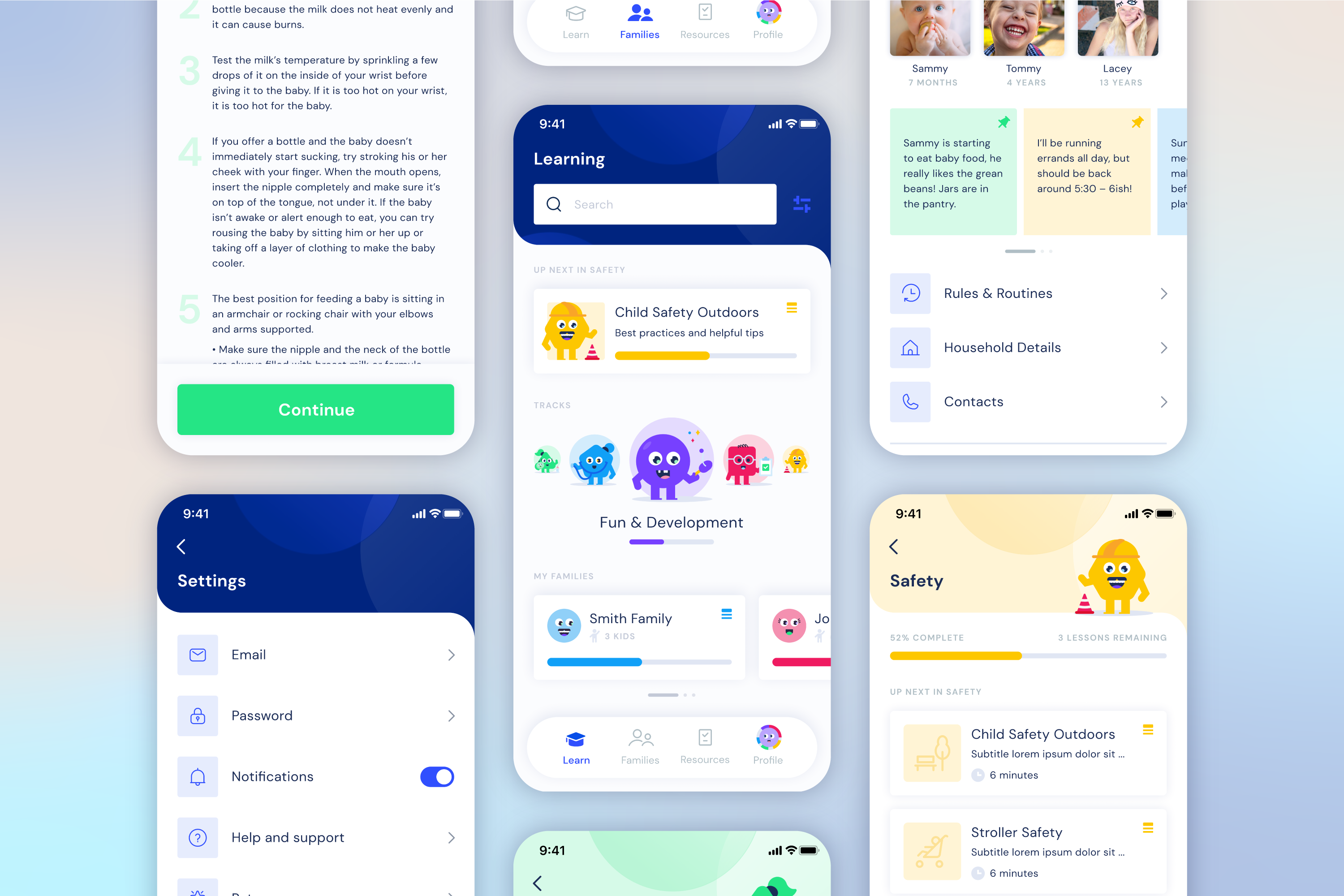
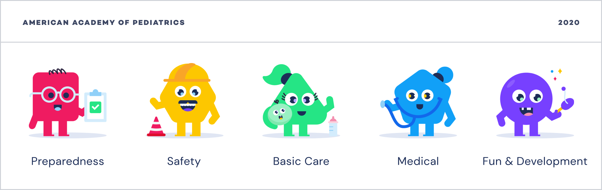
American Academy of Pediatrics
Caregiver Training Mobile App • UX & UI Design • Illustration
SUMMARY
A quick and really fun client project I was able to partake in was with the American Academy of Pediatrics. My role in this project was providing a visual direction for their Caregiver Training and Family mobile app, where parents, family members, or babysitters can see details of families they're involved with, and also have access to educational resources and training. I was able to design a very vibrant and colorful interface, as well as create a group of illustrated character mascots for each of the five different learning tracks. Below, you can find a summary of features and app designs, and a closeup of the illustrated characters.


- Date: Fall 2020
- Team: Red Foundry
- Roles: UX/UI Designer, Illustrator & Character Development
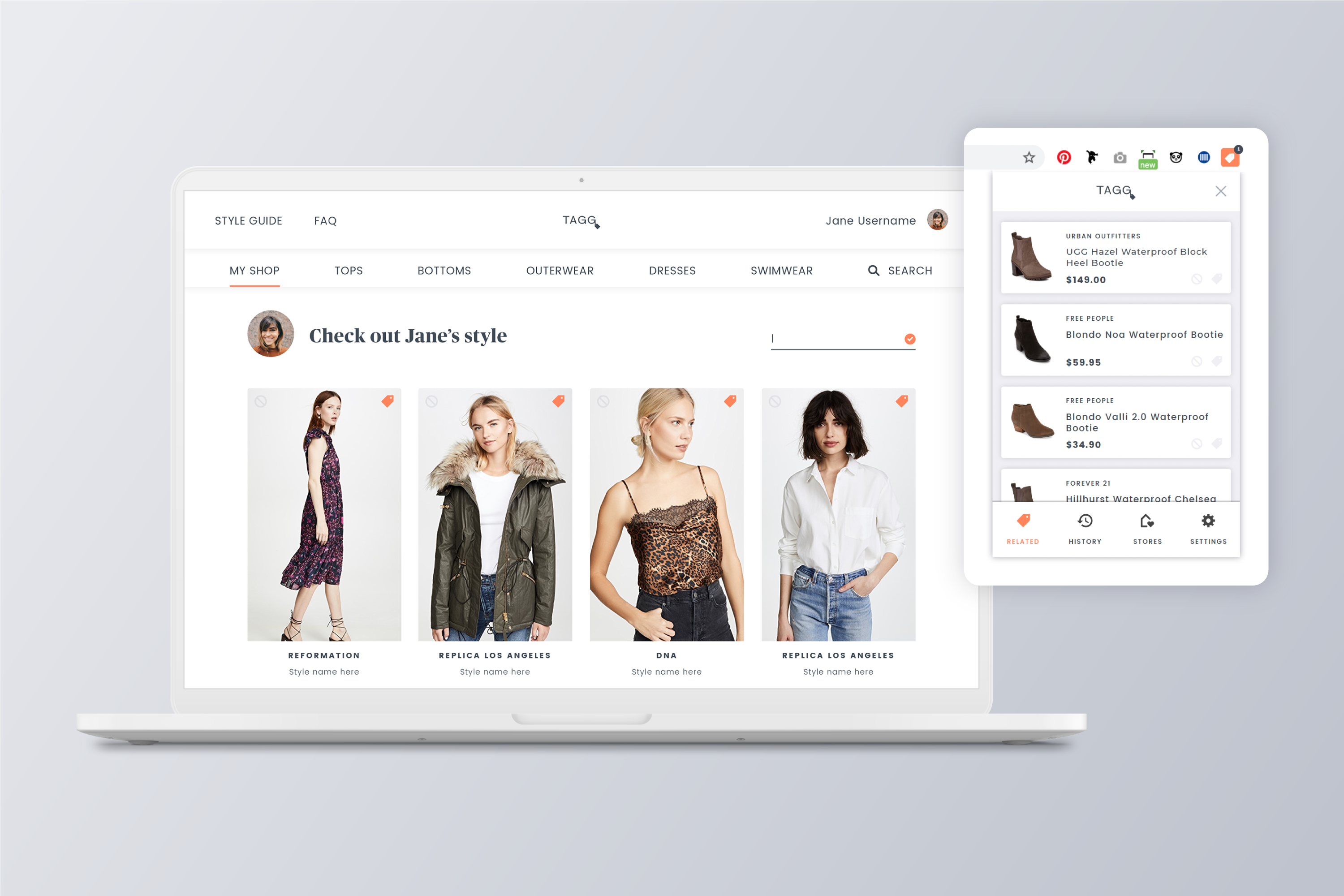
Tagg Fashion
Website & Chrome Extension • UX & UI Design • Brand Development
SUMMARY
The youngest client I've gotten to work with so far in my career was a highschool junior, who wanted to create a browser extension and website platform to track and manage shopping for clothes online. The idea was that when a user is shopping on any partner retailer's site, such as Nordstrom or Urban Outfitters, the extension will monitor items that they view or add to their cart, and then be able to recommend similar styles from other partner retailers. Myself and team members at Red Foundry collaborated closely with the client to design and build the website, as well as the extension interface, to be interactive and intuitive experiences for online shoppers.
The Tagg website has launched online here, and users can download the extension from the Chrome Web Store. Below, you can find a selection of the final website and extension designs.


BRANDING WORKSHOP
In addition to designing the user experience and interface for Tagg, I was able to lead the client through a multi-step branding workshop to help us define the brand voice and its style, and create a logo that would embody it. I conducted several exercises, such as the Brand Deck, value mapping, and image explorations to gain an understanding of what the brand and style could represent, and what it should not. Below is a visual representation of the brand aesthetic, as well as the final logo.
- Date: Winter 2019
- Team: Red Foundry
- Roles: UX/UI, Brand Designer
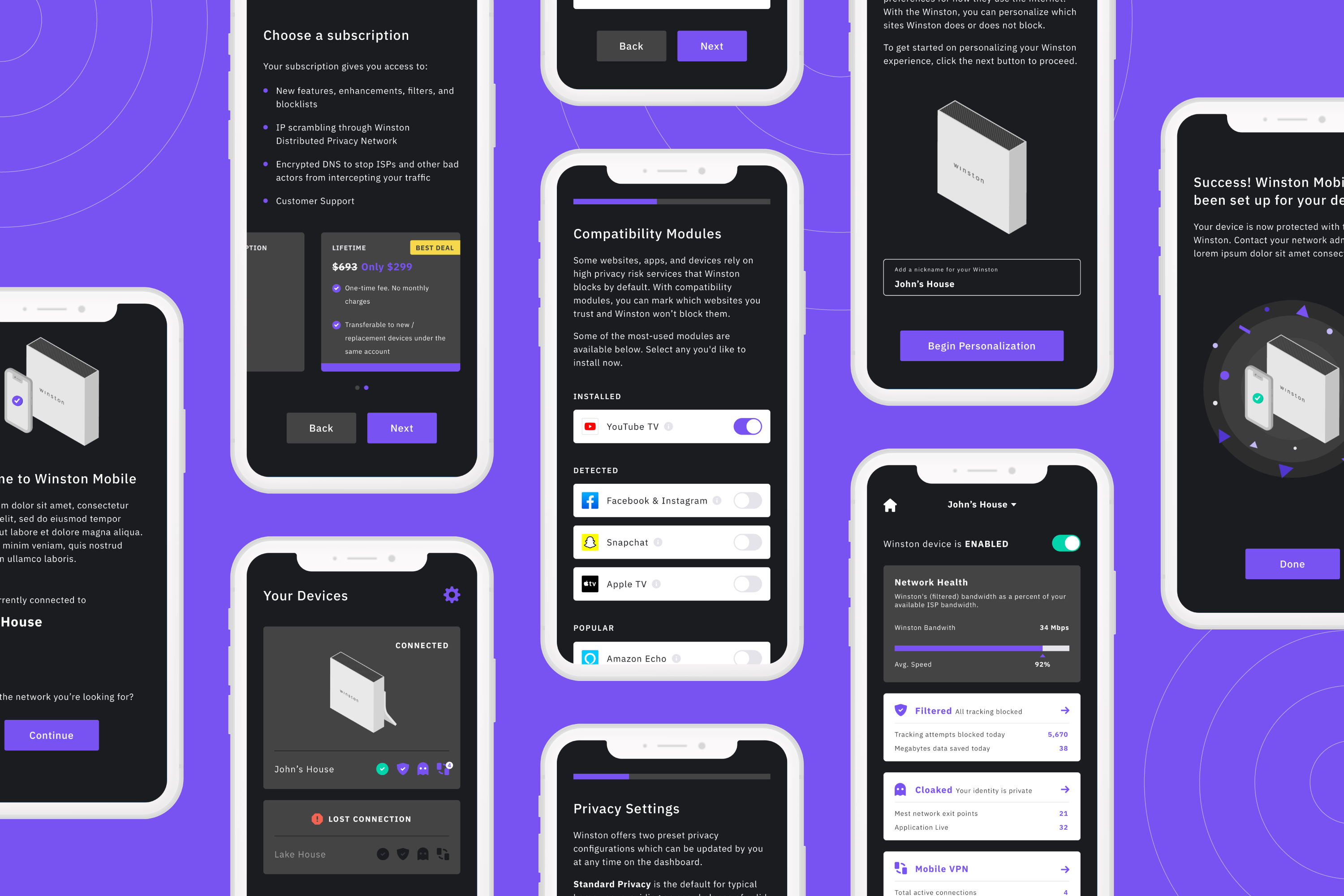
Winston Privacy
Mobile App for Internet Privacy Device • UX & UI Design
SUMMARY
At the start of 2020 I was able to work on a really interesting and eye-opening mobile app project with Winston Privacy. This client offers a hardware device that filters out tracking and surveillance from a customer's internet network. With a Winston device, corporations and bad actors can no longer invade someone's privacy or slow down their internet speed with spyware. The customer's internet activity is scrambled across multiple peers, and they are able browse the web anonymously, free of ads.
My team and I created a mobile app for both iOS and Android that allows Winston customers to easily set up and manage their Winston devices from their phones. From the dashboard, users see any potential digital peeping toms who have been prevented from gaining access to their online activity.
It was quite an educational project for me as I learned more about how truly easily accessible a person's data can be on the internet. And I believe in addition to providing clean and visually interesting designs, I was able to help improve the user experience by advocating for users who, like myself, were new to a lot of the techy-network related jargon and would benefit more with clear language, imagery, and helpful tooltips. Below, you can find a summary of features and a selection of the final app designs.

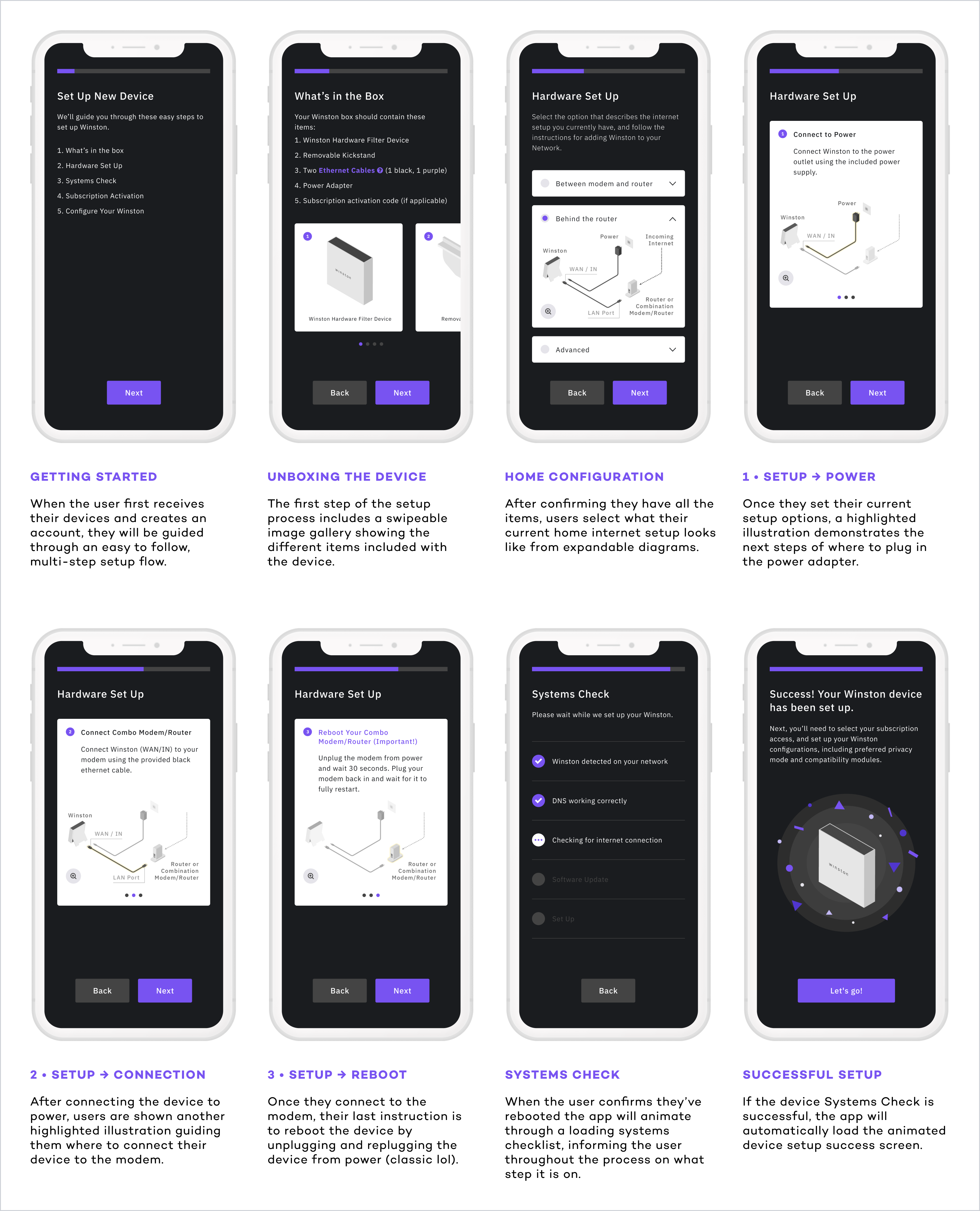
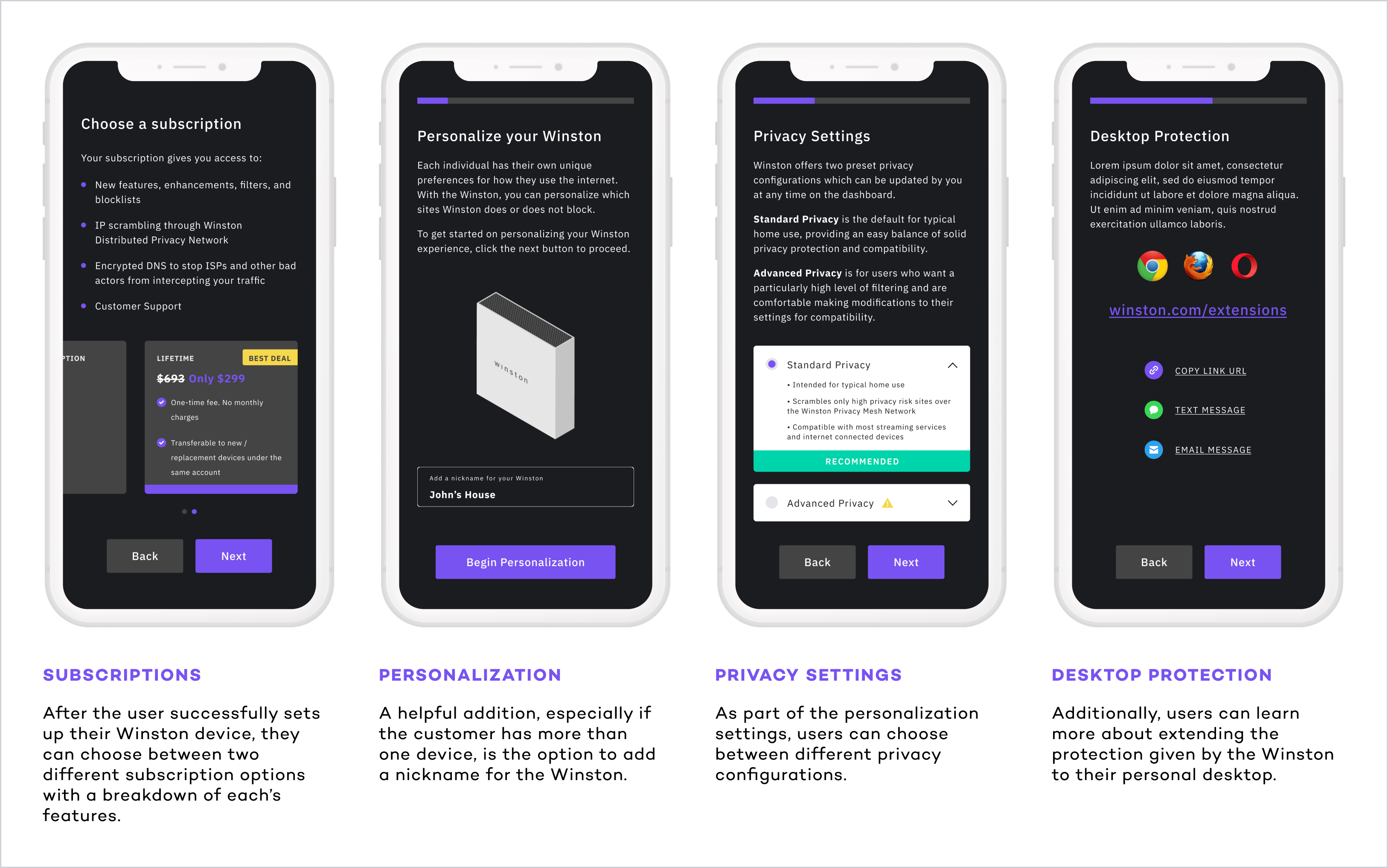
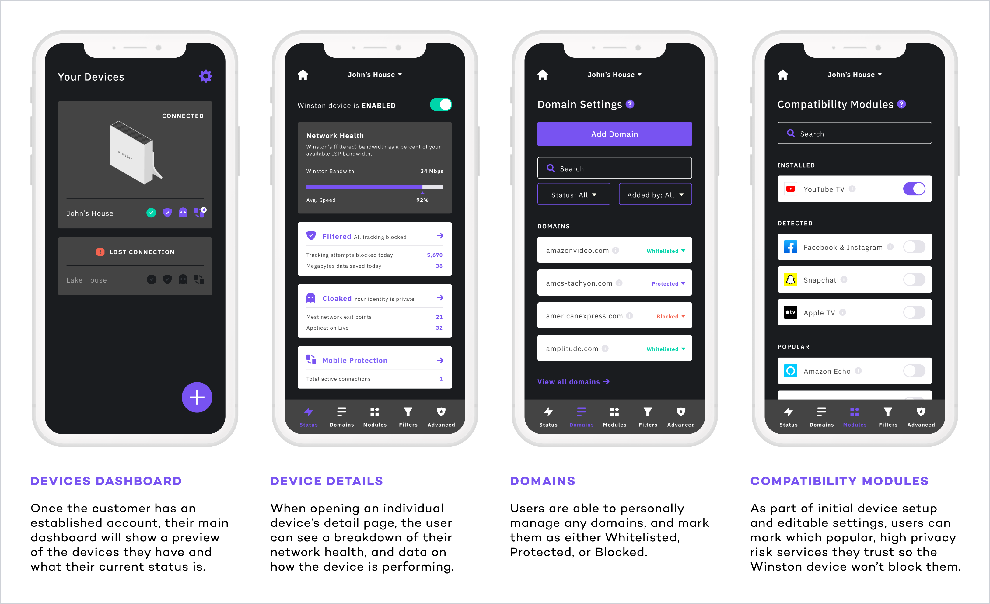
- Date: Winter 2020
- Team: Red Foundry
- Roles: UX/UI Designer
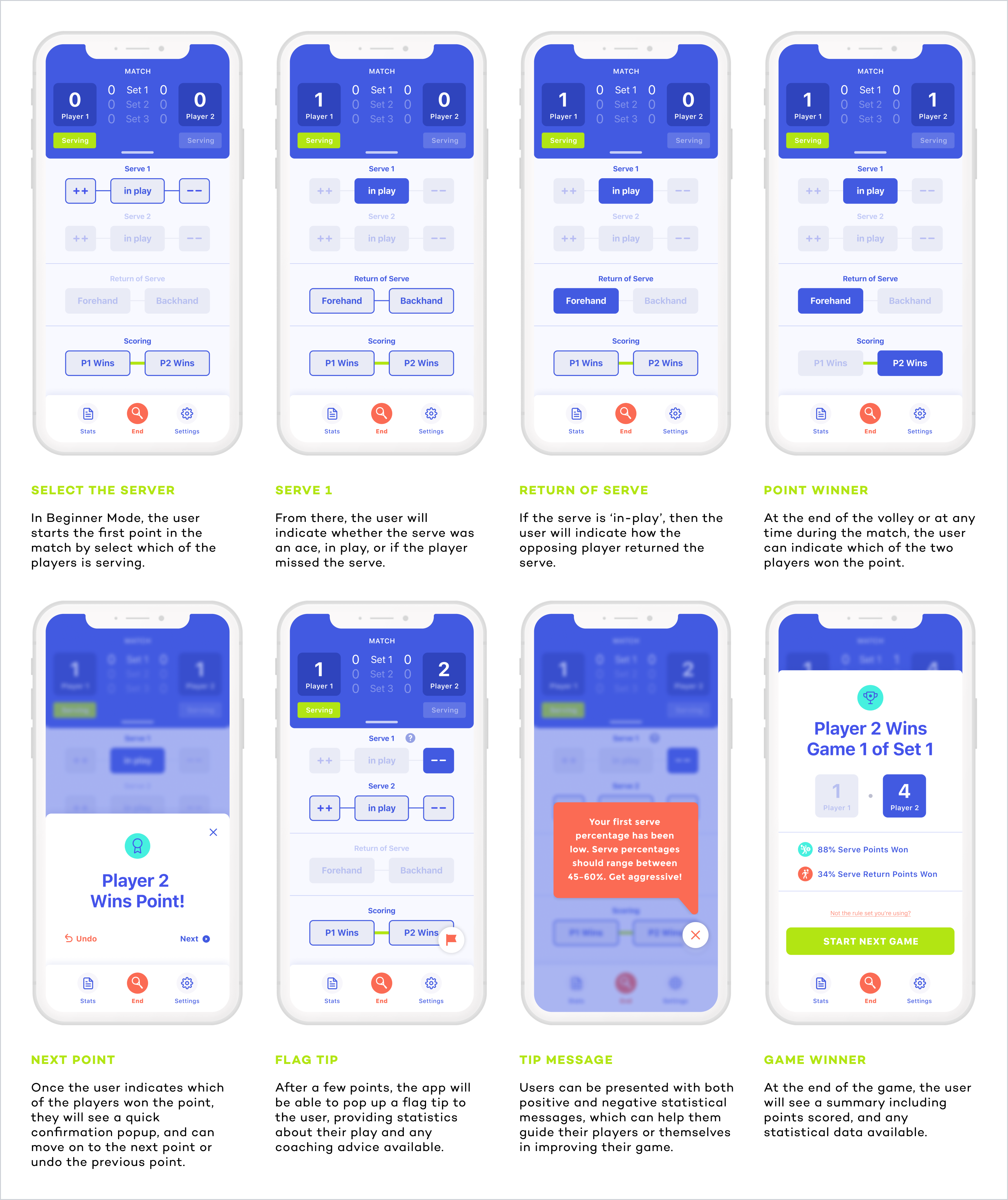
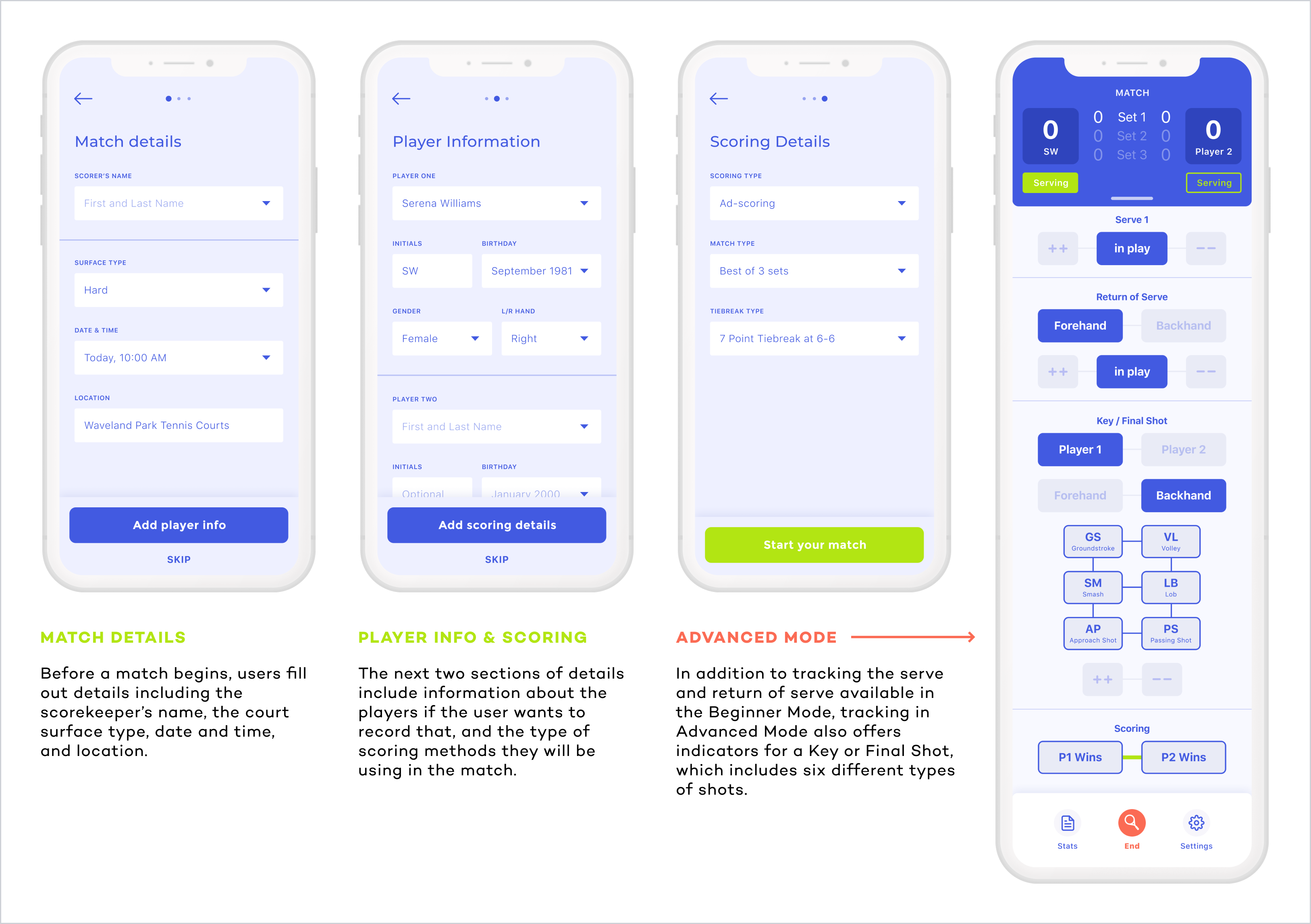
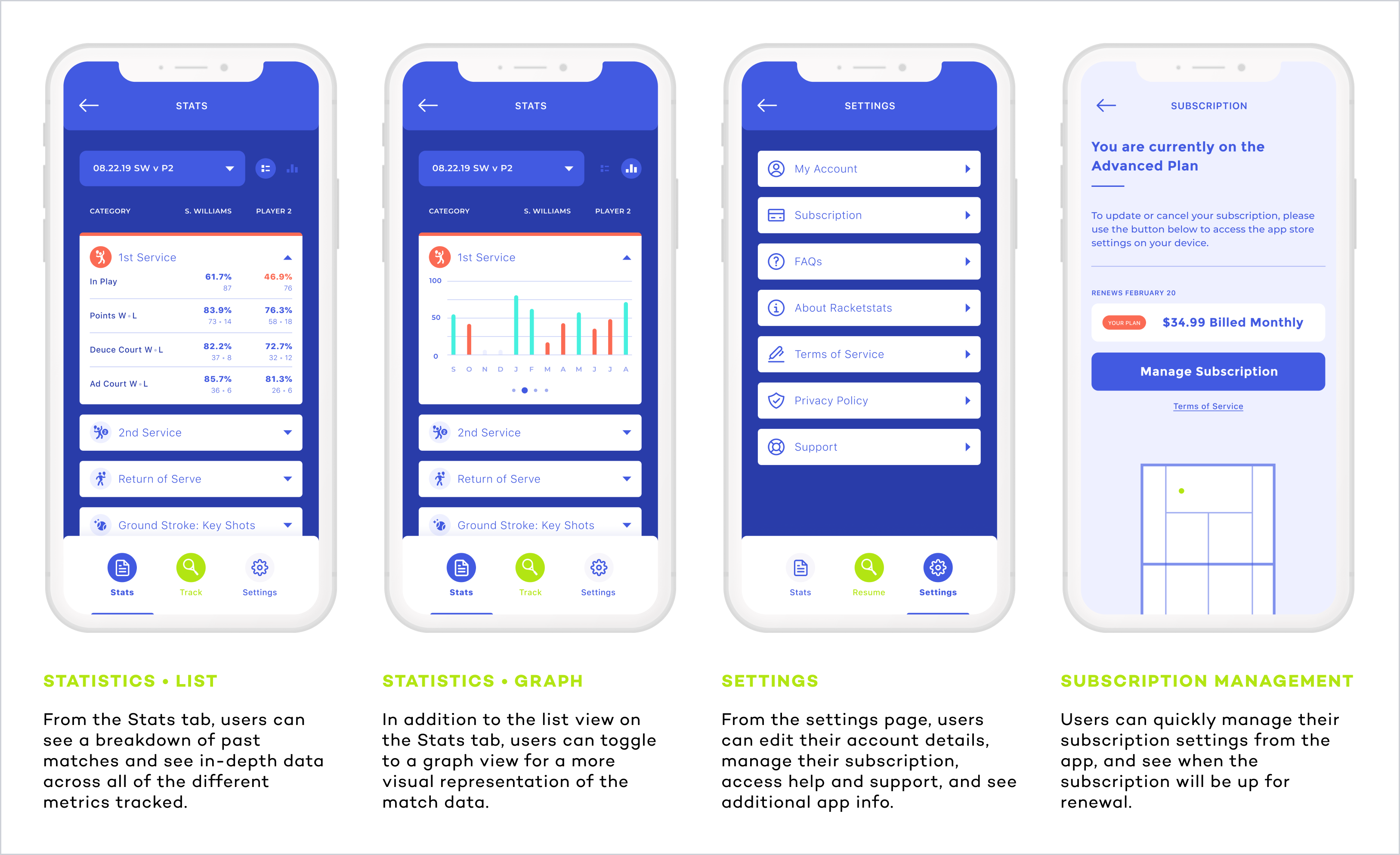
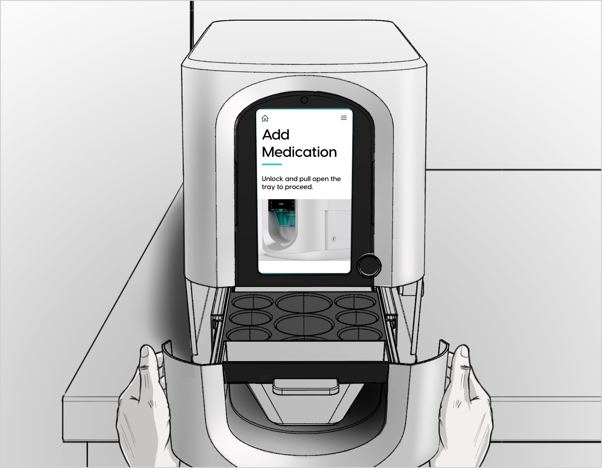
RacketStats
Tennis Charting & Stats Mobile App • UX & UI Design • Illustration • Social Media Management
SUMMARY
One of the first clients I was able to work with during my time at Red Foundry was Andy Durham, founder of RacketStats. His goal was to bring successful and intricate tennis statistics systems, used by the world’s top players, to anyone with a smartphone. The app would enable coaches, parents, and players themselves to easily identify weaknesses and strengths, and develop strategies for comprehensive improvement in real-time directly from their device. Our team's challenge through the discovery and design phase was to take a complex process and create a streamlined design that was intuitive for the user.
The RacketStats mobile app is available on the App Store and Google Play Store. Below, you can find a summary of features and a selection of the final app designs.

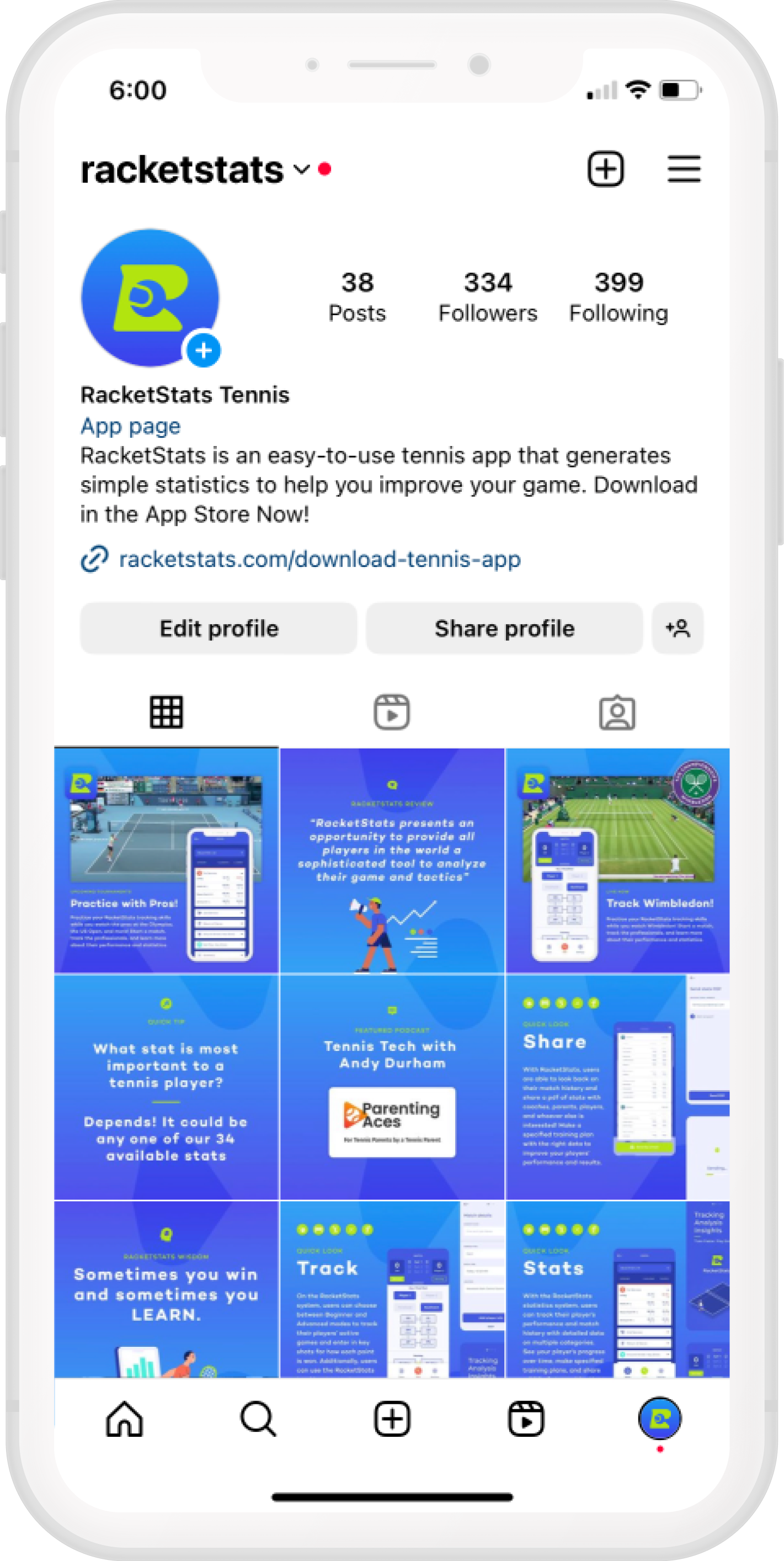
SOCIAL MEDIA & MARKETING
In addition to working with the client through the discovery and design process of the app, I was able to collaborate with him on setting up social media profiles, and creating a cohesive brand presence online that complemented the mobile app. I created illustration assets, regular social posts, and printed marketing materials.
- Date: 2019-2023
- Team: Red Foundry
- Roles: UX/UI Designer, Illustrator, Social Media Manager
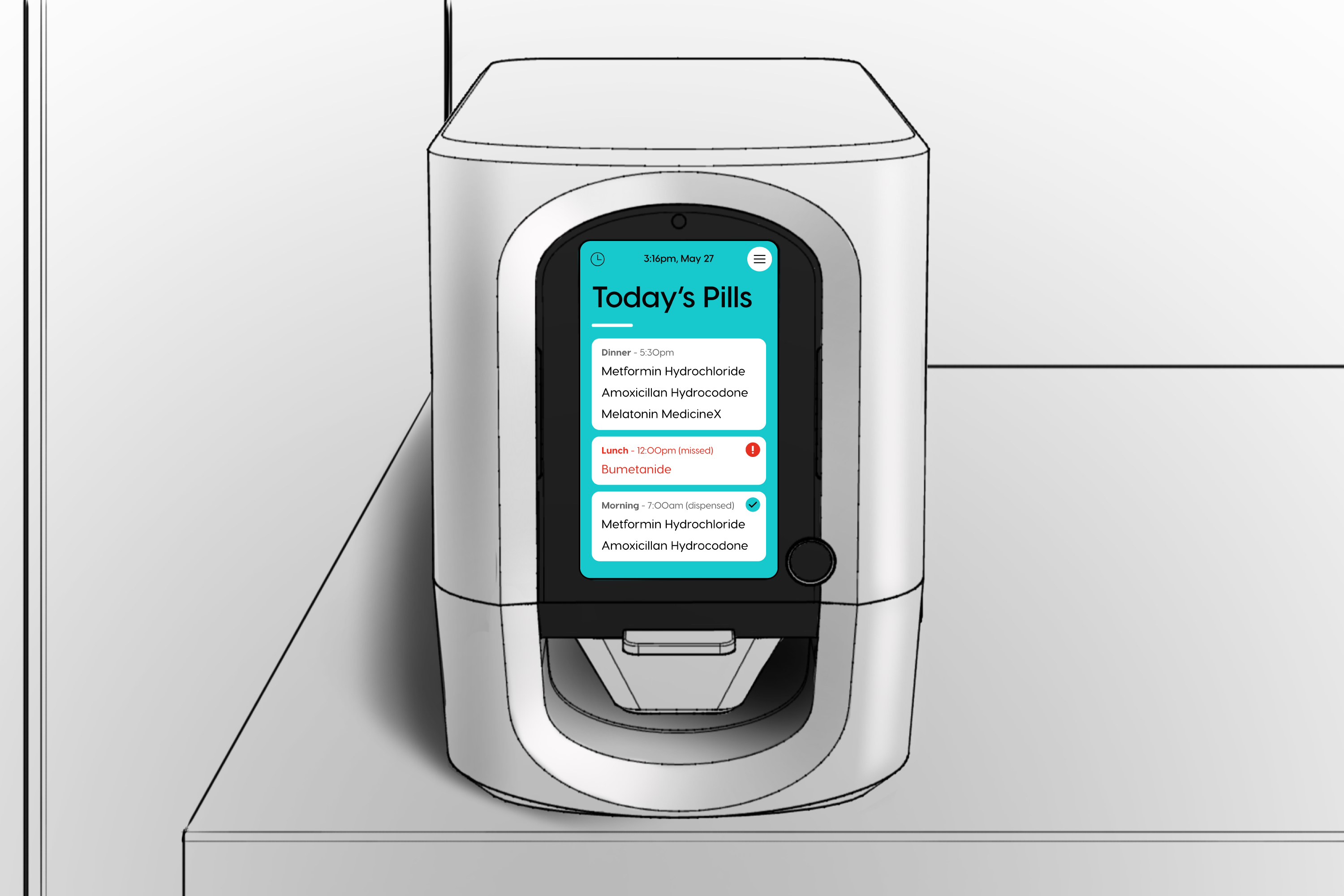
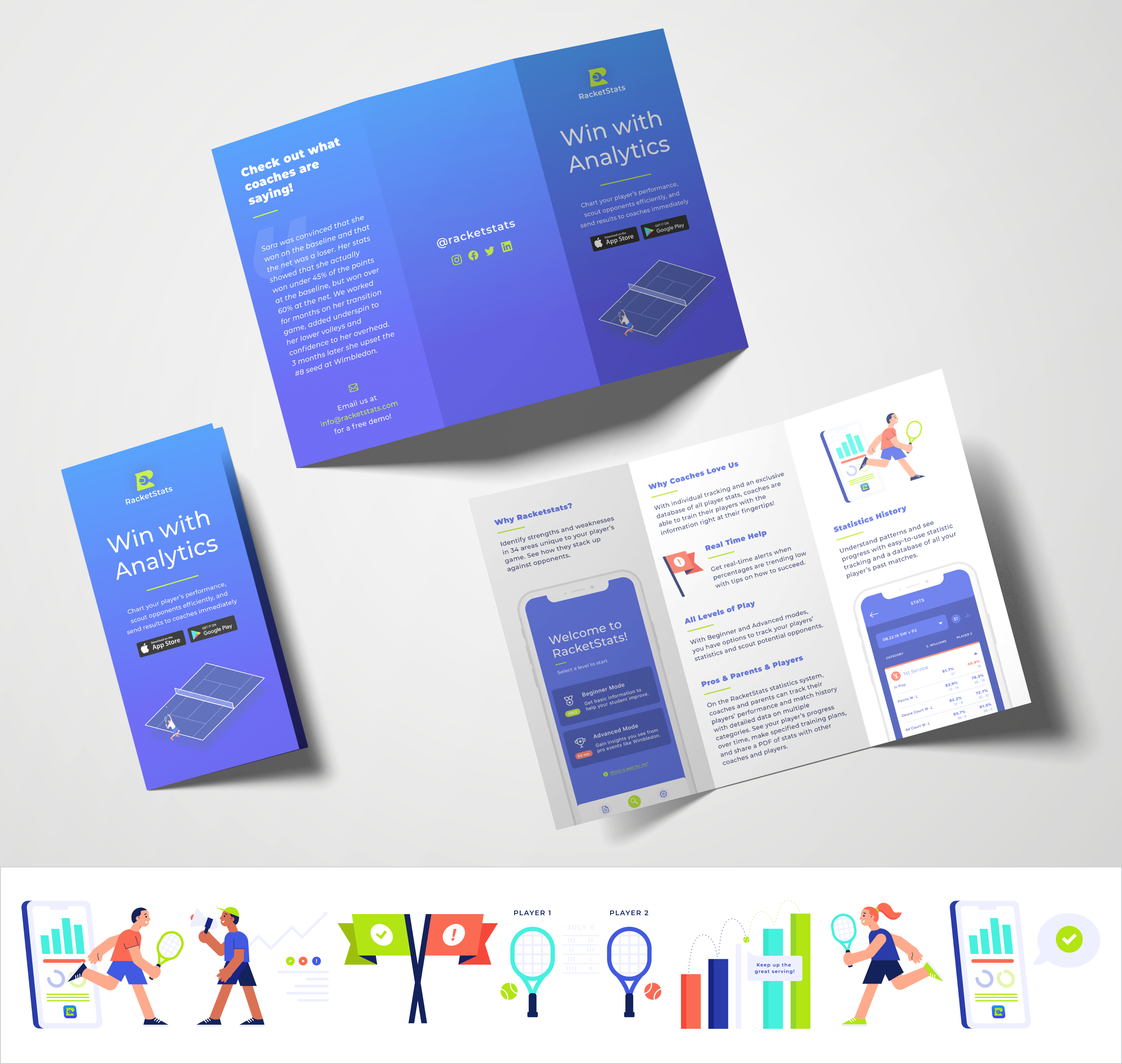
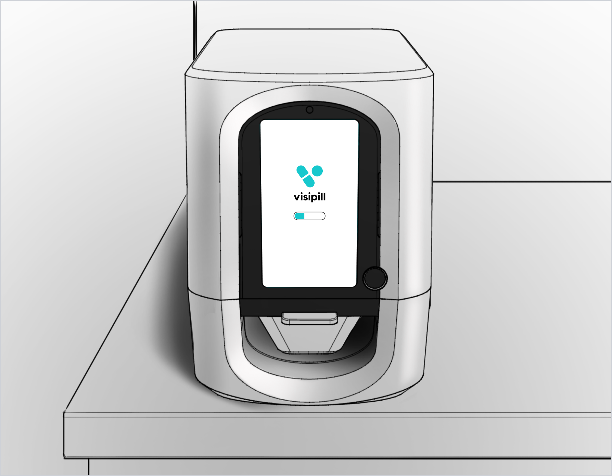
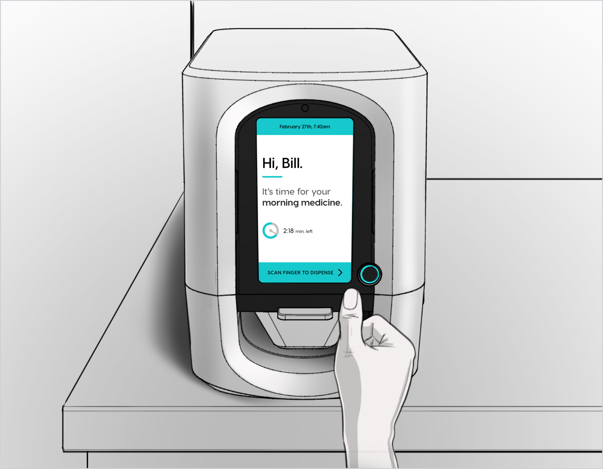
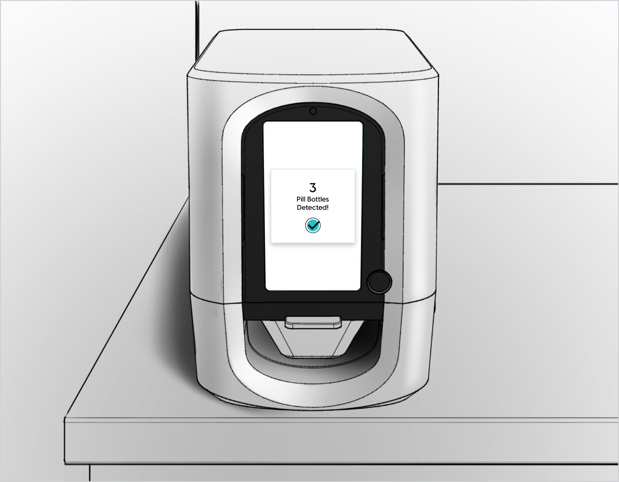
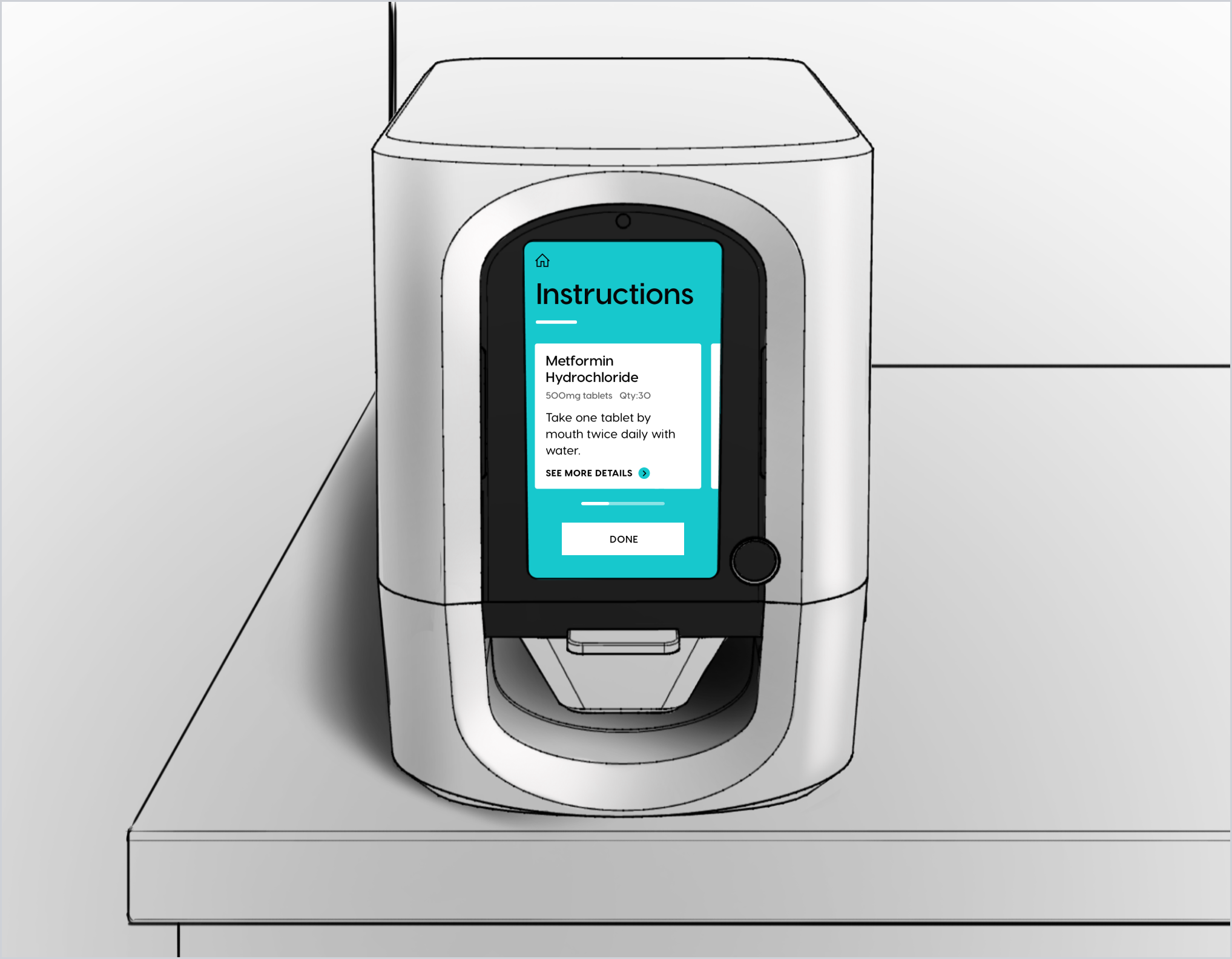
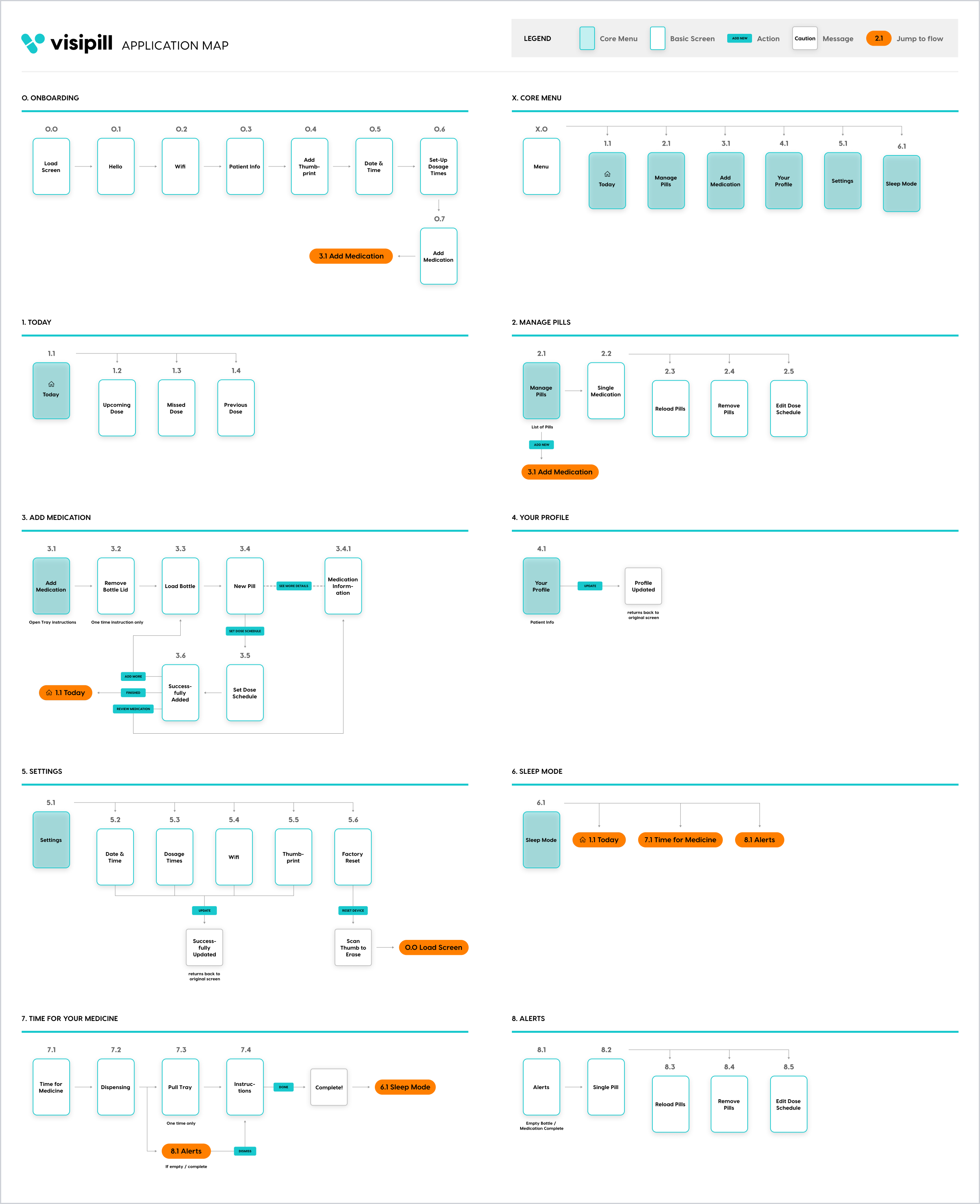
Visipill
Pill Dispenser Device Interface • UX & UI Design
SUMMARY
In the summer of 2019 I worked with the digital consultancy, Rocket Wagon, on user interface design for a product company called Visipill. The Visipill device is an electronic medication dispenser that monitors and administers a patient's timed prescription dosage regiment in accordance with an already stored medical profile of the patient. I collaborated with the Rocket Wagon team members and the client on creating an intuitive user experience, and providing a clear and accessible visual design.


- Date: Summer 2019
- Team: Rocket Wagon
- Roles: UX/UI Designer
Forth Phase
Brand Design for OR Schedule Optimization Tool • Brand Design
INTRODUCTION
Forth Phase is an operating room scheduling optimization tool that leverages machine learning and deep industry experience to improve patient experience and increase revenue for hospitals and clinics. I collaborated with the Forth Phase founders, two leaders in the healthcare and wellness field dedicated to improvement in the industry. The goal was to define the brand voice and its style, and create a logo that would embody it.
BRAND DISCOVERY WORKSHOP
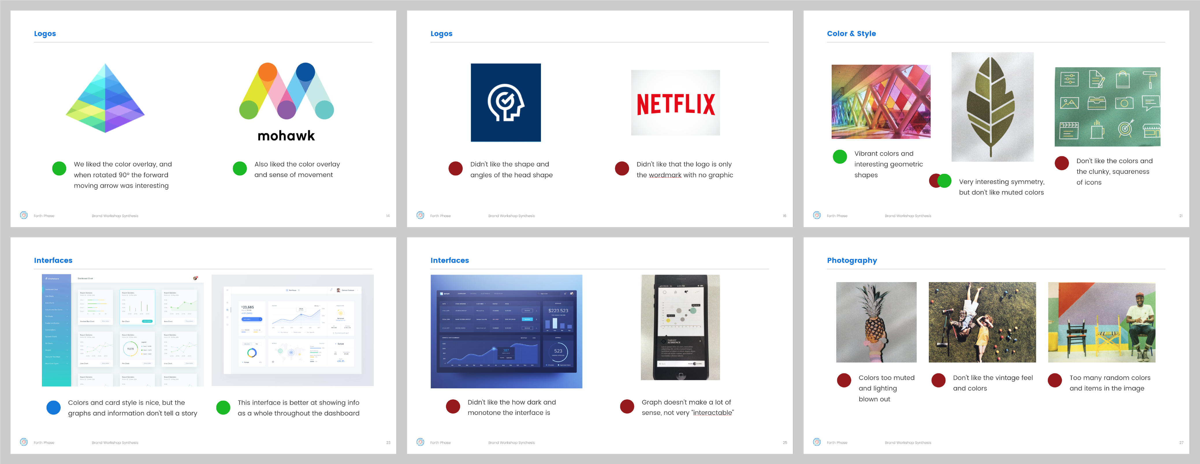
To start off the project, I conducted a full day workshop with the Forth Phase team, my experience-design lead, and two stakeholders in the company. We conducted several exercises, such as the Brand Deck, value charts, and image explorations to gain an understanding of what the brand and style could represent, and what it should not.

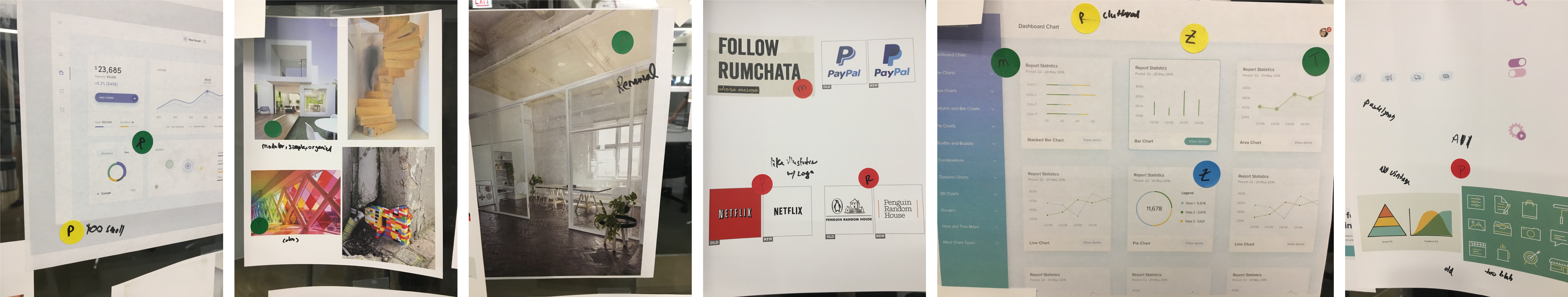
SYNTHESIS & CONCEPTS
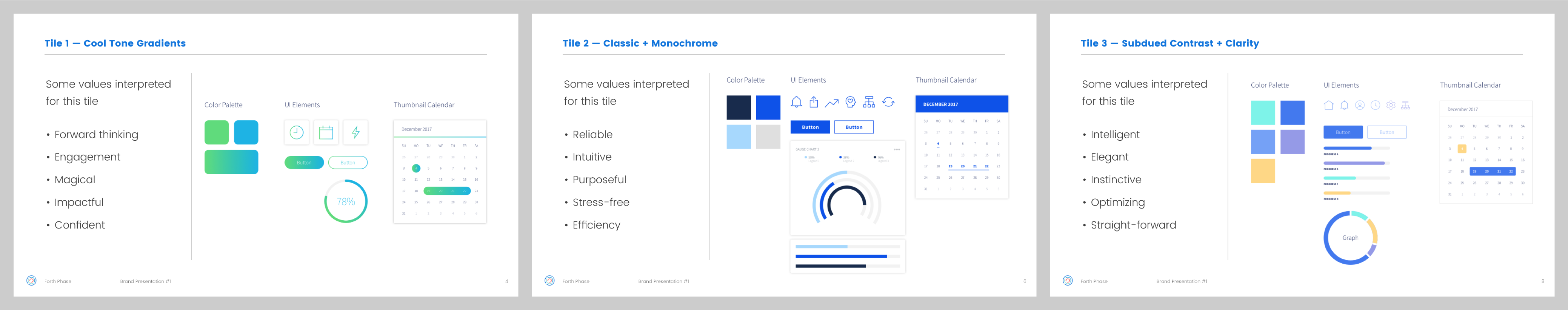
After the workshop, I put together a deck to synthesize the information we gathered, reiterating which values and imagery the team thought best fit with their ideal brand. I then developed visual style concept directions we could take that tied back to those values.
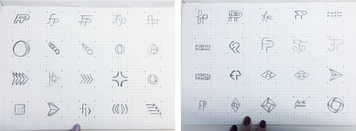
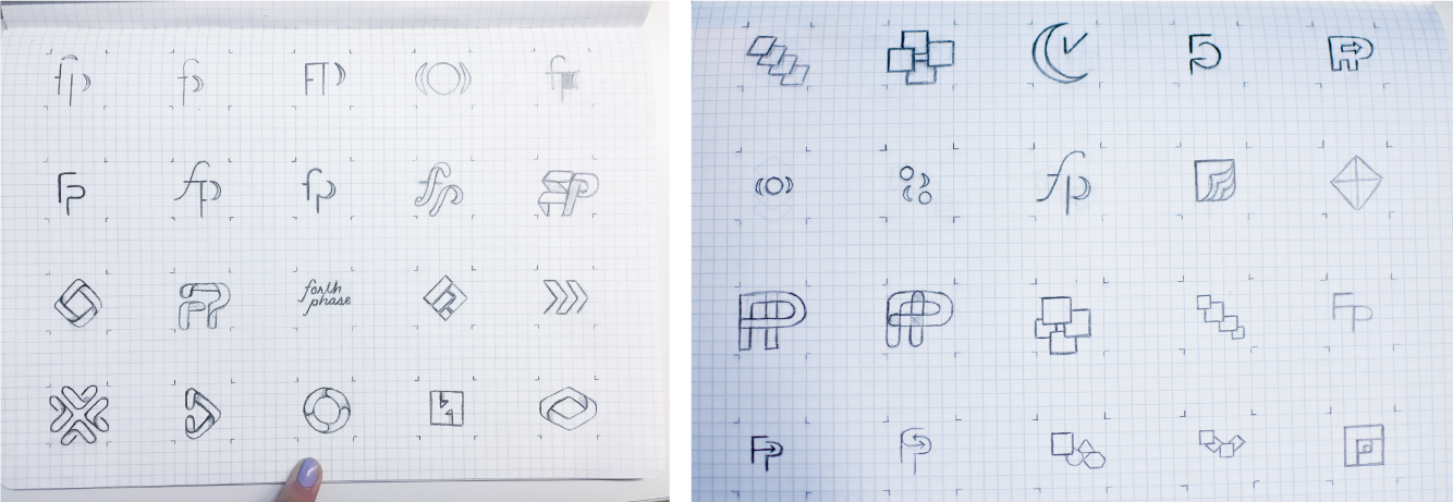
SKETCHING
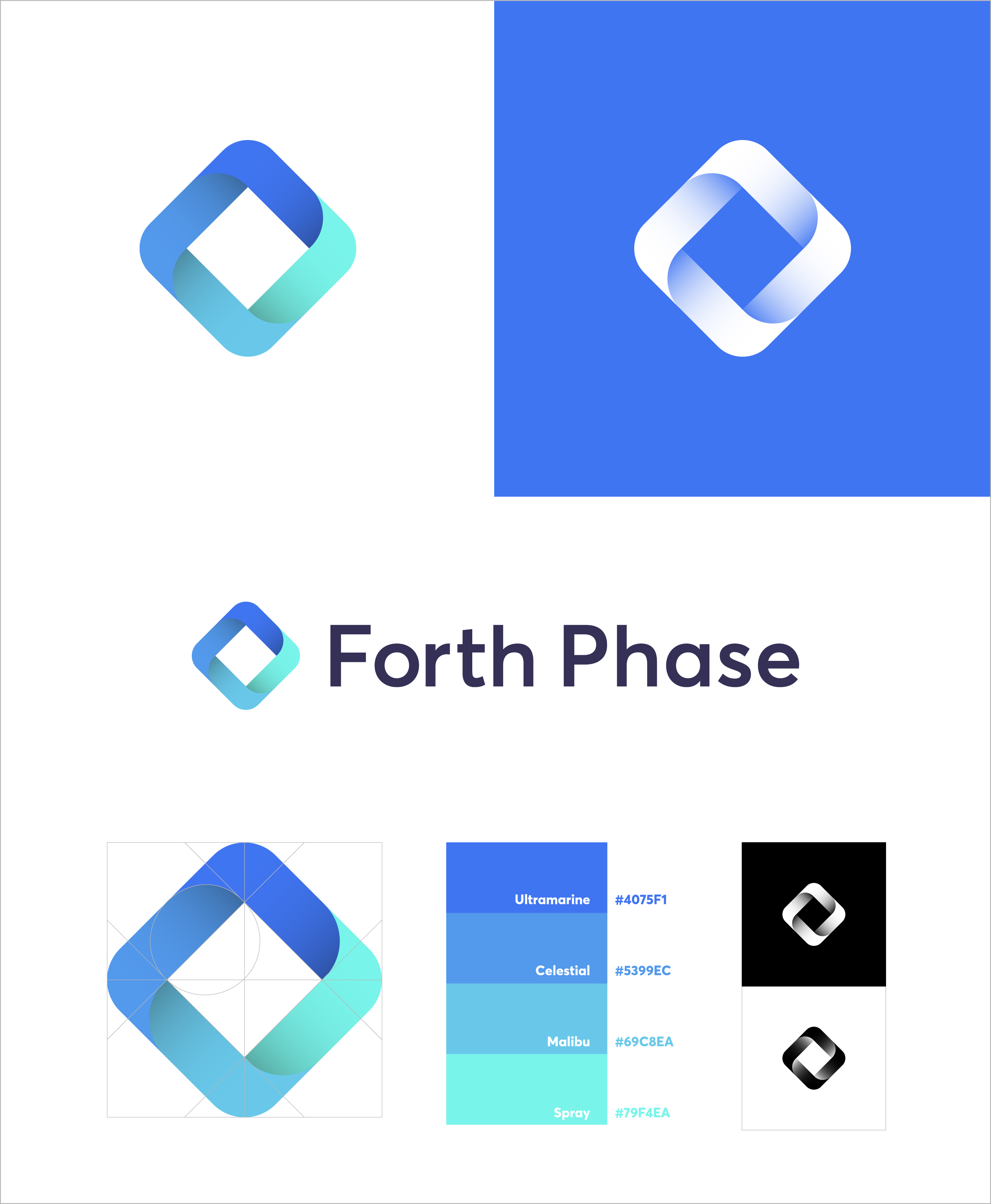
In addition to exploring visual styles for the Forth Phase brand, I brainstormed and sketched out a large collection of logo options. With some of these options, I worked on a classic monogram style; for others, I wanted to explore the origins of the Forth Phase name — the 'four phases' of surgical scheduling (Block Utilization With and Without Release, Out of Block Time, Total Block Time, and Operating Room Utilization).

REFINEMENT & COLOR EXPLORATION
At this point, I began to vectorize some of my sketches and started experimenting with a variety of color palettes. I would then share some of these versions with the whole team at intermittent reviews during the process.
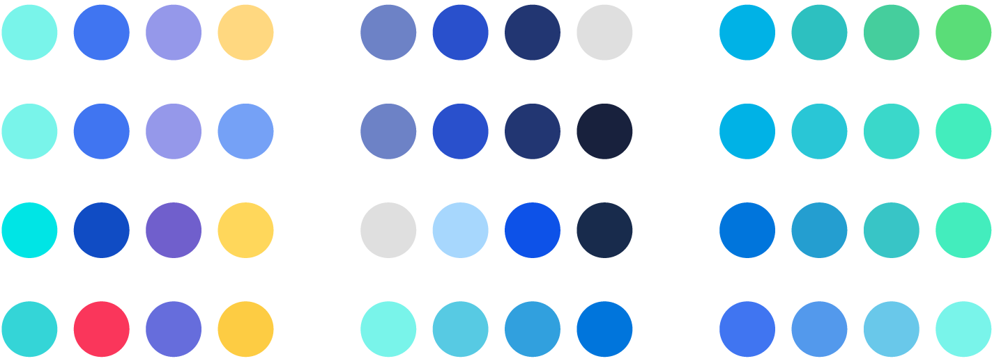
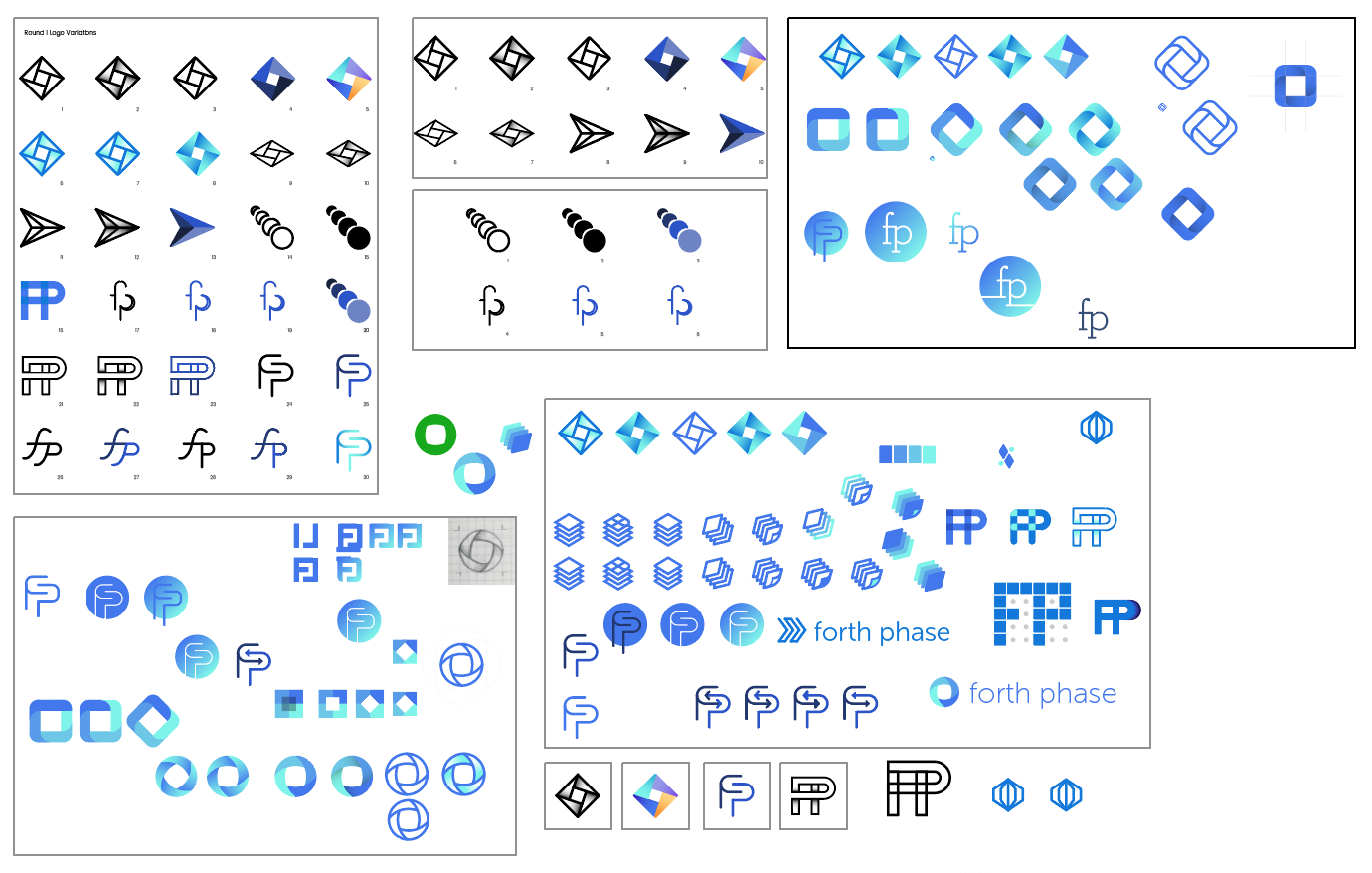
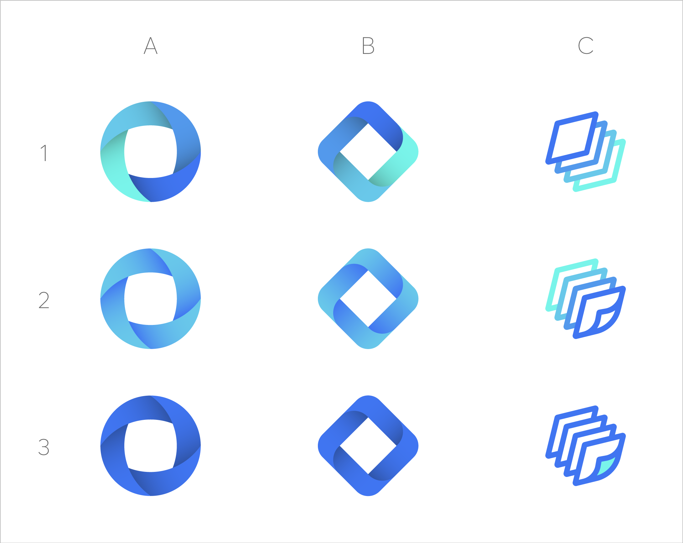
After meetings with the whole team and reworking different versions, I narrowed down to three final concepts with variations for each, and one color palette. These each came back to the 'four phases' representation, but in different executions.
Additionally, I began to experiment with a variety of typography treatments. I was able to collaborate with the Forth Phase team virtually between our weekly meetings to share different options through the web app Mural.ly. With this tool, the Forth Phase team was able to provide input on styles they didn't like and those they thought might fit the Forth Phase brand.

FINAL RESULT
In the final logo, “The Forth Diamond”, each of the diamond faces represents one of the four phases of the OR scheduling tool; Block Utilization With and Without Release, Out of Block Time, Total Block Time, and Operating Room Utilization. Each face connects and works together to form a cohesive and efficient whole.
BRAND GUIDELINES
I compiled a set of guidelines for logo and identity use, including color palettes and typefaces, so that future contributors will have clear instruction on how to use the logo. The brand book includes sections on the logo's structure and specifications, color and monochrome versions, and potential business card designs.

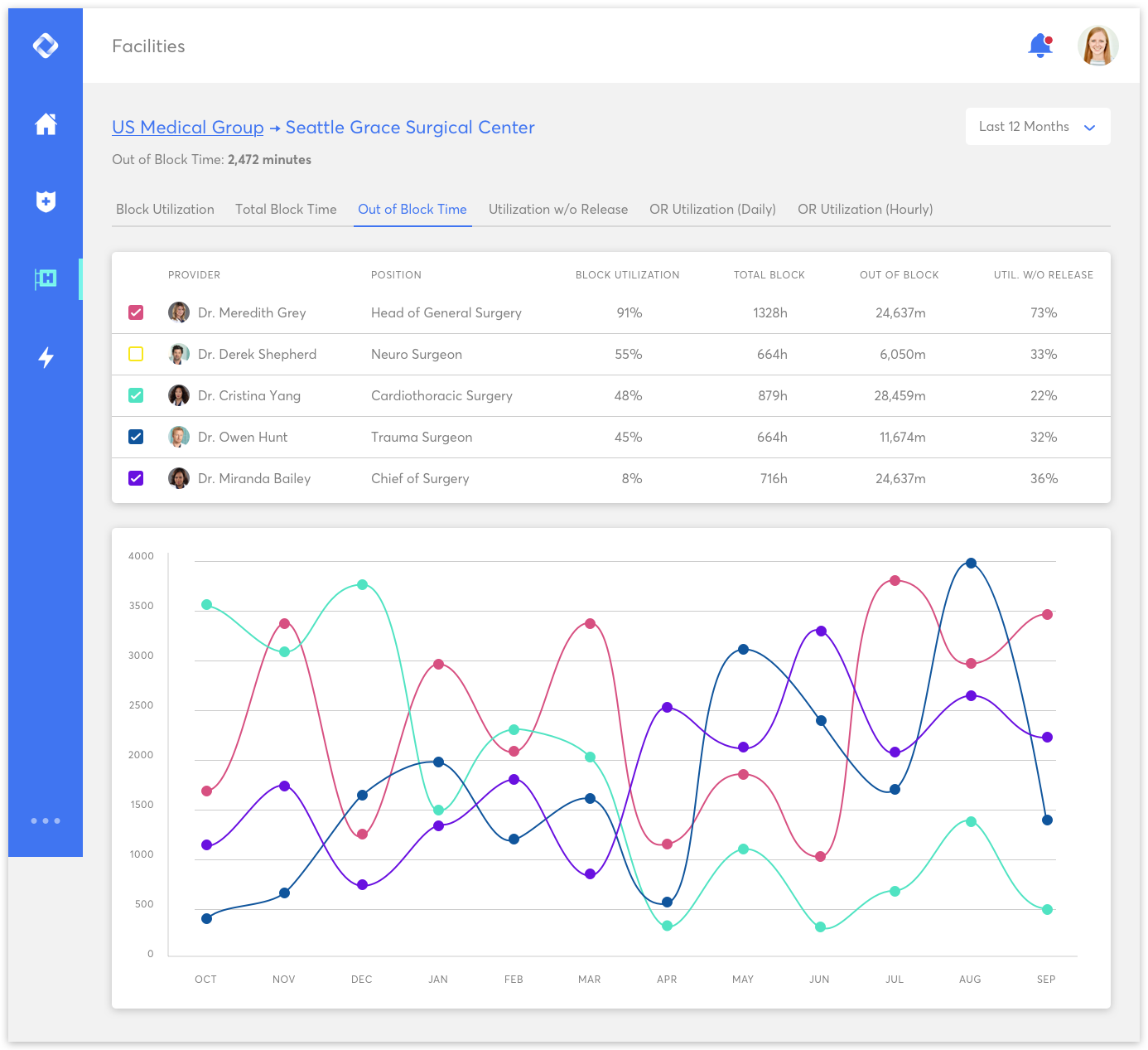
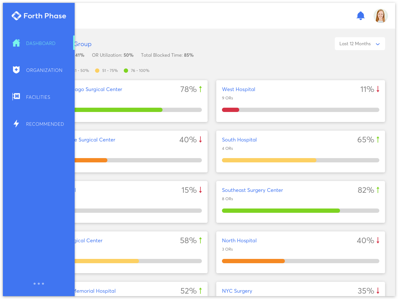
FUTURE CONSIDERATIONS
In addition to finalizing the Forth Phase brand and logo design, I began to work on a few user interface mockups based on the prototype they currently had. These mocks show the potential use of the brand elements in the UI, while also illustrating some considerations for data visualizations. As Forth Phase grows in the health and wellness industry, I hope to continue my work on the UI, as well as contribute to how the brand will be used and improved upon.

- Date: December 2017
- Client: Forth Phase
- Roles: Brand Designer
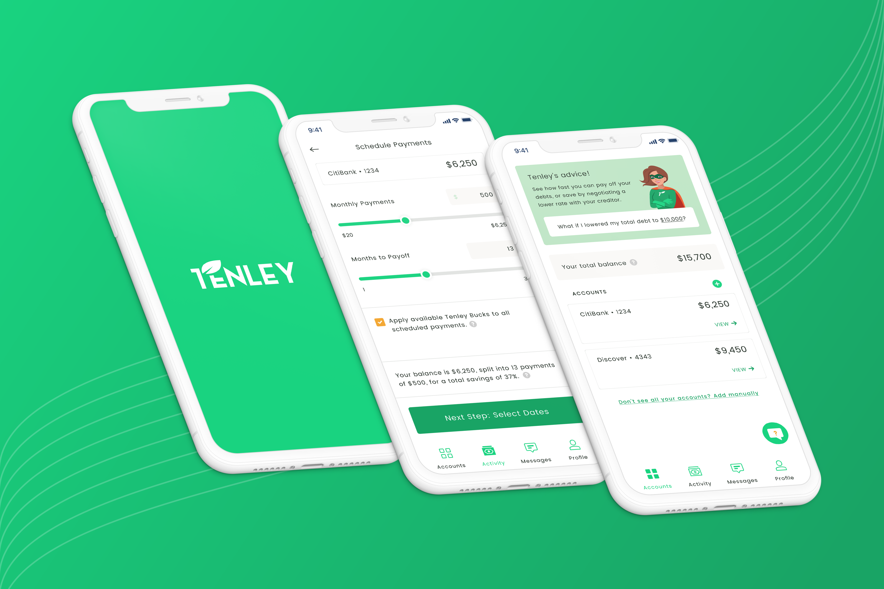
Tenley
Mobile App for Credit Consolidation • UX & UI Design
SUMMARY
The Tenley mobile app was an idea brought to the Red Foundry team from an entrepreneur, who wanted to create a streamlined, stress-free process for users who are looking into consolidating their credit debt. Our goal was to take a typically intimidating and frustrating experience and transform it into a clear and easily accessible solution.


- Date: Winter 2019
- Team: Red Foundry
- Roles: UX/UI Designer, Illustrator
Icons & Illustration


Branding & Logos
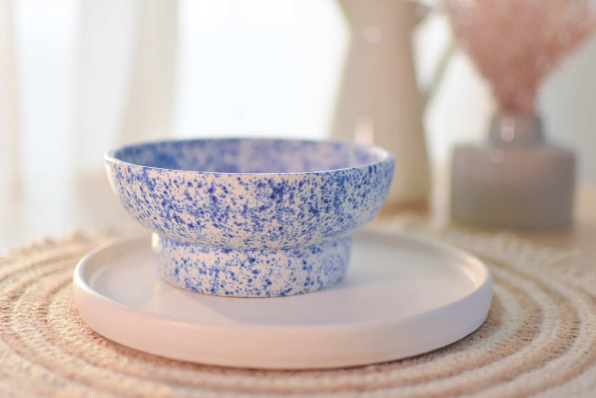
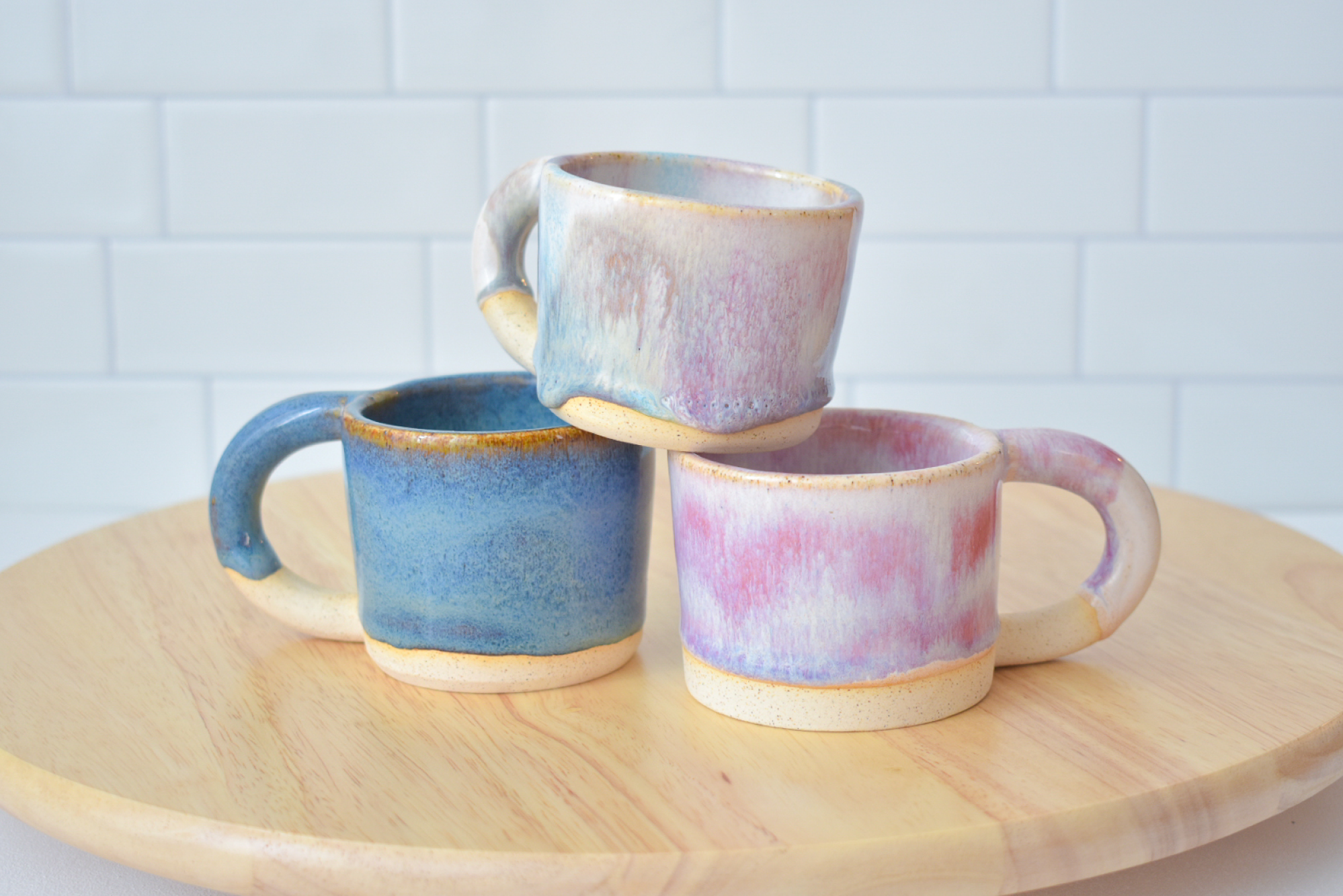
Mallory Made Co
Personal Project
One thing my mother (hi Mom, thanks for proofreading my website!) might tell you about me is that I have a few too many creative hobbies. I've always enjoyed diving into new mediums and skills, and love being able to share my creations with family and friends.
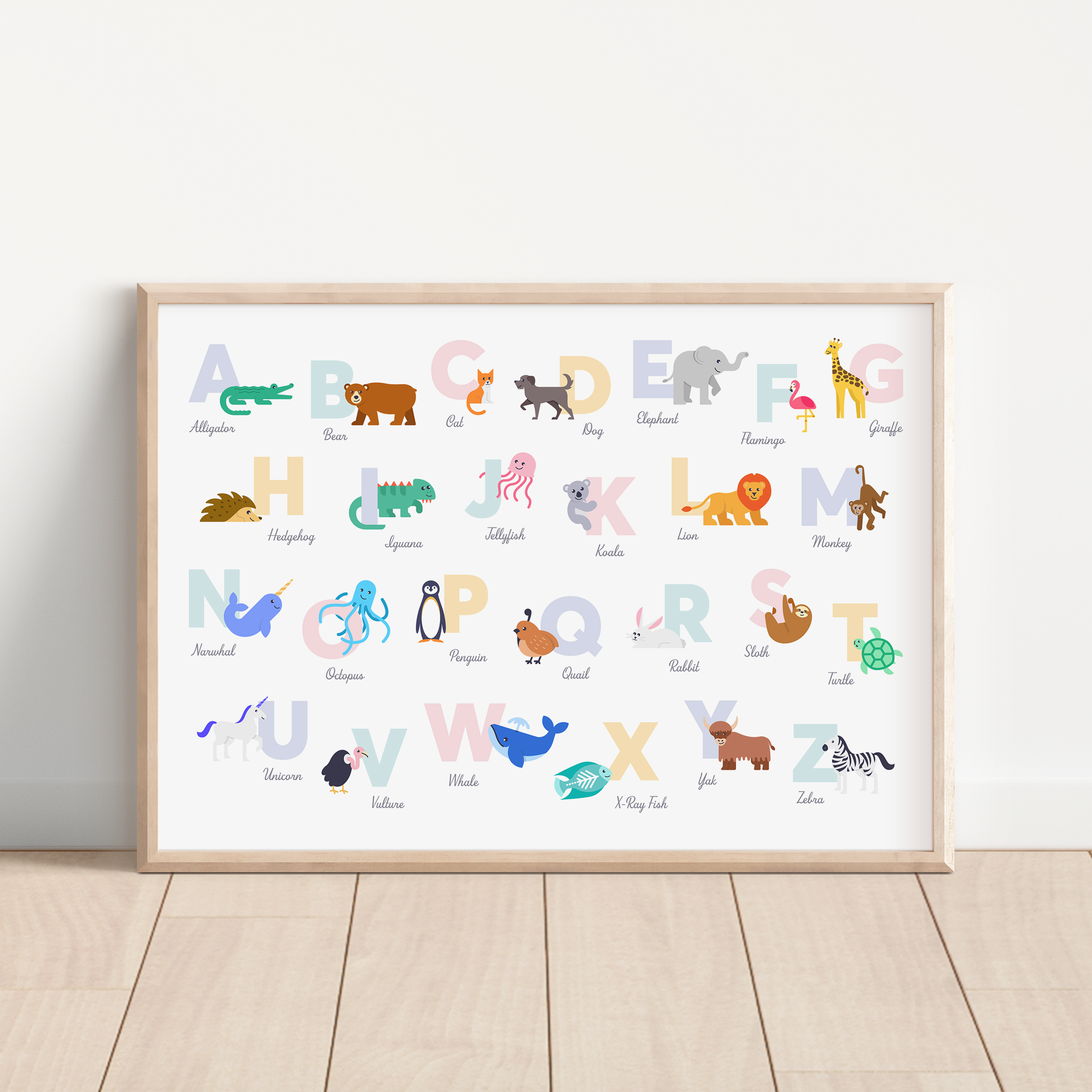
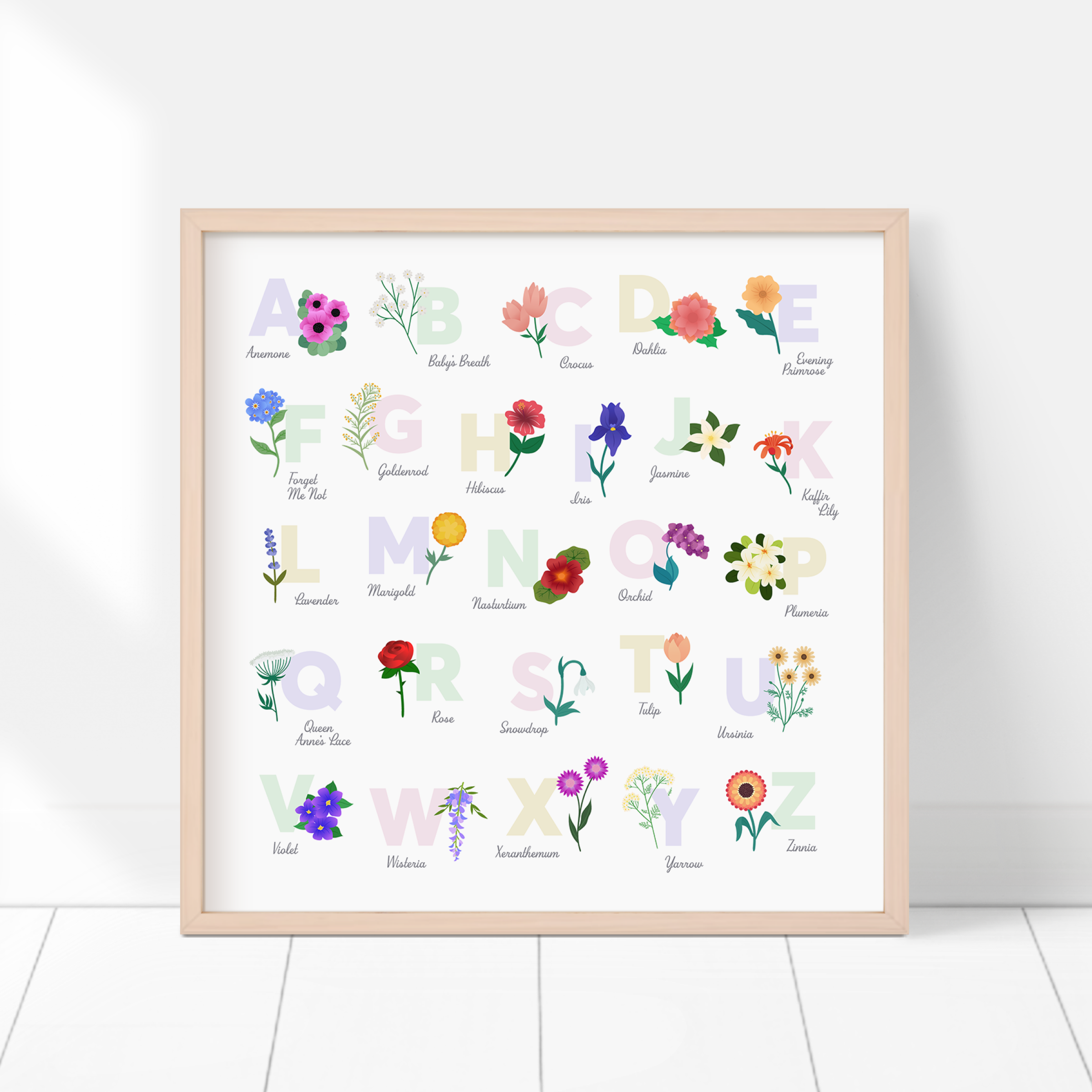
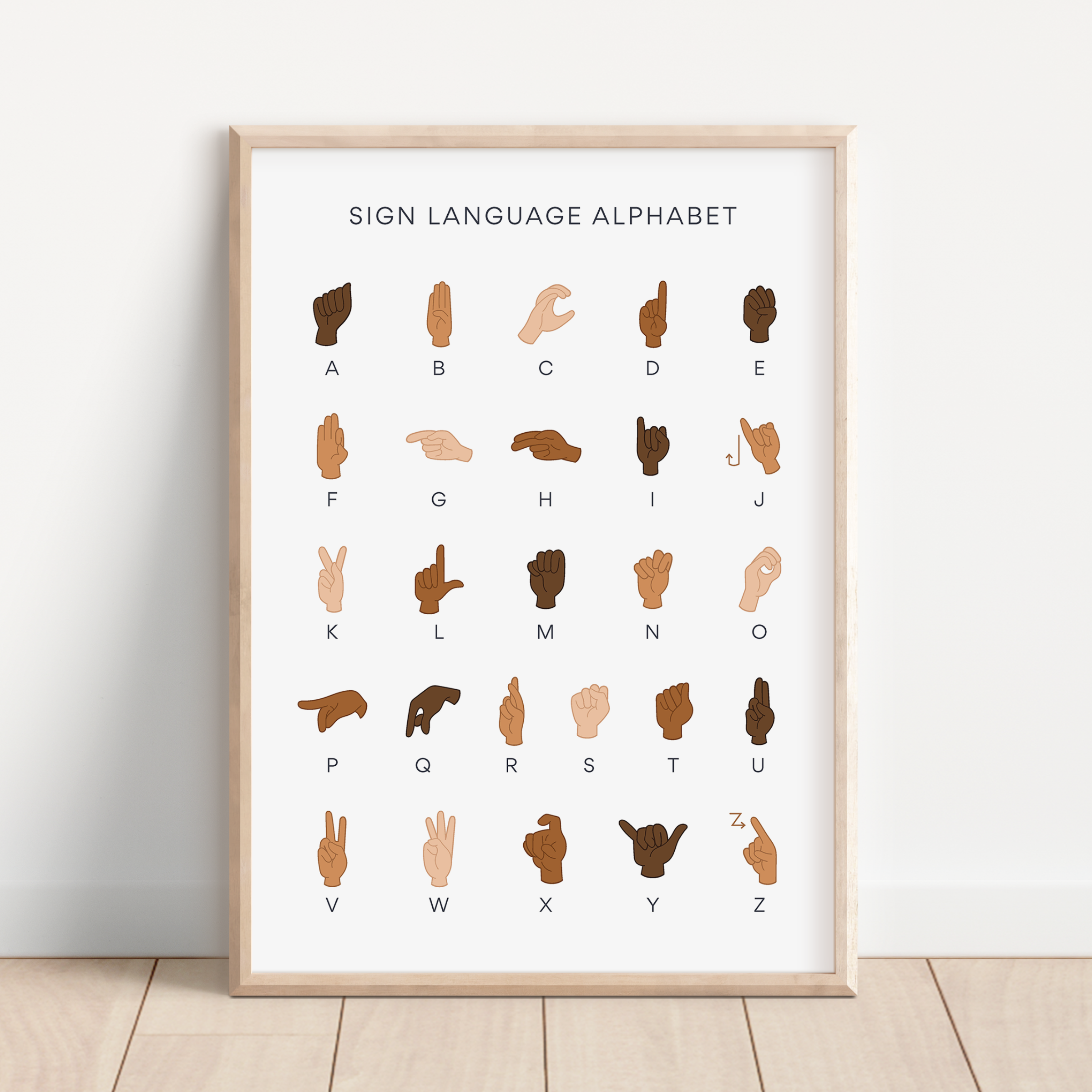
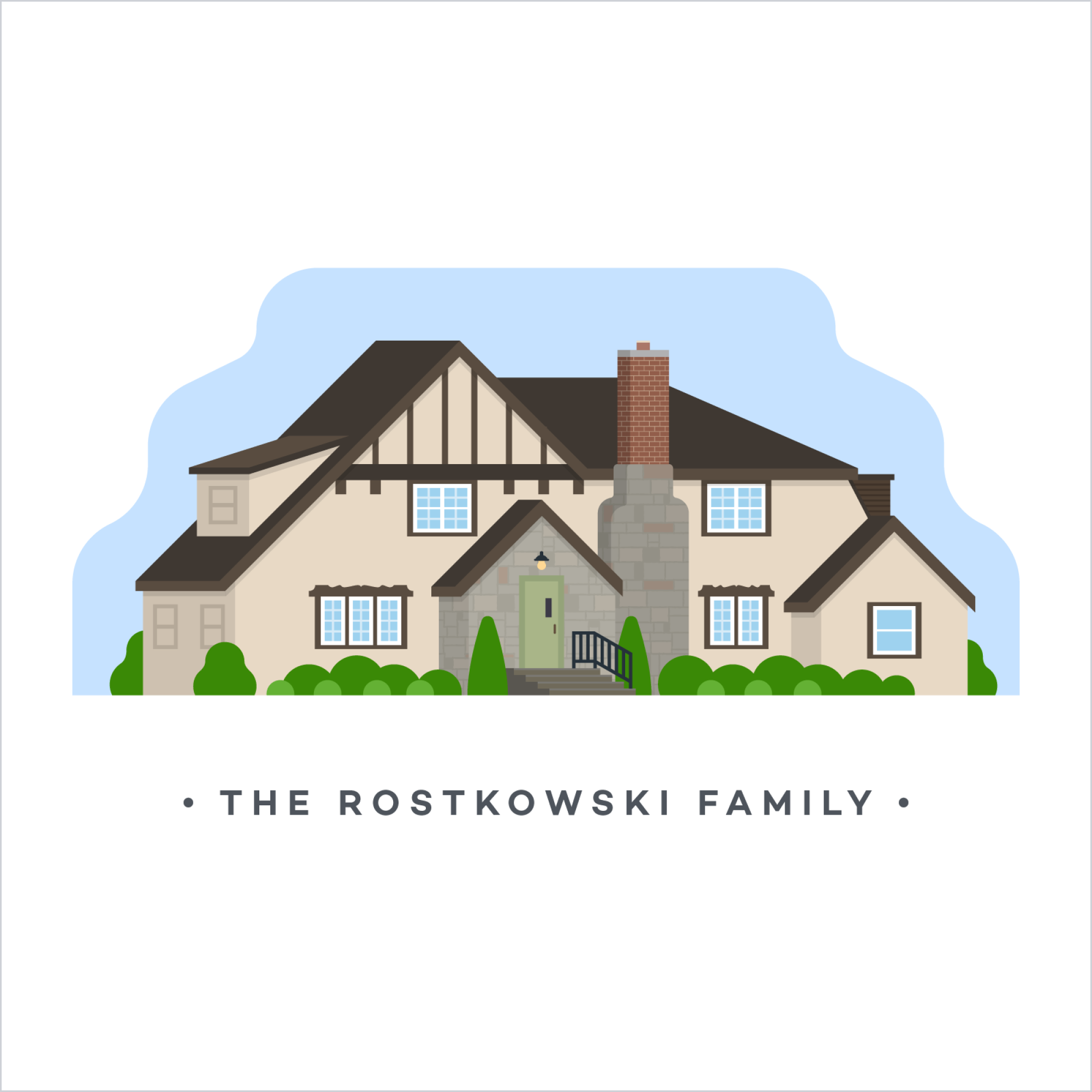
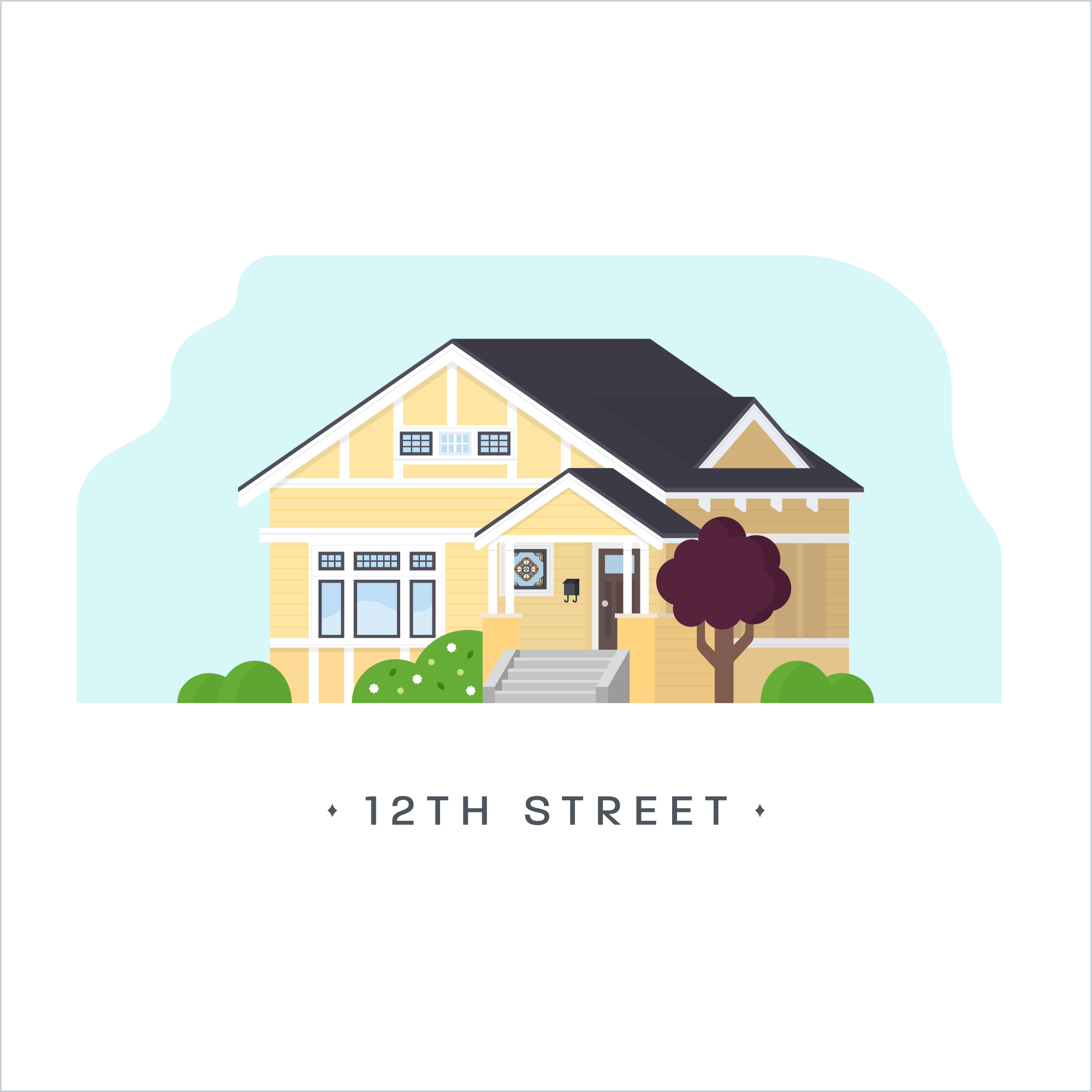
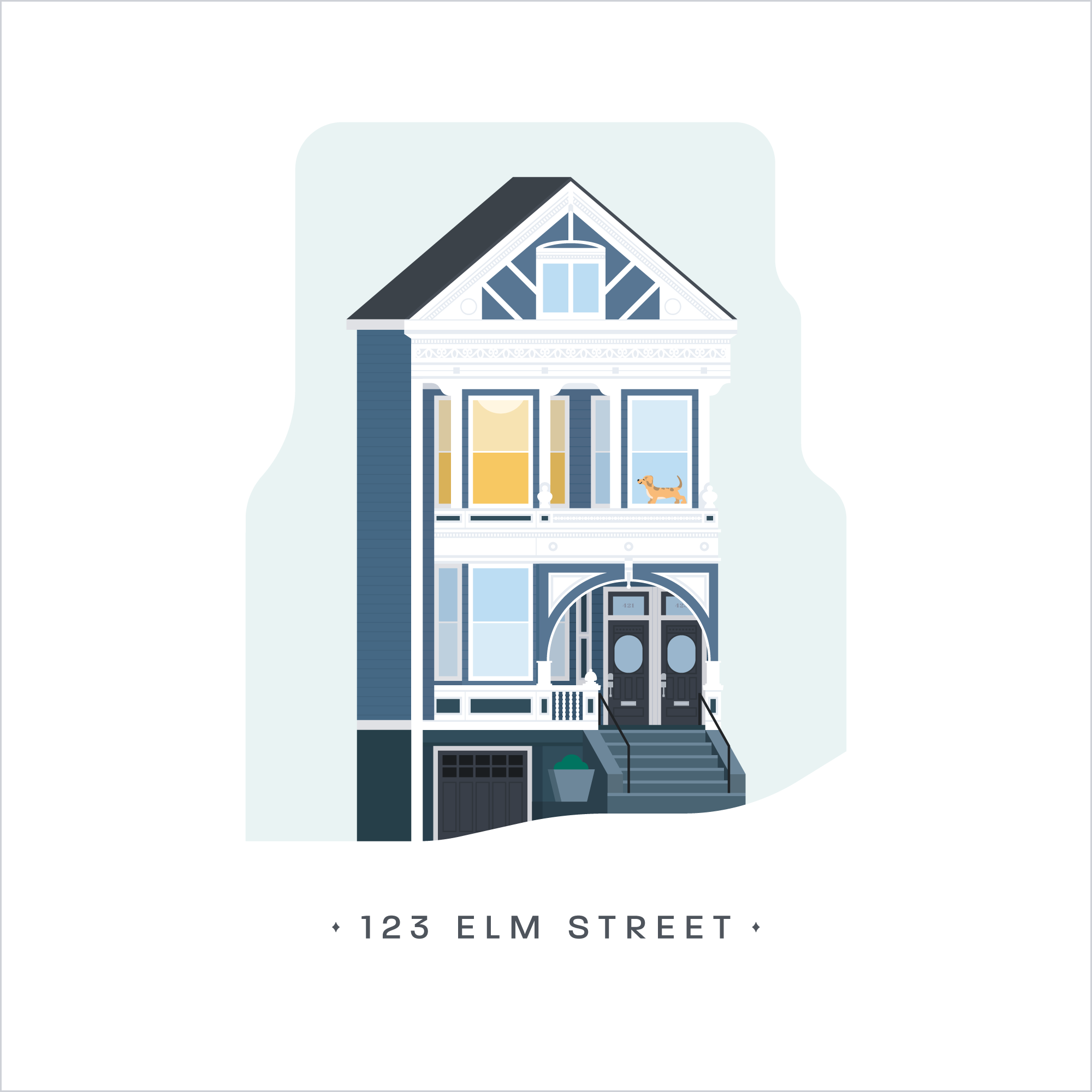
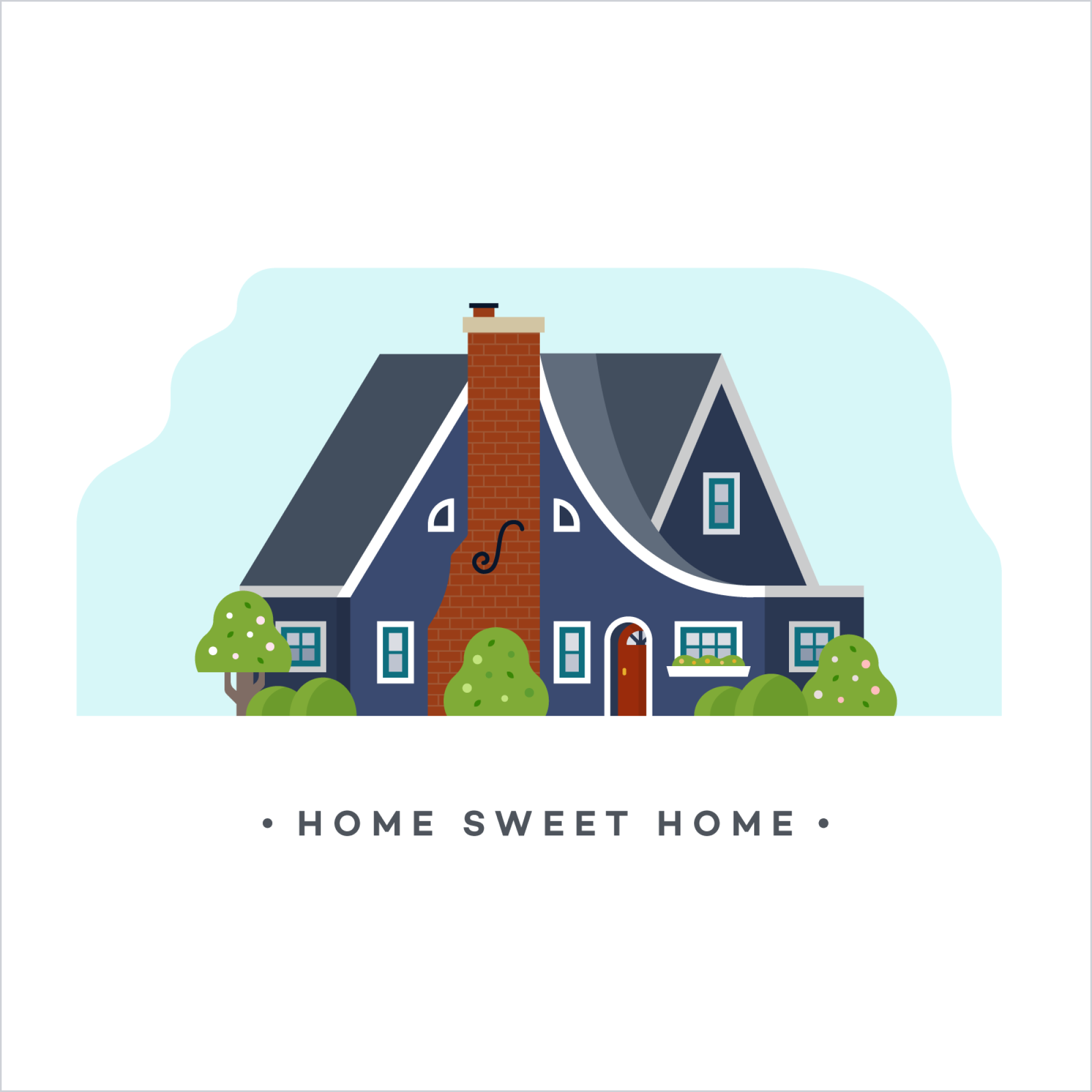
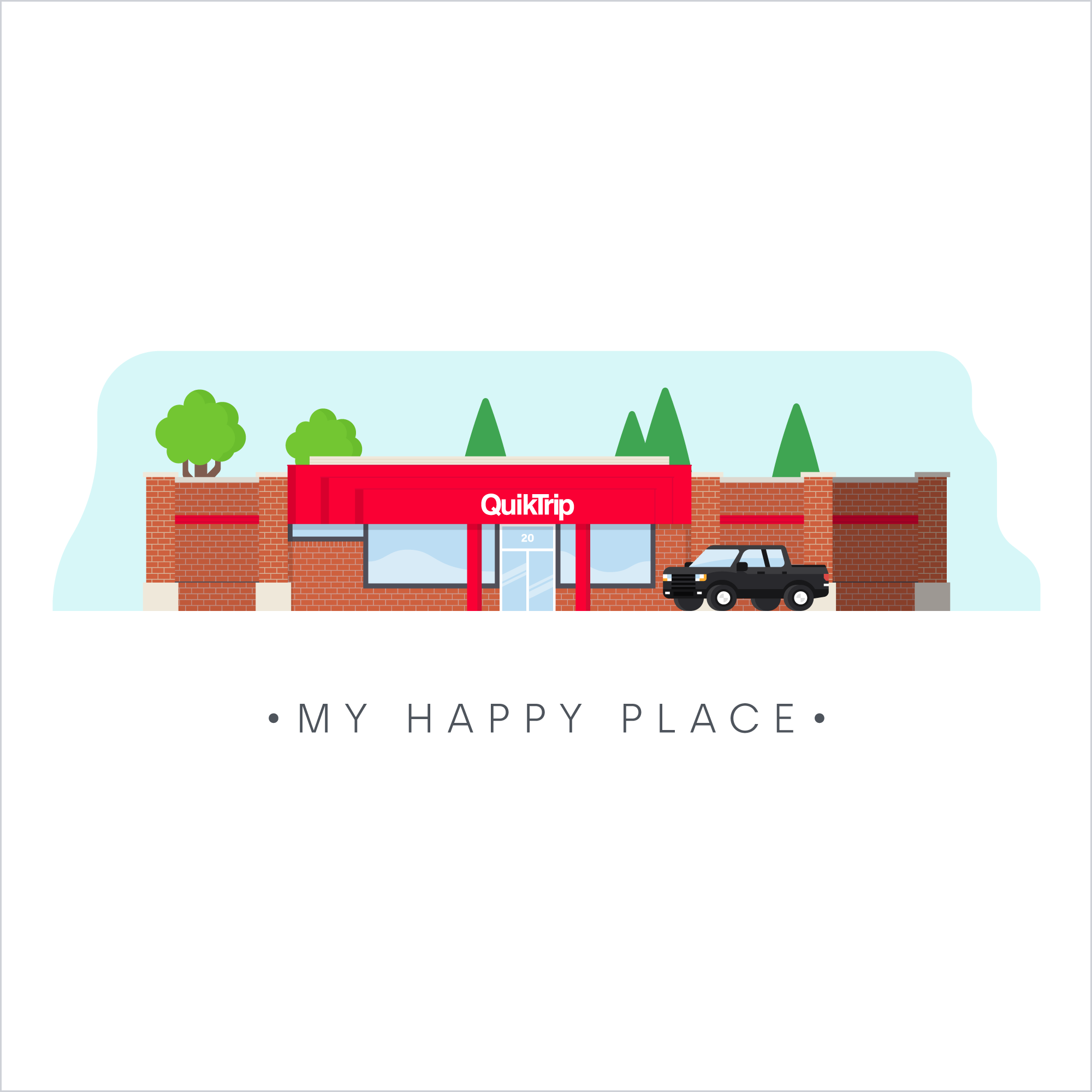
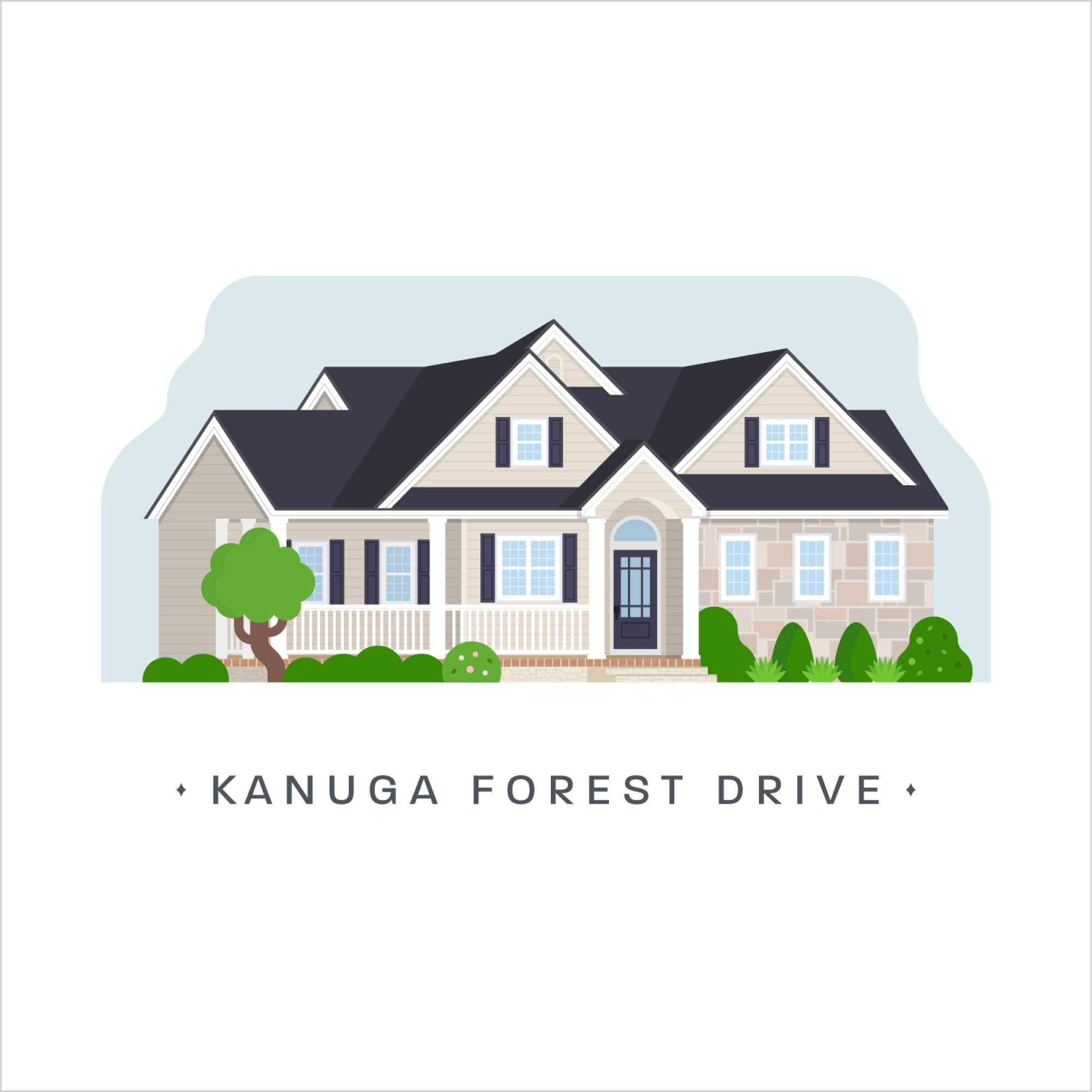
About five years ago I opened an Etsy shop to start selling an illustrated animal alphabet I designed for my nephew when he was born. My shop has slowly expanded to include more kids' illustrations, custom home illustrations, pottery creations, 3D printed items, felt banners, and more. In the past, I worried about trying to keep the shop very limited in an effort to be 'cohesive', but I've found that what's most important to me is exploring new mediums and having fun sharing any and all 'Mallory Made' creations.