Forth Phase
Brand Design for OR Schedule Optimization Tool • Brand Design
INTRODUCTION
Forth Phase is an operating room scheduling optimization tool that leverages machine learning and deep industry experience to improve patient experience and increase revenue for hospitals and clinics. I collaborated with the Forth Phase founders, two leaders in the healthcare and wellness field dedicated to improvement in the industry. The goal was to define the brand voice and its style, and create a logo that would embody it.
BRAND DISCOVERY WORKSHOP
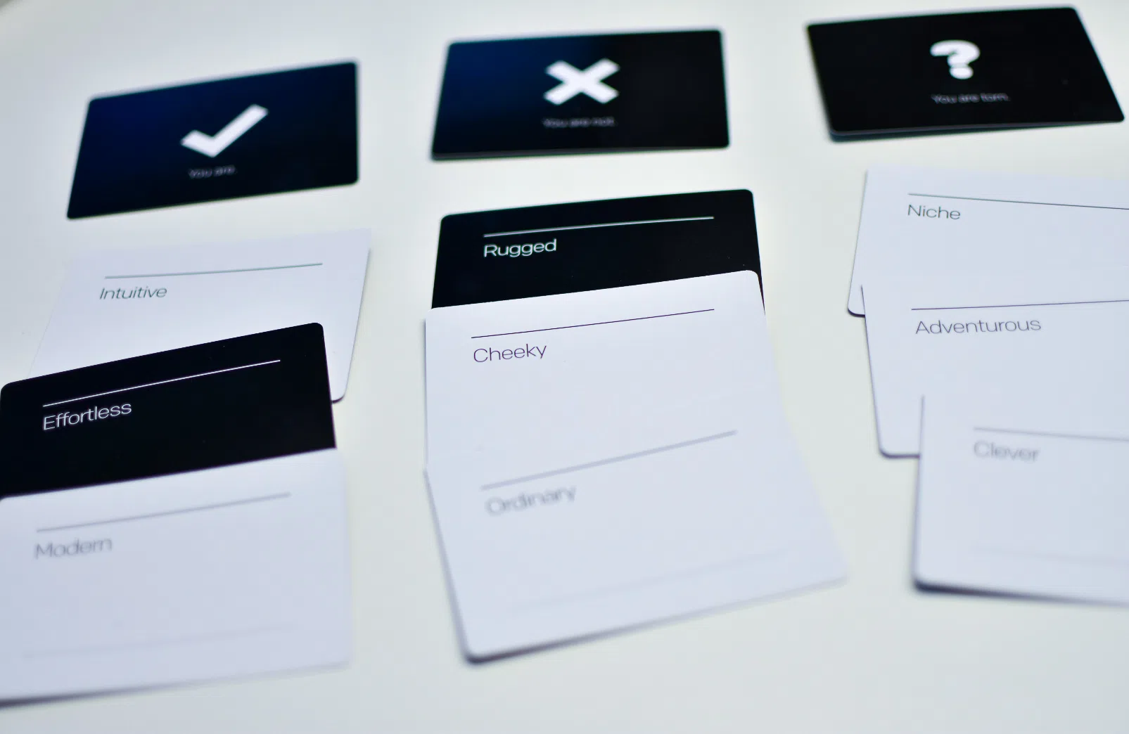
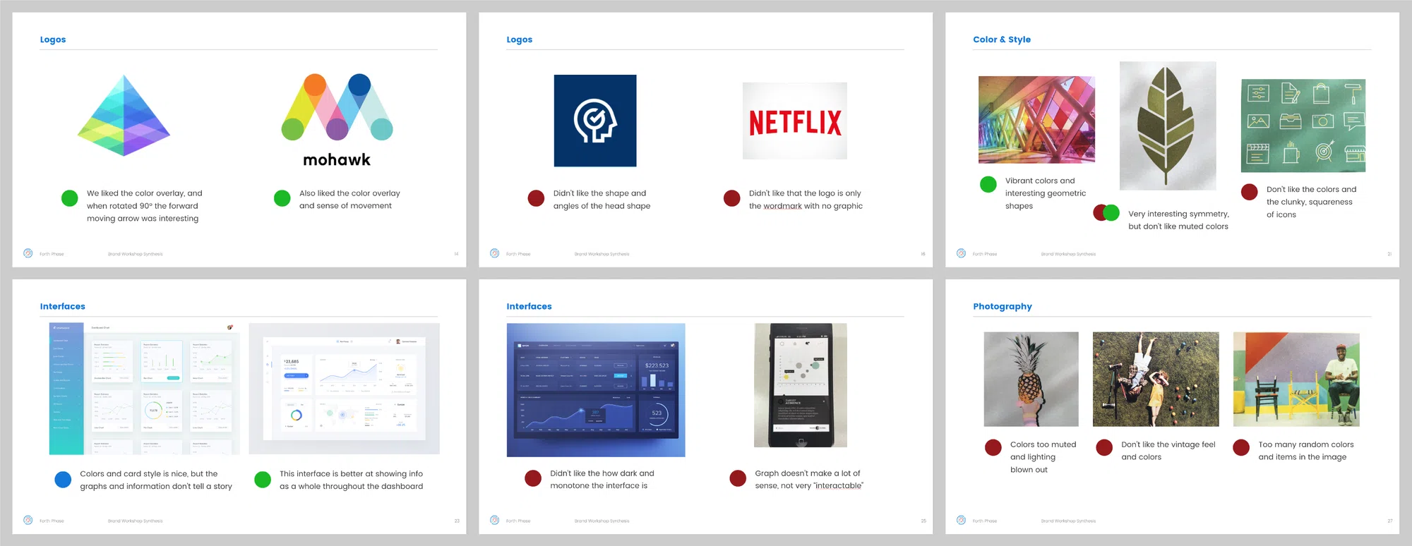
To start off the project, I conducted a full day workshop with the Forth Phase team, my experience-design lead, and two stakeholders in the company. We conducted several exercises, such as the Brand Deck, value charts, and image explorations to gain an understanding of what the brand and style could represent, and what it should not.


SYNTHESIS & CONCEPTS
After the workshop, I put together a deck to synthesize the information we gathered, reiterating which values and imagery the team thought best fit with their ideal brand. I then developed visual style concept directions we could take that tied back to those values.

SKETCHING
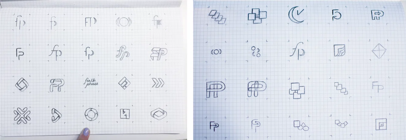
In addition to exploring visual styles for the Forth Phase brand, I brainstormed and sketched out a large collection of logo options. With some of these options, I worked on a classic monogram style; for others, I wanted to explore the origins of the Forth Phase name — the 'four phases' of surgical scheduling (Block Utilization With and Without Release, Out of Block Time, Total Block Time, and Operating Room Utilization).


REFINEMENT & COLOR EXPLORATION
At this point, I began to vectorize some of my sketches and started experimenting with a variety of color palettes. I would then share some of these versions with the whole team at intermittent reviews during the process.
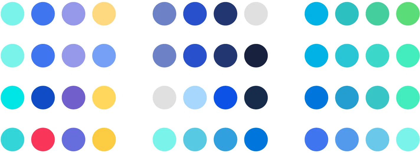
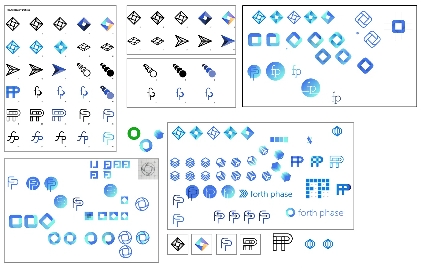

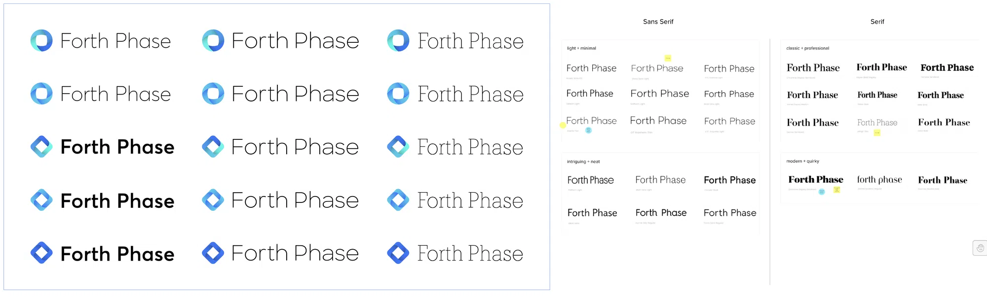
After meetings with the whole team and reworking different versions, I narrowed down to three final concepts with variations for each, and one color palette. These each came back to the 'four phases' representation, but in different executions.

Additionally, I began to experiment with a variety of typography treatments. I was able to collaborate with the Forth Phase team virtually between our weekly meetings to share different options through the web app Mural.ly. With this tool, the Forth Phase team was able to provide input on styles they didn't like and those they thought might fit the Forth Phase brand.
FINAL RESULT
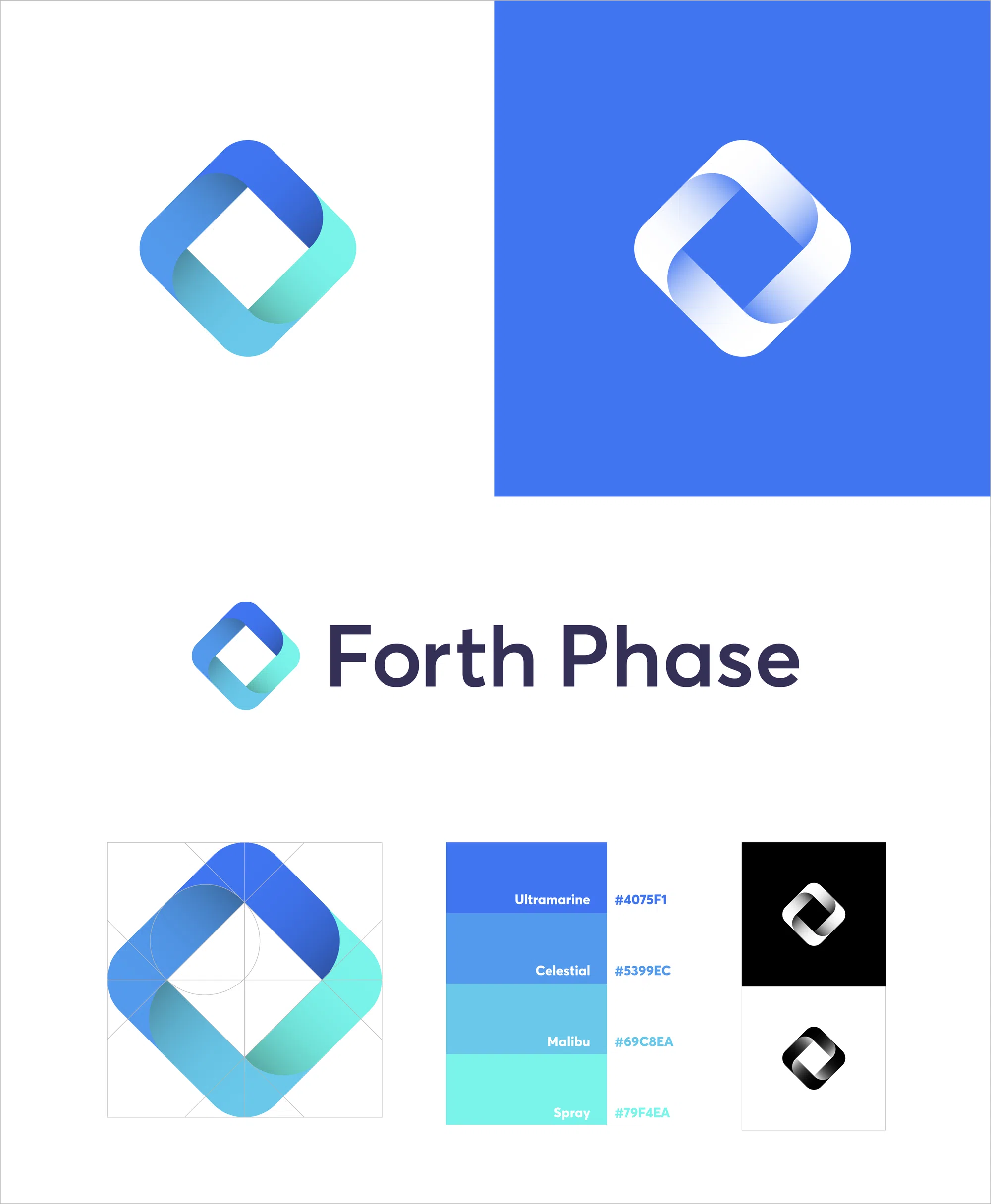
In the final logo, “The Forth Diamond”, each of the diamond faces represents one of the four phases of the OR scheduling tool; Block Utilization With and Without Release, Out of Block Time, Total Block Time, and Operating Room Utilization. Each face connects and works together to form a cohesive and efficient whole.
BRAND GUIDELINES
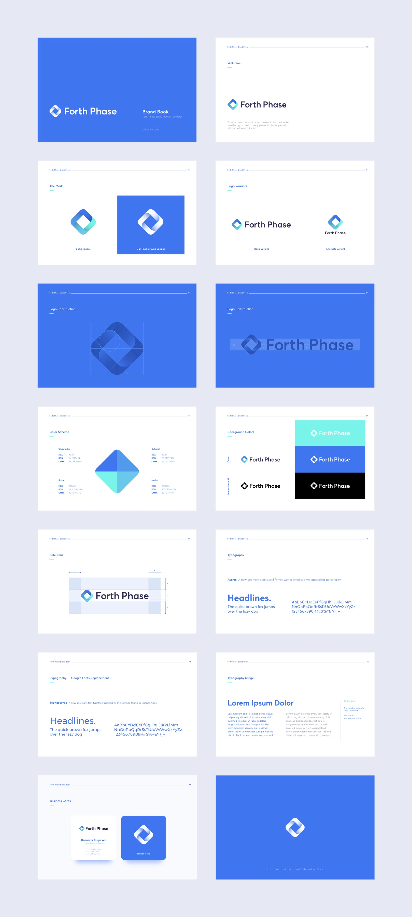
I compiled a set of guidelines for logo and identity use, including color palettes and typefaces, so that future contributors will have clear instruction on how to use the logo. The brand book includes sections on the logo's structure and specifications, color and monochrome versions, and potential business card designs.
FUTURE CONSIDERATIONS
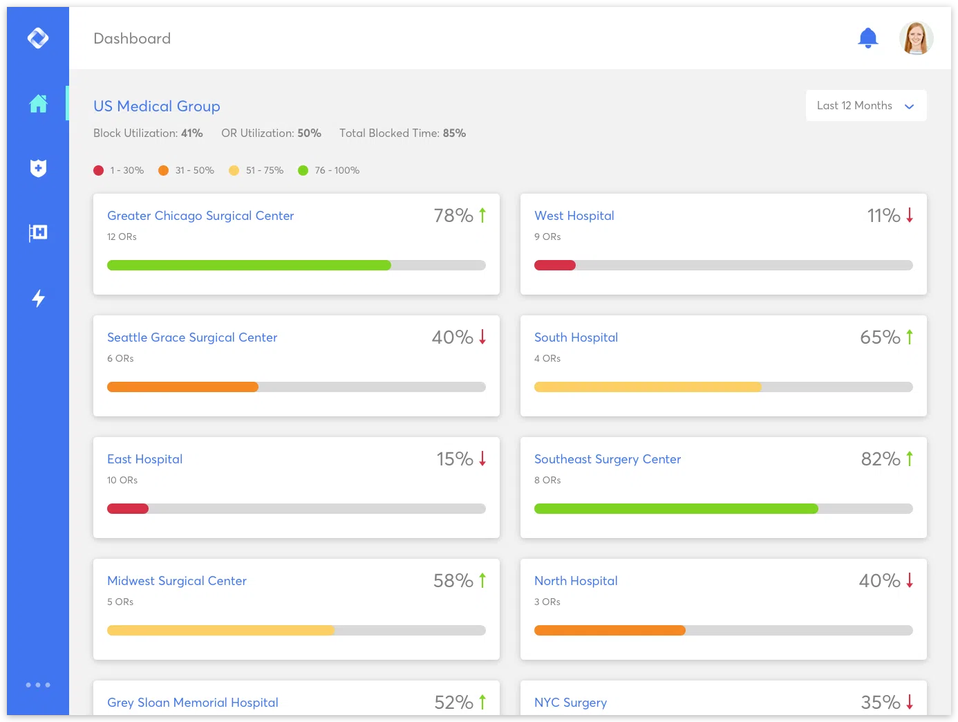
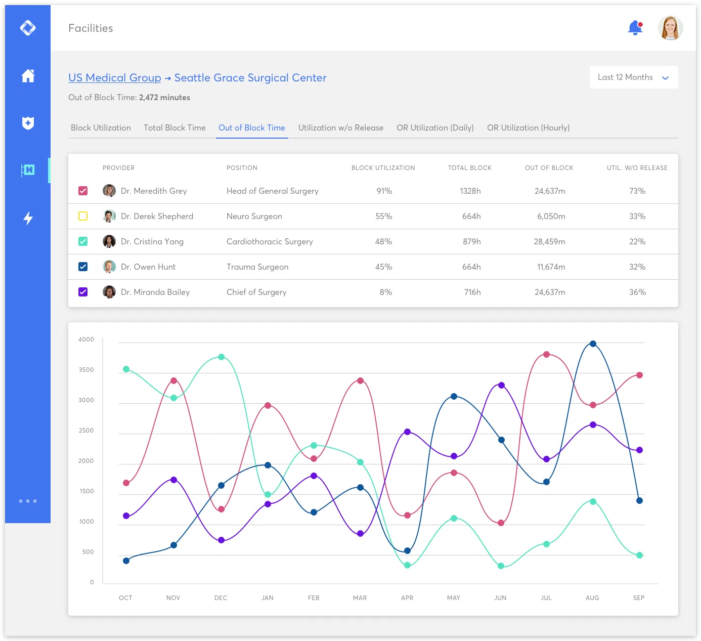
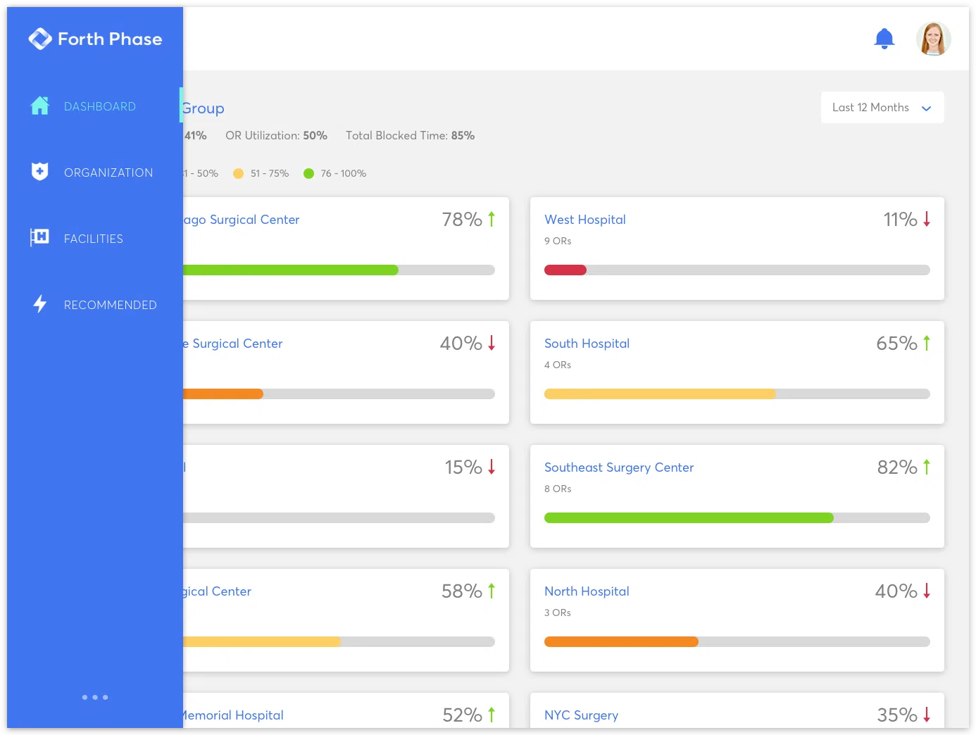
In addition to finalizing the Forth Phase brand and logo design, I began to work on a few user interface mockups based on the prototype they currently had. These mocks show the potential use of the brand elements in the UI, while also illustrating some considerations for data visualizations. As Forth Phase grows in the health and wellness industry, I hope to continue my work on the UI, as well as contribute to how the brand will be used and improved upon.