Resource Allocation Tool
Pharmaceutical Client • UX & UI Design
INTRODUCTION
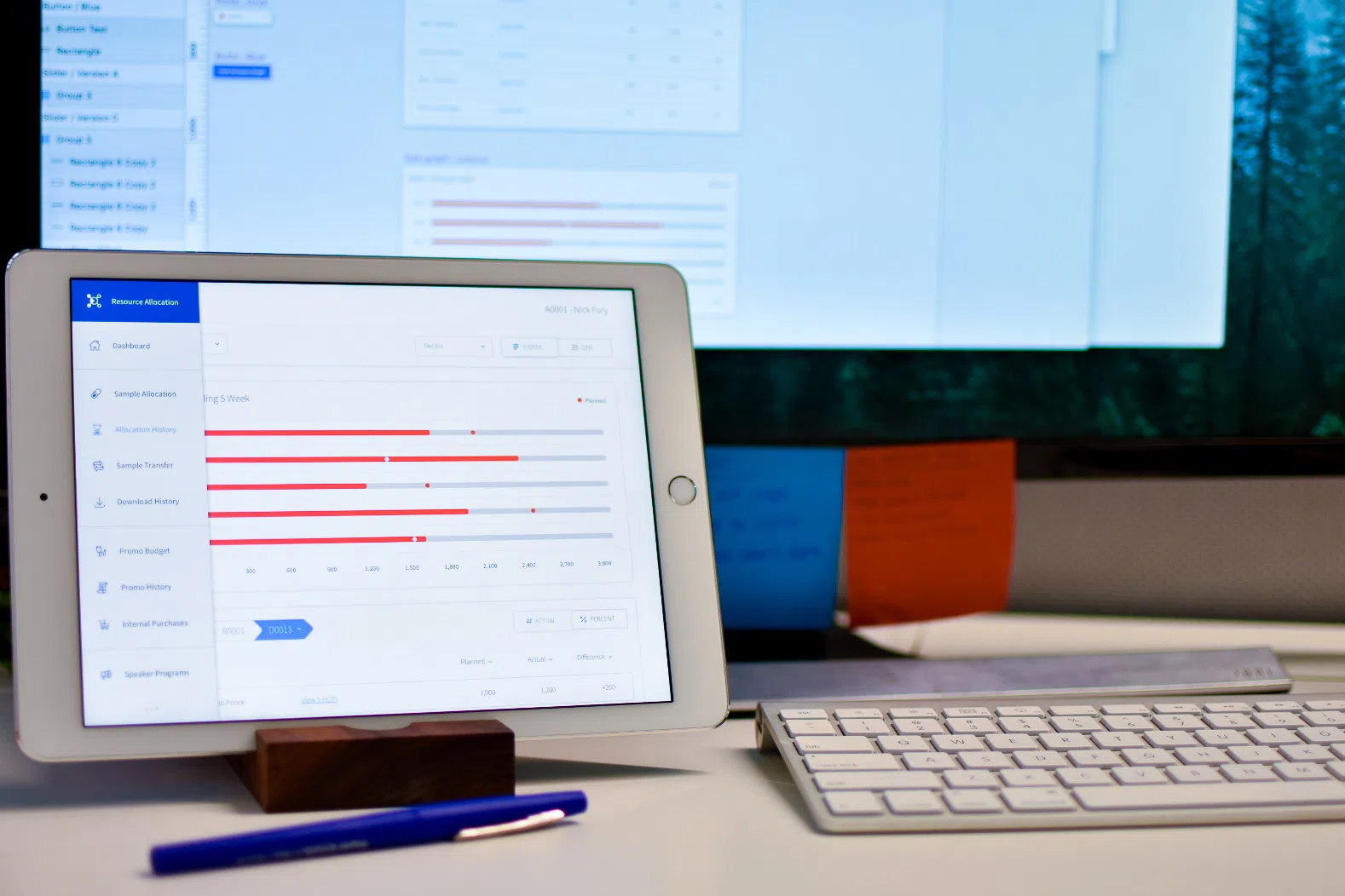
A client I was able to work very closely with is a global, research and development-driven pharmaceutical company committed to bringing better health and a brighter future to their patients. One of the many projects I've collaborated with them on is an internal iPad application, the Resource Allocation Tool. This app is used by pharmaceutical representatives to monitor and control allocations of samples and expense budgets to other reps and doctors.
This application was initially a developer-designed tool, and after I started at Pandera I had been working within the previously designed interface for a few months, making small updates and additions as needed. When the client introduced a new large piece of the application they wanted to collaborate with us on, I took the opportunity to redesign the interface, while also taking stock of the experience as a whole and make some minor updates there. The end goal was to improve user efficiency and visual appeal of the application.

REQUIREMENTS & IDEATION
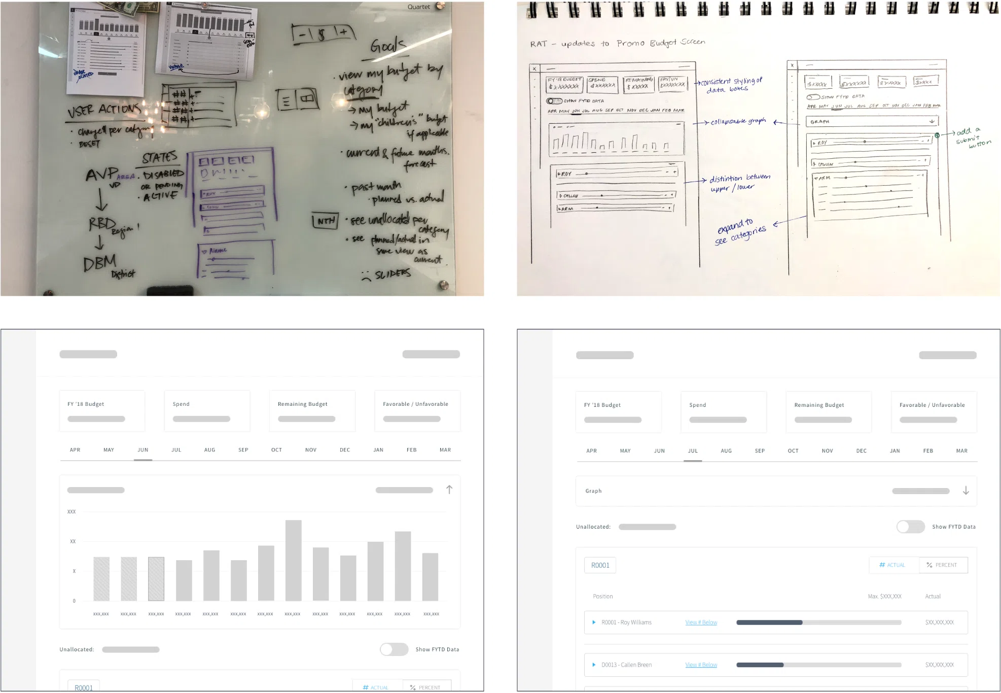
The first step was to discuss and define the goals of these users, and what elements I needed to cover in the designs. I started by defining the basics of what the user needed to do in the app, and went through the process of whiteboarding, sketching, and wireframing.

FINAL DESIGNS
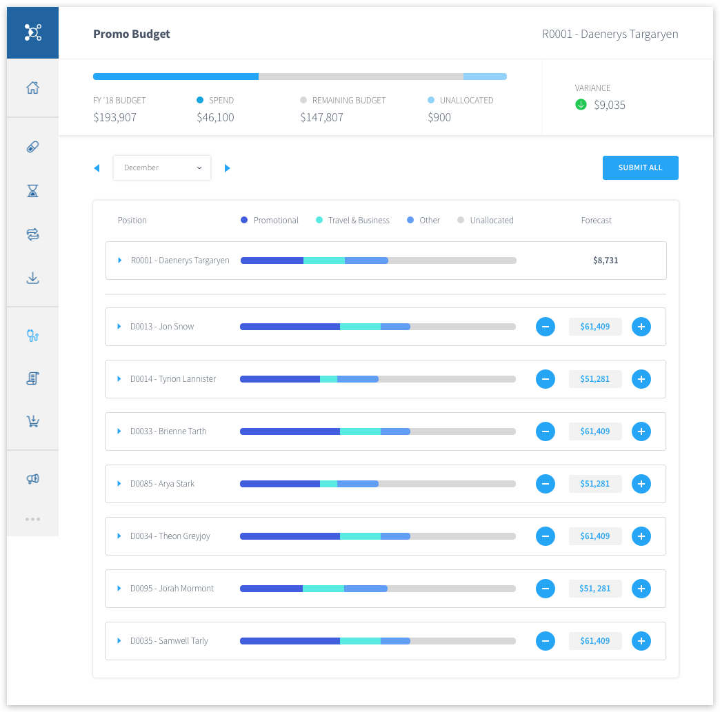
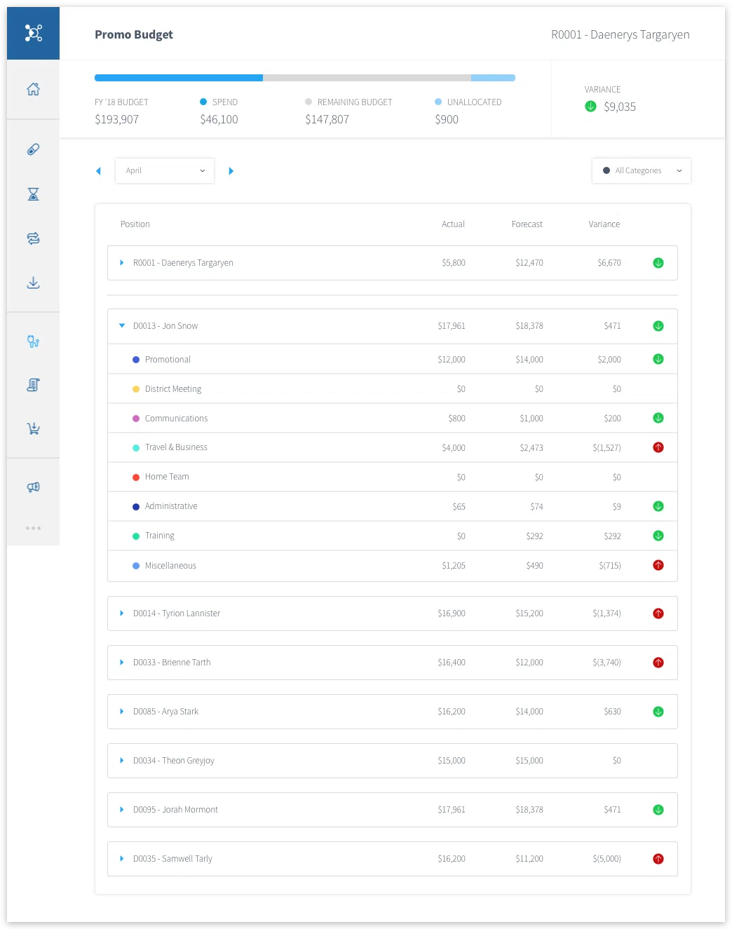
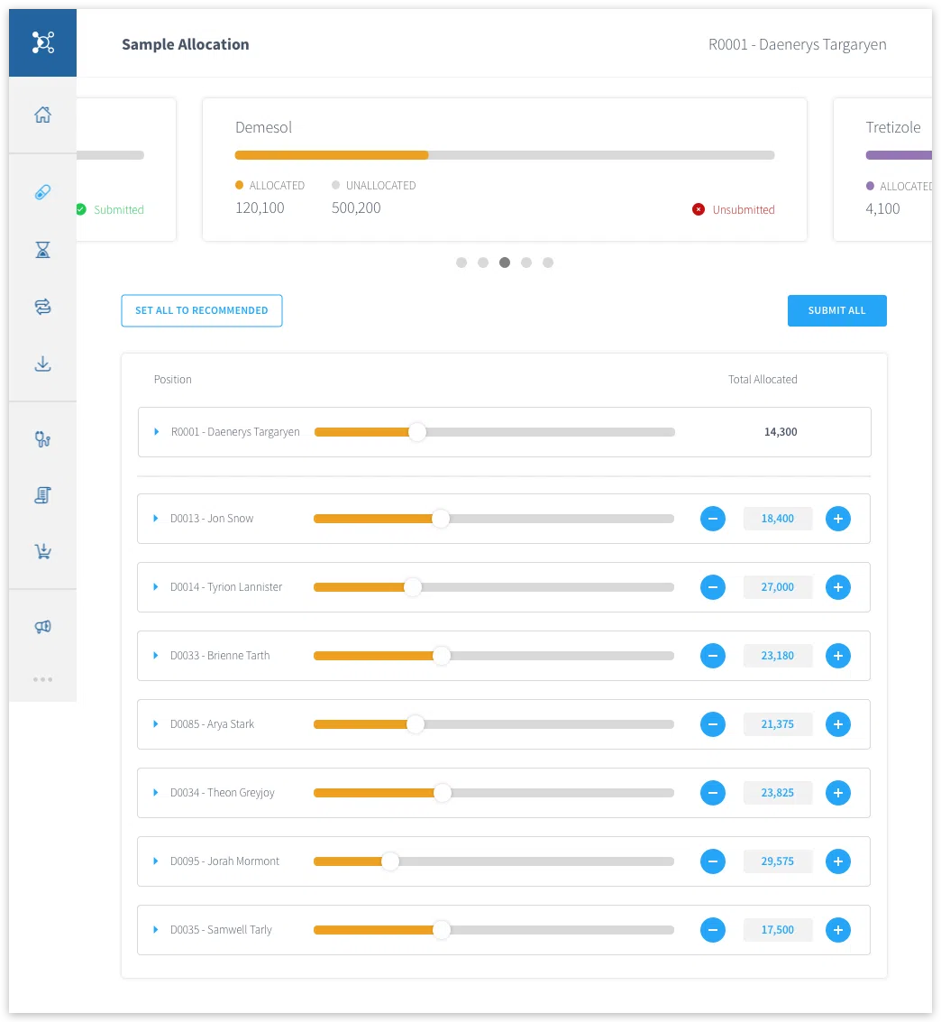
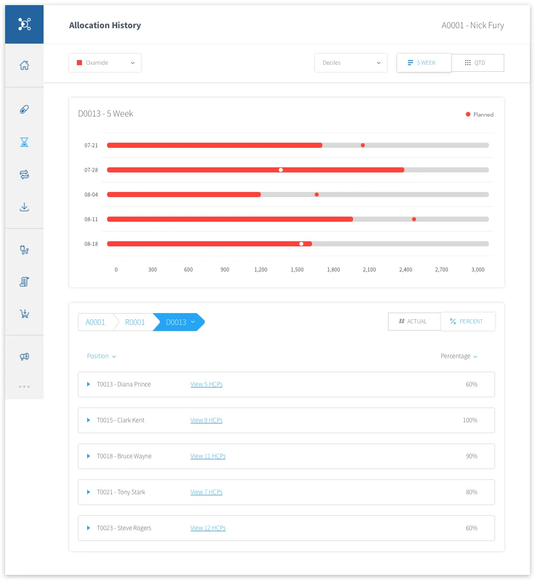
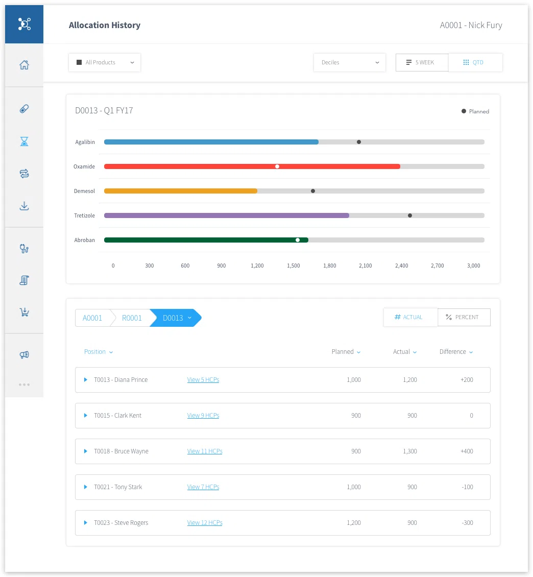
In my final designs, I wanted there to be a lot of consistency in the visual language across the application. One of the biggest visual elements I implemented was the horizontal progress bars, for tracking both budget usage and sample allocations.
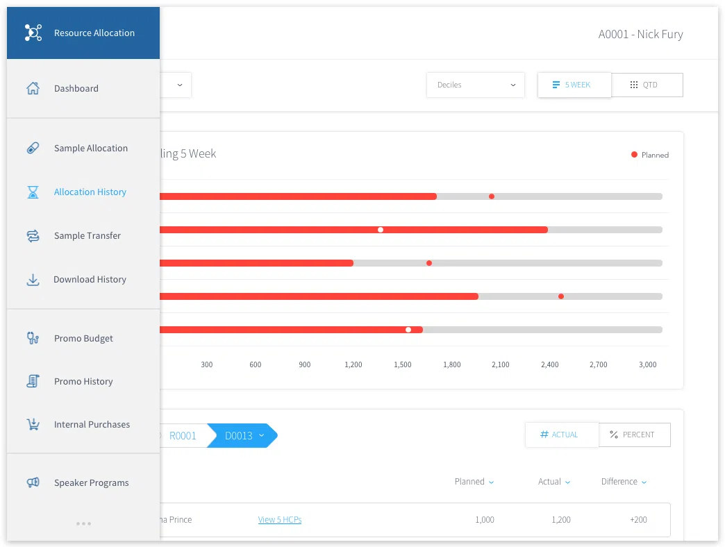
Additionally, I made some big changes to the left hand navigation menu. To allow more screen real estate for the data visualizations, I designed the menu to be retractable, but still usable when it's in the closed state. I also took the time to design new custom icons to add to the visual appeal of the app, especially with the icon-focused menu.

FRIENDLY FEEDBACK
After shipping these updates to the resource allocation tool, I sought more user feedback from the stakeholders and reps who would be using the application. Below are a few quotes from some of the end users...

What I love the most about this app is how simple and clean the layout is

It’s much more appealing and easy to use the application, making my job easier

I now enjoy using this app, my work feels more organized and easier to navigate